


![]() Incredibles Logo PNG
Incredibles Logo PNG
This family sets the whole world in motion. The Incredibles logo represents kind and super-capable heroes. Their benevolence and humor help them avoid losing their hearts in difficult situations and always emerge victorious in the fight against evil.
The Incredibles grew out of ideas developed by filmmaker Brad Bird long before he joined Pixar. Bird became interested in animation as a child and later studied at CalArts, where he met future Pixar cofounder John Lasseter. After conflicts at The Walt Disney Company, Bird worked in television animation and spent years shaping concepts inspired by superhero comics, spy films, and family life.
Following the commercial failure of The Iron Giant in 1999, Bird revisited his superhero family project and pitched it to Lasseter in 2000. Pixar quickly signed him to a multi-film deal, making Bird the first outside director hired by the studio. He brought part of his Iron Giant team into Pixar, while animators trained in traditional 2D techniques adapted to computer animation tools.
Released on November 5, 2004, The Incredibles became Pixar’s sixth feature film and the studio’s first story centered entirely on human characters. The production required new technology to realistically animate skin, hair, and clothing. Bird wrote the screenplay himself and temporarily voiced Edna Mode before the performance was removed from the final cut. Composer Michael Giacchino created the retro-inspired score.
The film earned $632 million worldwide and won Academy Awards for Best Animated Feature and Best Sound Editing. During the same period, superhero films such as Spider-Man 2 and Batman Begins dominated theaters. Still, Pixar approached the genre through family dynamics instead of comic-book spectacle. After Disney acquired Pixar in 2006, Bird eventually returned for Incredibles 2 in 2018, which grossed more than $1.2 billion worldwide.
Meaning and History
![]()
The development team has created a world where everything is thought out to the smallest detail. They designed a space ideal for living, reproduced each character’s appearance with anatomical precision, and detailed the skin and hair. But the most amazing thing is that many had never dealt with 3D graphics before filming Incredibles. Not long before that, some designers and artists were working on a 2D cartoon, The Iron Giant. Both projects’ authors are the same person, animator, screenwriter, and director Phillip Bradley Bird. At first, he made an unsuccessful debut with The Iron Giant, but was later rehabilitated when Pixar signed him to create several animated films.
The Bird had the idea for Incredibles back in 1993. He wrote the script before collaborating with Pixar, so he didn’t initially adapt it for 3D animation. So, it turned out to be one of the most difficult jobs for the studio, since it had avoided human characters. Bird’s team also did not know how to bring people to life with computer graphics; they were used to 2D and had never worked with 3D programs. And Bird did not want to compromise and was opposed to taking anything out of his story. He asked Pixar’s creative executives to identify the most disaffected and underperforming designers and to let them bring their crazy ideas to life.
Incredibles is famous for its complex visual effects and thoughtful images. Each superhero from the family wears his costume with an “i” on his chest. This symbol eventually became the cartoon’s logo. But where did it come from? According to the plot, all the outfits were created by designer Edna Marie “E” Mode. Phillip Bradley Bird himself voiced this eccentric woman because no one but him could reproduce the Japanese-German accent. He also designed the characters’ appearance, making him a major contributor to the emblem’s design.
What is Incredibles?
Incredibles is an animated film by Pixar Animation Studios, inspired by 1960s spy thrillers and retro comics. It was released in 2004 by Walt Disney Pictures. Four years later, its sequel, Incredibles 2, was released. The original plot follows a family forced to hide their superpowers and pretend to be ordinary people. But circumstances lead them to save the world.
2001 – 2003
![]()
2004
![]()
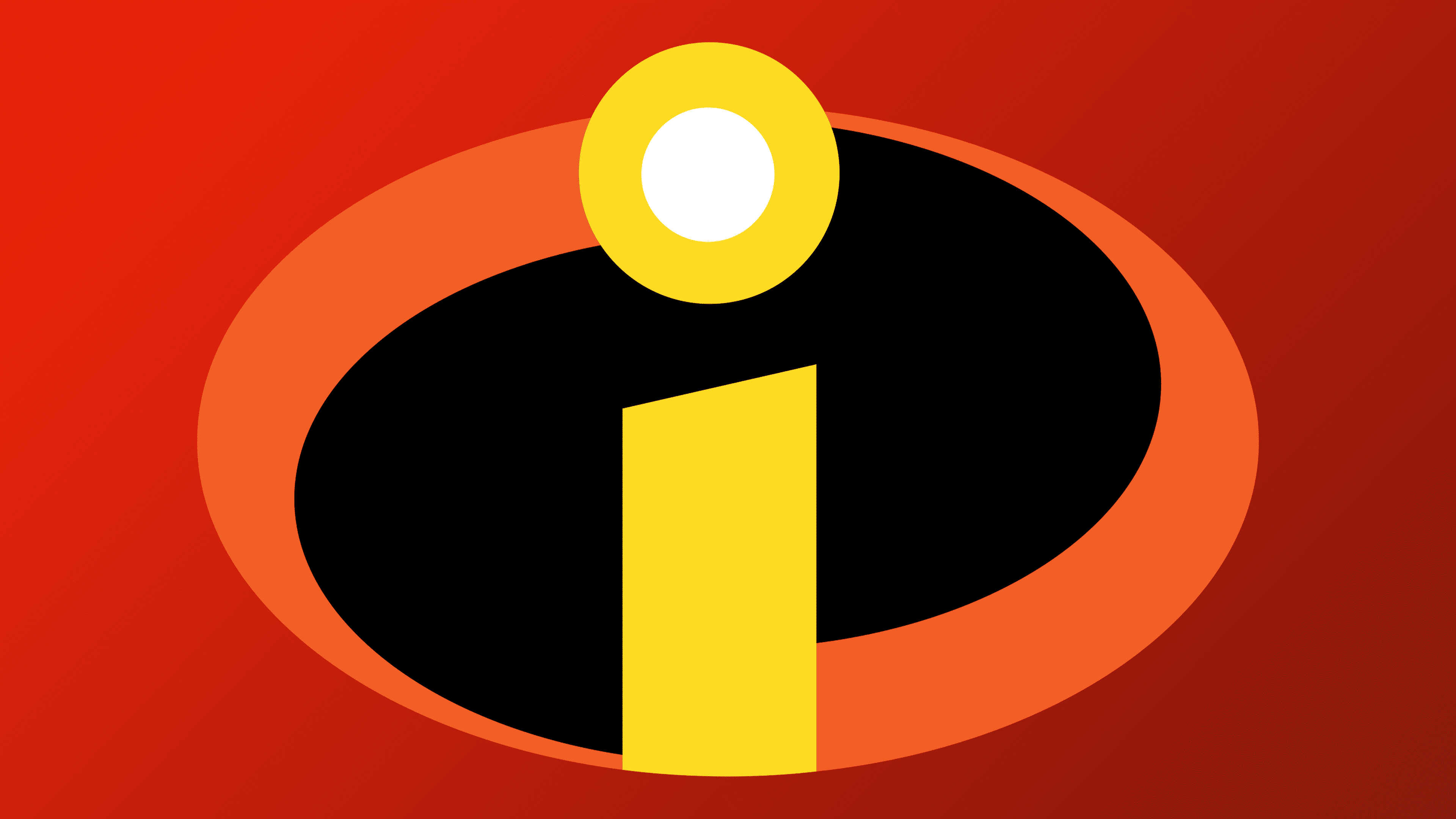
The logo, first introduced to audiences in 2014 with the premiere of “The Incredibles,” quickly became iconic and symbolic. It features a black oval framed by two orange arcs on the sides. The left arc narrows from top to bottom, while its mirror image on the right points in the opposite direction. At the center of the emblem is the yellow letter “i,” composed of a truncated rectangle and a circle with a white dot inside. The distinctive shape of these elements gives the logo the appearance of a burning candle.
The film’s title is positioned below, rendered in a bold, black, grotesque font. An interesting feature is the varying heights of the letters in the word: the closer they are to the center, the shorter they become.
This logo perfectly captures the spirit of the time when the “Incredibles” brand was just beginning to win viewers’ hearts. The orange and yellow colors symbolize energy, warmth, and family bonds, aligning perfectly with the movie’s theme. The black color adds contrast, emphasizing the importance and strength of the main characters. The simple yet memorable design strikes a balance between family values and superhero adventures, making the movie popular and beloved.
2018
![]()
Font and Colors
The Incredibles symbol was designed as a superhero logo, drawing inspiration from classic comics. As the cartoon’s ideological inspirer, screenwriter, and director, he deserves the main credit for the logo’s design. The first letter of the media franchise’s title is placed in the same oval as the Batman bat. True, the base’s color is different. In addition, the Incredibles logo features two diagonal lines that create a sense of movement.
The movie poster featured the same inscription as the logo. The developers used their design, and only then did Jens R. Ziehn create a similar sans-serif typeface called The Incredibles. Some letters are in the Greek style, especially the zigzag “S” and the beveled “E,” “L,” and “I.”
The emblem combines bright “superhero” colors, orange and yellow, with the classic white and black.