


 Indiana Jones Logo PNG
Designers infused the Indiana Jones logo with hidden dynamics to convey the film’s adventurous atmosphere. The emblem represents the franchise’s main character and his worldwide travels in search of ancient artifacts and treasures.
George Lucas began Indiana Jones in 1973, writing a draft called The Adventures of Indiana Smith as a tribute to 1930s and 1940s adventure serials. Philip Kaufman helped shape the early story and suggested the Ark of the Covenant, but the project paused while Lucas moved on to Star Wars.
The decisive turn came in Hawaii in May 1977. Steven Spielberg told Lucas he wanted to make a James Bond film, and Lucas offered Raiders of the Lost Ark instead. Spielberg liked the pulp-adventure idea, but not the surname Smith. By 1979, the character had become Dr. Henry Walton “Indiana” Jones Jr. Tom Selleck was initially considered, but Lucas ultimately cast Harrison Ford.
Raiders of the Lost Ark opened on June 12, 1981, with music by John Williams, and became the year’s top-grossing U.S. film. Indiana Jones and the Temple of Doom followed in 1984, and Indiana Jones and the Last Crusade arrived in 1989 with Sean Connery as Indy’s father, adding a father-son story to the franchise.
The brand expanded beyond film through Marvel Comics in 1983, Dark Horse Comics in 1991, Ballantine Books and Bantam Books, video games starting in 1982, and The Young Indiana Jones Chronicles in 1992. Indiana Jones and the Kingdom of the Crystal Skull came out in 2008. After the Walt Disney Company bought Lucasfilm in 2012, James Mangold directed Indiana Jones and the Dial of Destiny, released on June 30, 2023, with Ford returning for the final film.
Meaning and History
The logo includes the inscription “INDIANA JONES” in a recognizable style. This is the name of the franchise’s main character. Initially, he was supposed to be called Indiana Smith, but Steven Spielberg disliked the surname, so he changed it. George Lucas, the story’s creator, proposed the current variant. As for the name, it was chosen in honor of a dog named Indiana, which once lived with Lucas and became the prototype for Chewbacca.
The emblem design evokes popular comics and transports viewers to a world of thrilling action and archaeological puzzles. The chosen font makes the brand name more noticeable and dynamic, emphasizing the film’s adventurous nature.
What is Indiana Jones?
Indiana Jones is a fictional archaeology professor and the title of a series of feature films based on his adventures. The franchise also created video games, books, comics, and more. Steven Spielberg directed the first four films. The idea was conceived by George Lucas, who created the original character and his story.
1981 – today
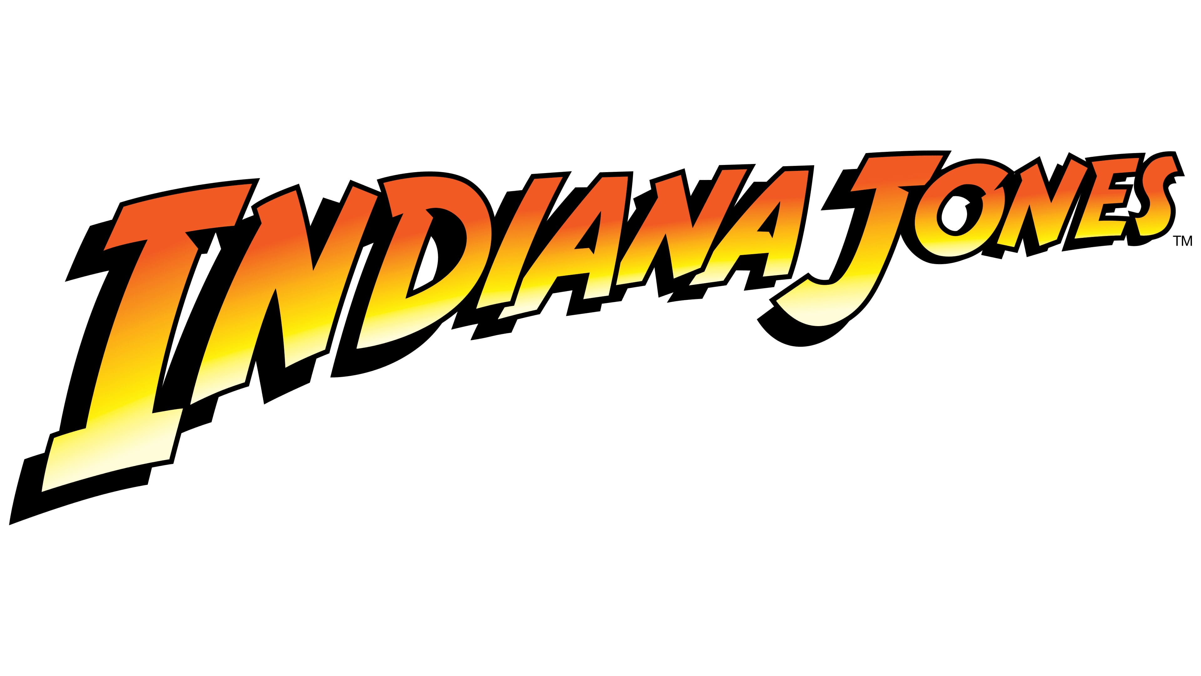
The Indiana Jones logo looks like a comic book inscription. This was done to reflect the retro aesthetics and atmosphere of the 1930s, when the first film’s events take place. After all, the so-called Golden Age of Comic Books began in the late 1930s. The emblem design underscores the franchise’s historical roots and demonstrates its close connection to pop culture.
The phrase “INDIANA JONES” is set in irregular capital letters, colored in a three-color gradient of orange, yellow, and white. Each casts a wide black shadow, concentrated on the left side. The glyphs vary in size and are arranged in descending order, from largest to smallest. As a result, the inscription seems to recede into the distance. The perspective effect is enhanced by arranging the letters diagonally from bottom to top.
The emblem’s dynamism symbolizes action and adventure, as the cult action films about Indiana Jones are full of various events, danger, and energy. The emphasis on cinematic movement makes the films spectacular, so the logo should match.
Font and Colors
To achieve the desired inscription shape, designers developed a custom set of glyphs with irregular serifs, curved lines, and small recesses. Later, free fonts Adventure (in 2001) and SF Fedora (in 2002) were created based on it. Neale and Shayna Davidson created the first, and ShyFonts created the second.
The Indiana Jones logo’s colors were chosen to match a palette of sand, stone, and the sun. This aims to evoke associations with archaeological excavations. Bright shades and gradients are used to attract attention.