 Indiana State Sycamores Logo PNG
The emblem of the Indiana State Sycamores, symbolizing their state affiliation, reflects the most common trees in the region in its name. The emblem demonstrates the team’s unity and adherence to traditions while continuously evolving.
Indiana State Sycamores: Brand overview
| Founded: | 1982 |
| Headquarters: | Terre Haute, Indiana, U.S. |
| Website: | gosycamores.com |
Meaning and History
The recent update of the Indiana State Sycamores team logo indicates their preference for developing and modernizing their branding while still remembering their “old” symbols. In some ways, they even adhere to traditions to demonstrate the team’s unity.
This includes, for example, the map of Indiana, which, even after the redesign, remains the central element of the emblem, albeit in a slightly altered form. Similarly, the inscription – the nickname of the sports department – has been retained. Although the font is now different and looks nothing like it did before, the designers have drawn associative parallels between them.
What is Indiana State Sycamores?
Indiana State Sycamores is the athletic department of Indiana State University in Terre Haute. It comprises 15 teams participating in intercollegiate programs. They are members of the Missouri Valley Conference and compete in NCAA Division I, including FCS. They are also part of the MVFC.
1982 – 1987
The logo introduced in 1982 consists of two parts. The first is the word “Sycamores” in a script-like font forming an arch. The second is a sycamore leaf, very similar to a real leaf. The pattern has an uneven “texture”: black and white horizontal stripes across its surface. The inscription is also black and white.
1988 – 2019
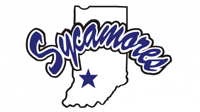
In 1988, the teams introduced a new emblem, which lasted for over 30 years. The word “Sycamores” was retained but became bright blue. The tree leaf was replaced with the outline of the state of Indiana, in the lower left corner of which artists depicted a white five-pointed star, accurately representing the geographic location of Terre Haute.
2020 – today
Almost 32 years later, the Indiana State Sycamores felt their logo looked outdated. It was created before modern graphic tools, so it was morally outdated. Moreover, it was difficult to apply on merchandise due to its many small details, and the font of the inscription was not versatile.
The development of the new logo began in 2016 when Sherard Clinkscales became the ISU Director of Athletics. Oklahoma-based Old Hat played a direct role in the branding. They offered the university a significant discount, as this logo was their first. The presentation took place in 2020 in Tirey Hall.
Indiana State Sycamores Baseball
The university’s baseball team has its monogram logo. It consists of intertwined letters “IS,” resembling a dollar sign.
Indiana State Sycamores: Interesting Facts
The Indiana State Sycamores are the sports teams for Indiana State University in Terre Haute, Indiana. They play in the NCAA Division I and are part of the Missouri Valley Conference.
- Larry Bird: Larry Bird is a basketball legend who played for Indiana State. He led the team to the NCAA Championship game in 1979, where they played against Michigan State. This game is famous because Larry Bird played against Magic Johnson, and it’s remembered as one of the best moments in college basketball.
- 1979 Basketball Tournament: That year, the team had an amazing season, winning all their games until the final one, ending with a record of 33-1. This run to the championship game is a big part of the Sycamores’ history.
- Lots of Sports: Indiana State offers many sports for men and women, like baseball, softball, track and field, and cross country. They want to give many students the chance to compete and do well.
- Track and Field/Cross Country: They’re good at track and field and cross country, with many NCAA champions and All-Americans coming from these programs.
- Sycamore Tree: The team’s mascot and name come from the common sycamore trees in Indiana. This name stands for strength, resilience, and growth.
- Hulman Center: This is where the basketball teams play. It’s a famous Terre Haute venue that hosts games and other big events.
- Missouri Valley Conference: Participating in this conference means the Sycamores compete against other schools with long sports traditions and strong rivalries.
- Baseball Success: The baseball team has also had a lot of success, with several trips to the NCAA Tournament and winning their conference. Some of their players have gone on to play professionally.
- Helping Out in Terre Haute: Indiana State’s teams and athletes do a lot for the local community, like service projects and clinics for kids, which helps connect the university with people in the area.
- Doing Well in School and Sports: Indiana State cares about its athletes’ success in their classes and sports. Many of them win academic awards while competing in top-level college sports.
The Indiana State Sycamores are known for great moments in sports, strong teams, and helping their students grow in every way, from athletics to academics and being part of the community.
Font and Colors
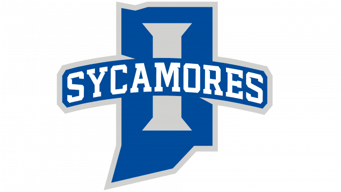
Firstly, designers changed the shape of the state. Until 2020, the image was detailed, making it difficult to print. So, the outline was simplified, approximating it to a polygon shape with perfectly straight edges. The star was replaced with the letter “I,” intended to reference Indiana’s name, so many may not recognize the state in its angular geometric form.
The old inscription also became a thing of the past. The word “SYCAMORES” is now in uppercase letters with rectangular serifs. The block font is also used for the letter “I,” which mimics the style of the Larry Bird era, popular in the 1970s. Another new detail of the emblem is the accent gray color, complementing the official blue and white color scheme.
Indiana State Sycamores color codes
| Absolute Zero | Hex color: | #0142bc |
|---|---|---|
| RGB: | 1 66 188 | |
| CMYK: | 99 65 0 26 | |
| Pantone: | PMS 2728 C |
| Light Gray | Hex color: | #d0d0ce |
|---|---|---|
| RGB: | 208 208 206 | |
| CMYK: | 0 0 1 18 | |
| Pantone: | PMS Cool Gray 2 C |
