Among the team’s fans, the Indianapolis Colts logo is well known for its blue horseshoe. It replaced the spirited horse previously used on the emblem in honor of the club’s historical roots. Excellent physical condition, luck, and endurance – that’s what it demonstrates.
Indianapolis Colts: Brand overview
| Founded: | January 23, 1953 |
| Founder: | Jim Irsay |
| Headquarters: | Indianapolis, Indiana, U.S. |
| Website: | colts.com |
The Indianapolis Colts are an American football team based in Indianapolis, Indiana. The Colts compete in the NFL as a club in the South Division of the American Football Conference (AFC).
The team’s history began in 1952 with the most unfortunate club of that time – the Dallas Texans. After a series of colossal failures, the club was expelled from the league and disbanded. Members of this club left Dallas and moved to Baltimore, where the new team, Baltimore Colts, was founded. This happened literally a year later – in 1953.
This status lasted several decades (from 1953 to 1983), and then the players were forced to move to a new structure based in Indianapolis. The lease had ended, and at that time, the Baltimore government did not want to build a new stadium in place of the outdated Memorial Stadium. Negotiations were very tough due to the city authorities’ doubts about the advisability of investments. This was associated with the fact that the team had not been shining recently.
Then Robert Irsay risked moving his club to another place, choosing between Phoenix and Indianapolis. He chose Indianapolis because its mayor made an ambitious attempt to turn Indianapolis into the “Great American City.” Leaving, the owner took all the paraphernalia from Baltimore – the nickname, official colors, and logo.
The first owners of the team were a group from Dallas, led by a pair of young millionaires, Giles Miller and his brother Connell (from the 1st to the 7th game of 1952), and the NFL (from the 8th to the 12th game of that year). Carroll Rosenbloom of Baltimore became the owner of the shares later, as the club found no takers. He led the club from 1953 to 1972 and named it Baltimore Colts. Carroll believed that this nickname reflects the relentless, almost animalistic persistence of the team and its boundless pursuit of victory.
Then Robert Irsay bought the team, exchanging franchises with Rosenbloom. He was its sole owner until 1997. Jim Irsay, Robert Irsay’s son, became the primary owner after his father’s death in 1997. He remains the owner of the club to this day.
Meaning and History
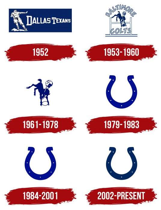
The last three logos of the “Indianapolis Colts” are in the form of a horseshoe. But for the team, this design is relatively new, as until 1979, it had entirely different emblems. First – with a football player and then – with a horse overcoming an obstacle. It was no coincidence that it was chosen because the team was founded in Texas, which is known for its horse breeding traditions. The horse’s image first appeared in 1953 when the “Dallas Texans” moved to another city and became known as the “Baltimore Colts.” And it’s not surprising, as equestrian sports were especially popular in Baltimore. The next move to Indianapolis did not significantly change the situation: the franchise retained the nickname and chose a logo in the shape of a horseshoe – as a symbol of determination and success. The blue color in the Colts logo symbolizes superiority, class, and strength, while white symbolizes integrity and charm.
What is Indianapolis Colts?
The Indianapolis Colts are three franchises of the National Football League that moved to the American Football League and formed the American Football Conference. It currently competes in the AFC South. The club was formed in 1953 and has won many championships, including two Super Bowls.
1952
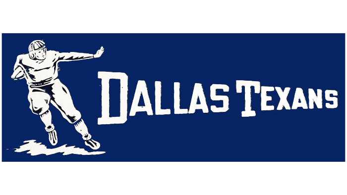
The logo of that time refers to the team’s original nickname – Dallas Texans. The Dallas Texans logo includes these words and a dark blue background in the shape of a quarter. The letters are of different sizes, creating a dynamic effect. So does the football player running with the football, making straight arms. The other hand signals “Caution!” The color of the nickname, the player, and his uniform – yellow. As is the ground under his feet.
1953 – 1960
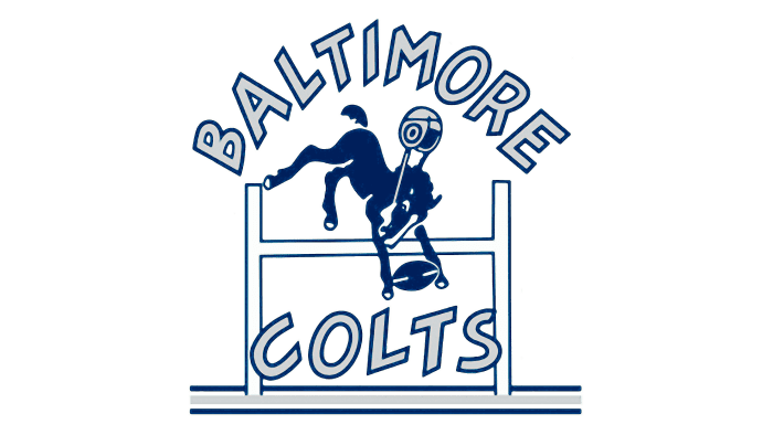
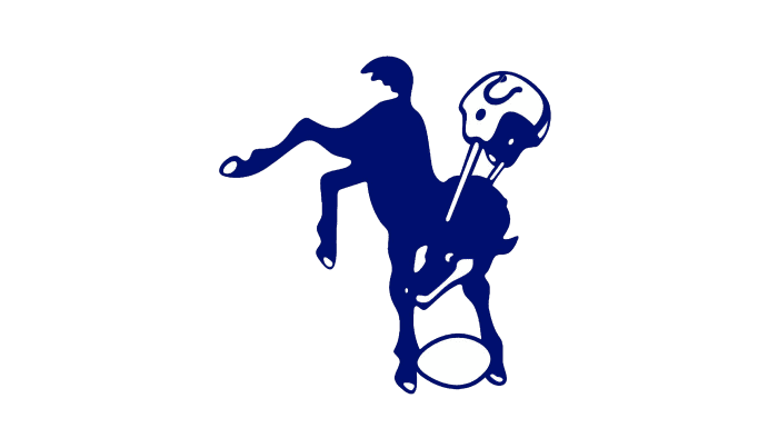
After the old club’s disbandment and the formation of a new one, the team received a radically redesigned logo. It depicts a blue bronco holding a blue football with two stripes, flying over a goalpost. Also present is a helmet that has flown off, embodying the energy and determination of the athlete.
On the animal’s head is a rectangular spot – a sign of luck and success. It’s white, as is the hoof. All other elements are blue, except for the helmet (it’s gray). The wordmark “BALTIMORE COLTS” – is gray with a blue border. The words are divided, the first – along the top edge of the emblem, the second – along the bottom. The goalposts are wide and firmly stand on the “ground.”
1961 – 1978
This design is a modification of the previous emblem’s design. Designers removed from the logo non-descriptive details, such as the goalposts, the ground beneath them, and the nickname, which occupied almost half of the space. They left only the levitating horse on a white background. The football also became white with a blue outline. A dark blue horseshoe appeared on the helmet. The gray color disappeared, and the animal became larger.
1979 – 1983
This logo is key to the one that would be used for many years in a row. It depicts a horseshoe, which was previously depicted on the horse’s helmet. However, now the image is artistically refined: it is narrower and lighter blue than the real one. The horseshoe has seven small white holes. According to the creators, such a color scheme reflects strength, perseverance, honesty, energy, charm, and perfection.
1984 – 2001
With the move to Indiana from Baltimore, the “Colt” logo also moved—the classic blue horseshoe – the same as in Baltimore. The Indianapolis Colts logo became the embodiment of animal persistence and endless striving for victory. The only change was that the color became slightly darker. Several holes, sizes, and shapes remained the same.
2001 (unused)
This is an unused emblem. Most people don’t know about it because it was never printed on the uniform. The Indianapolis Colts emblem is in the form of a blue and white colt’s head. It is made in a cubic style and placed on the face. The eyes, nostrils, and lower part of the head are geometric shapes with sharp edges.
The ears are triangular and pointed. This indicates that the colt is on guard and listening carefully to what’s happening. This is also indicated by the rectangular nostrils and rectangular eyes. The main colors of the logo are white, blue, and black.
In 2001, another unused Indianapolis Colts logo appeared. It depicts the same colt’s head as the previous one. Two things differ the shade (light blue turned into characteristic blue) and the background (the inscription “Colts” is behind). The team’s nickname resonates with the key style element, as it geometrically coincides with it. The word is divided into two parts: “co” (left) and “us” (right). The head is in the center, creating the impression that the colt is peeking out from behind a fence, leaning on it.
2002 – today
The current symbol of the “Indianapolis Colts” is connected with the emblem used in 1961-1978. The horseshoe did not appear by chance – it had already been depicted on the horse’s helmet, albeit not so detailed. Artists redrew this element, expanded and scaled it to become the club’s main calling card.
As a result, an original logo in the shape of a horseshoe was created, which since 1979 has had three versions. In shape and proportions, all variants are identical – they differ only in the palette. In the last case, a dark blue shade was used, becoming popular after the redesign in 2002. The Indianapolis Colts emblem of this period underwent minor changes, mainly in color. Otherwise, the “Indianapolis Colts” logo remained unchanged and looked like a large horseshoe with seven holes on a white background. The shade of the key element darkened and acquired a characteristic blue color. The Indianapolis Colts logo, as before, symbolizes perseverance and endless determination to win.
Indianapolis Colts: Interesting Facts
The Indianapolis Colts is a football team with a long and exciting history in the NFL, with many big moments and famous players.
- Starting in Baltimore: The Colts started in 1953 in Baltimore, Maryland. They moved to Indianapolis in 1984, which was a big deal and upset many of their Baltimore fans.
- Super Bowl Wins: They’ve won the Super Bowl twice. Their first win was in 1971 when they were still in Baltimore, and their second was in 2007, after moving to Indianapolis.
- A Legendary Game: The 1958 NFL Championship game, where the Colts beat the New York Giants, is known as “The Greatest Game Ever Played.” It was the first NFL game to end in sudden-death overtime and helped make football super popular in the U.S.
- The Peyton Manning Era: Peyton Manning, who the Colts picked first in the 1998 draft, turned the team into one of the best during his time there (1998-2011). He won four MVP awards and helped them win a Super Bowl.
- Lucas Oil Stadium: Their stadium, opened in 2008, has a retractable roof and a big window that looks out over Indianapolis. It’s where they play their home games and even hosted a Super Bowl in 2012.
- Their Own Marching Band: The Colts have had a marching band since 1947, even before the team moved to Indianapolis. It’s a big part of the team’s tradition.
- A Big Comeback: In a 2013 playoff game, the Colts returned from a 28-point deficit to win against the Kansas City Chiefs, one of the biggest comebacks in NFL history.
- Johnny Unitas: A legendary Baltimore Colts quarterback, Johnny Unitas led the team to many victories, including a Super Bowl.
- Pioneers of the No-Huddle Offense: The Colts were among the first teams to use a no-huddle offense a lot, which means they played fast and didn’t stop to talk between plays. Peyton Manning made this strategy even more famous.
- Winning Tradition: Since moving to Indianapolis, the Colts have been successful, making it to the playoffs many times thanks to great players and smart coaching.
These points show how the Indianapolis Colts have been a big part of NFL history, with amazing games, players, and strategies that have left a mark on the sport.
Font and Colors
From a visual standpoint, the Indianapolis Colts emblem is very simple: a wide curved blue line with seven symmetrically positioned white dots. But from a semantic content standpoint, it’s much more complicated, as the horseshoe is a well-known symbol of luck and determination. Thus, it performs a dual function: plays off the theme of equestrian sports and serves as the team’s unofficial talisman, predicting victory in upcoming matches.
The creators of the Indianapolis Colts logo did it without inscriptions, as they could fill the concise drawing with meaning. Even the color scheme was chosen not by chance: white symbolizes unity and integrity, and blue represents endurance and superiority. This color combination became classic, as it was used in the first emblem of the Dallas Texans club. The team moved, and the names and elements of visual identification changed, but the blue and white palette remained a good tradition.
Indianapolis Colts color codes
| Royal Blue | Hex color: | #002c5f |
|---|---|---|
| RGB: | 1 51 105 | |
| CMYK: | 100 65 0 35 | |
| Pantone: | PMS 654 C |
| Silver | Hex color: | #a5acaf |
|---|---|---|
| RGB: | 155 161 162 | |
| CMYK: | 5 0 0 30 | |
| Pantone: | PMS 429 C |
FAQ
Why is the team’s emblem a horseshoe?
The horseshoe is a sign of luck, so its use on the emblem of the “Indianapolis Colts” may be symbolic. It first appeared in the club’s emblem in 1961, but not by itself, but as part of another horse emblem.
Did the “Colts” change their logo?
The Colts have changed their logo several times. But in 2020, they only redesigned an alternative version, depicting the letter “C” in the form of a horseshoe. The main graphic symbol has remained unchanged since 2002.
What color is the “Indianapolis Colts” uniform?
The football club’s uniform is painted in two colors: speed blue and classic white. There are two options for jerseys with reflected colors.
In honor of what is the team “Indianapolis Colts” named?
The history of the name Indianapolis Colts dates back to the time the team was founded, known as the Baltimore Colts. Its nickname embodied the long-standing traditions of racing and horse breeding in the city of Baltimore.
