Renowned for its quality and aesthetic hair and body care products, Colgate-Palmolive has created a new look for its novelty Irish Spring soap. The new fragrance has gained an original visual identity and noble, sophisticated packaging thanks to close collaboration with the designers of Chase Design Group and Tin Horse. The design allowed the product to stand out brightly on the shelves among the abundance of competitors, forcing the buyer to choose this product with its originality and beauty. With its clean and fresh scent, the soap itself attracts the consumer. But since 1970, the brand has not been updated this type of brand, offering a characteristic original fragrance as a deodorant soap for men.
Several fragrances and products have been launched during this time, including body wash, a group that Irish Spring also represents. By expanding its range, increasing the appeal of its products, and lowering the age limit of its consumers, the brand is increasingly attracted to creative ways of graphic design, through which it better reflects the stylish and modern masculinity offered by men’s perfumery. This approach informed the rebranding and identity formation of the company’s new product.
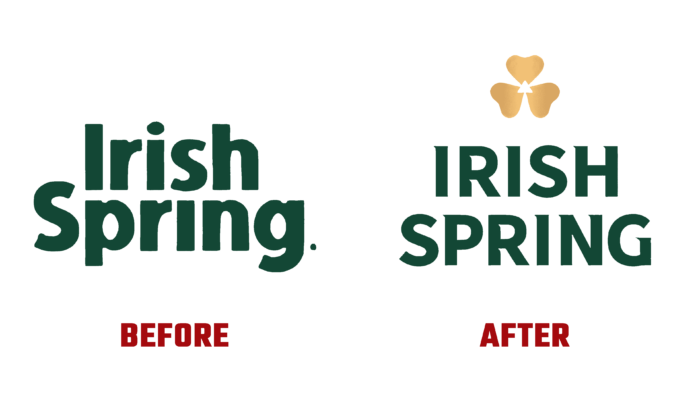
The new design created a unique combination of the new brand’s promise, a pleasant and unique scent with the versatility of previously created iconic assets, and the rich green structure of Irish Spring. It is based on the distinctive white trademark and gold clover symbol, which are the traditional hallmarks of its products. A sleek, modern look was created, which pays homage to the heritage and promises to offer new products to the customers constantly. With the current identity, the accurate communication of the brand’s true essence was realized, which was only possible by going beyond its past. At the same time, a discreet and strong image was developed with a system that allowed to separate each of the products into a separate direction while maintaining a single identity of the products of the famous Irish Spring.
The packaging of the shower gels has taken on the simplicity and natural beauty of nature. It is decorated with a refreshing natural landscape, different for each fragrance. The packaging design was built on its shape and streamlined and on the appeal to the main consumer – the young male generation. The understated aesthetic style with a sans serif bold capital lettering that retains the fresh white of the previous mark effectively serves as a timeless symbol of the company’s shared heritage.
