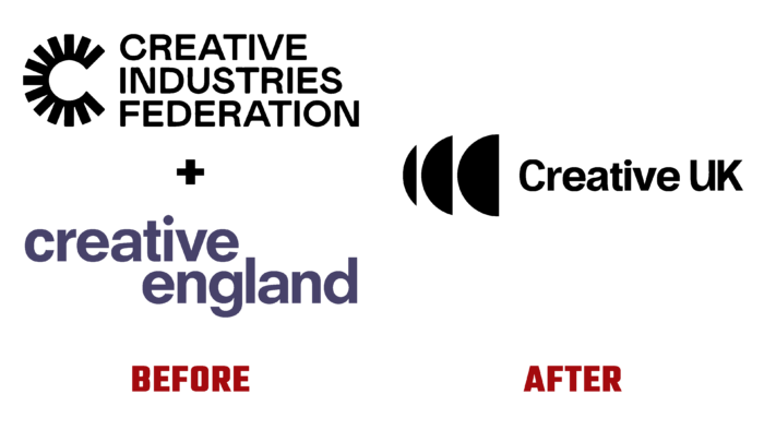
The history of the Creative UK brand began in 2011. This brand results from a merger between the Creative Industries Federation and Creative England brands. The organization supports creative people, their undertakings in business, initiative projects for investments in business development and industry. They work with partners not only in Britain but also abroad.
The brand’s resource base is a creative sector that operates through membership opportunities and outreach.
London-based creative agency Multivitamins designed the new identity.
The new identity is based on the Amplify logo. It consists of three semicircular shapes against which the brand name is written. Available in white and black versions.
I would like to note that in such a conceptual way, they wanted to emphasize the loudness of creativity, the influence of the brand, and the ability to implement different aspects of the activity together, joining forces, but at the same time, so that different projects are implemented by separate departments that know their business 100%.
The public appreciates the new design, even though it looks rather dull and clumsy. We made a logical emphasis that creativity is a continuous process consisting of various stages elements. Therefore, this style of “matryoshka” came out in the final version.
The initiators of the process also support the redesign, noting that it is boldly recognizable, easily broadcast, and read on various digital media.
Another advantage is that it can be easily adapted to graphic patterns in different dimensions, including 3D.
In the design of digital communications, it looks easy and quite simple. However, there is a noticeable nuance. The disadvantage is that this spherical image is too typical. It is minimalistic, neat, but “hackneyed.”
In design, in general, a hemisphere, the stratification of parts is a rather stereotypical visual image present in many designs of various companies.
In addition to the new icon, the creative agency developed a custom font for identification. Now it has grotesque typography.
Be that as it may, the public appreciated the efforts of the creatives, and judging by the reviews, the rebranding of the identity looks timeless and dynamic.


