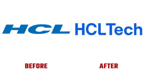
On Monday, September 26, Indian IT company HCL Technologies officially rebranded as HCLTech and updated its visual identity as part of the “Supercharging Progress” concept. These changes were to reflect its main goal – the unification of technologies to improve the conditions of life on the planet.
Since the IT consulting firm is committed to development and wants to look progressive in partners’ eyes, it has combined several modern solutions in its logo. First, the palette uses a rich blue that creates a sense of depth and freshness. In some cases, it is presented as a gradient with a transition to a purple hue – this is exactly the version that HCLTech showed on September 26.
Secondly, the brand name is written in bold sans-serif type, which is very popular lately. But the designers wanted to add something interesting to the geometric grotesque, so they rounded off the outer side of the corner at the letter “L.” The inscription attracts attention better and does not look too rough in this form. In the main version, the glyphs are blue, but on a dark background, they can turn white so as not to blend into the surrounding space.
When an Indian IT company unveiled its new corporate identity, it complemented the presentation with an unusual rocket icon. The hull of the spacecraft was depicted with white and silver lines. At the bottom were three orange stripes – the fire that occurs during takeoff. And on top was a dark blue arrow, indicating growth and progress. Obviously, this symbol was only associated with the Supercharging Progress concept because it was not included in the main version of the logo.


