The brand’s corporate identity is an example of strict minimalism, which is always relevant. The HCL logo combines a bold and confident font that is complemented by a pleasantly expressive coloring. Another feature of the logo is the absence of decorative graphic elements, which signifies the company’s focus on a specific area of activity. HCL Technologies puts all its efforts into improving the quality of services and providing high-quality service.
HCL: Brand overview
| Founded: | 11 August 1976 |
| Founder: | Shiv Nadar |
| Headquarters: | Noida, Uttar Pradesh, India |
| Website: | hcltech.com |
HCL Technologies is one of the world’s largest information technology and consulting outsourcing providers. The company is of Indian origin and based in India (Uttar Pradesh). The main management is carried out by a large corporation HCL Enterprise. HCL Technologies has extensive geography. It provides services not only within the country but also abroad. The structure also includes offices in more than 40 countries.
The company compares favorably with other firms in the information technology field. She uses innovations and implements the latest developments that make her products one of the best. The success of HCL Technologies is also confirmed on a financial level. Its revenue for the year is more than 10 billion dollars, which allows it to occupy leading positions in popular ratings. The brand was even included in the Forbes Global 2000 list.
Meaning and History
The key trend of the HCL logo is a commitment to tradition. The company follows the principles of efficiency and pragmatism in everything, including visual identity. Therefore, its emblem has no curly elements or decorative delights – the emphasis is on simplicity. The designers focused on the optimal readability of the text because an individual sign consists only of a name.
What is HCL?
HCL Technologies is a large Indian-based IT company. Provides services in the field of information technology, consulting, and outsourcing. The firm has offices in 50 countries and a client base of more than 200 major market-leading companies.
1976 – 2022
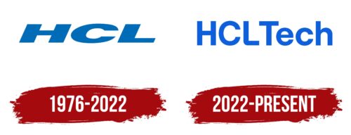
Stable growth and high achievements are directly reflected in the visual identity. HCL Technologies has a stylish logo that symbolizes confidence, reliability, and professionalism. These characteristics are shown in every detail. The massive font, which provides detail and space between letters, demonstrates strength. The slightly slanted letters also show movement and progressiveness, while the light neutral coloring emphasizes a responsible attitude to business.
HCL Technologies was founded in 1976. But, at that time, it was a small company Microcomp Limited, which produced personal computers. It was founded by a team of 6 qualified engineers led by experienced entrepreneur Shiv Nadar. The company has gradually developed, expanding its structure and range of services, and all this time, it has worked under logo, which was created at the time of its foundation.
This approach to visual identity shows that HCL Technologies always remains true to its foundations and values. They can be traced in the color scheme, font format, and design features. The main component of the emblem is the brand name, and the main features of the visual concept are already based on it. As conceived by the designers, the brand name reflects dynamism and, at the same time, emphasizes stability.
In addition, the semantic load of the logo includes pragmatism, rigor, and the desire for improvement. The last feature is manifested in the choice of bold font, stylized as a modern design. Soft, smooth lines distinguish it with neat cuts and the absence of classic serifs. An additional characteristic is the slight slope of the letters and the stretch, which symbolizes dynamic growth. Another important feature concerns the chosen color.
The basic background and the contrasting inscription, made in a neutral shade, demonstrate reliability and high quality. This message is especially important for a digital services company to convey to customers. In addition, the designers wanted to emphasize professionalism in the chosen field. HCL Technologies operates within a well-defined framework, focusing only on specific products. At the level of visual identity, this is manifested in the absence of unnecessary details in the logo.
The visual concept of HCL Technologies includes an original italic typeface and a cool color palette. The inscription has an expressive and massive appearance. The HCL letters are presented in large size and the style of the Helvetica font family. This fairly popular format is often used for logos of famous brands. It demonstrates trust, coziness, and comfort.
Despite the rather straight lines, the corners of the letter do not seem so sharp, which causes only positive emotions. A beautiful pleasant coloring also continues the line of benevolence. The background is decorated in the traditional white color, symbolizing calmness and reliability, and a rich blue tint is used for the letters. In the Pantone matching system, it is numbered 2935C. It is a fresh light color demonstrating high quality, responsibility, and safety.
2022 – today
Everything has changed in this version of the logo – the style, color, and font. No, the icon has not become graphic, but modernization has touched all its sides to meet the requirements of modernity. Thus, the blue hue was saturated due to the admixture of neon colors, and the glyphs aligned and stretched upwards. The design borrowed a business design, simple and well adaptable to any media. Next to the abbreviation “HCL” appeared the additive “Tech.” It starts with a capital letter, while all other characters are lowercase. The second half is almost close to the first because the distance between “L” and “T” is still greater than between the rest of the characters. The letters are now less bold and more rounded: they are even, chopped, and smooth.
Font and Colors
The cursive HCL logo is a custom typeface with no analogs because it has too much slope and wide letters. Another emblem version is set with a mixture of Foundation Sans Bold fonts from FontSite Inc. and Stolzl Medium from The Northern Block. Of course, there were some adjustments, too, since the bottom corner of the “L” has a pronounced rounding.
The brand palette consists of a neutral blue, but one of the logos also features a neon shade. It makes the inscription colorful and distinct on any background.
HCL color codes
| Tang Blue | Hex color: | #065fdd |
|---|---|---|
| RGB: | 6 95 221 | |
| CMYK: | 97 57 0 13 | |
| Pantone: | PMS 2728 C |
