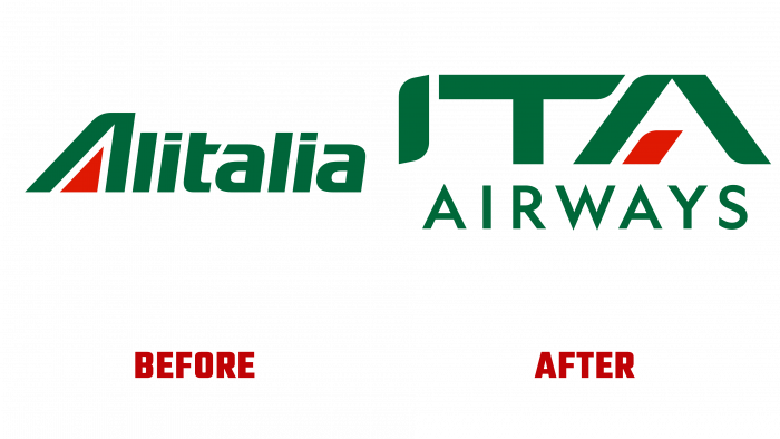
Created as a future replacement for Italian airline Alitalia, the new brand, ITA Airways, has shown its new visual identity. ITA Airways, a wholly state-owned company, owned by the Ministry of Economic and Finance, already operates more than 41 domestic European and intercontinental flights. Also, it supports many directions in the development of the country’s tourism and foreign trade. The main direction of its strategy, the brand sees the creation of the most comfortable conditions in providing the convenience of its customers. The company formed its identity around the core values - the ethical code, observance of passengers’ rights and their priority in all directions, social equality, convenience and comfort, complete safety. The brand relies on two fundamental elements – sustainability and digitalization – form the basis of a startup’s identity, strategy, and policy.
One of the main visual differences of the company will be the use of blue livery by employees, whose color echoes the design of the fuselage of the company’s aircraft, but for many, resembles the T-shirt of the national football team. It is a symbol of the country’s unity and pride, are a member of the state symbols, the national team, and sports organizations. The rudder of all aircraft of the brand is painted in the country’s tricolor. The applied emblems look very impressive on the background, in which part of the fuselage is painted – the color of the blue sky.
The logo itself is presented in a text version of the company name, which consists of 2 characters, where the first is in large and bold type – ITA. The second word – Airways, is written in thin lowercase letters in a smaller font, somewhat shorter than the top one, and is located under the first. Both words are created in the colors of the national flag, where green is the color of all letters, white is the negative space, and the central line of the letter “A” is made in red, placed parallel to the left leg. The ITA font was designed to be rounded. All right corners of the letters have been rounded, the upper and lower shelves of the letter “I” are made with a gentle curvature, creating a visual sense of the direction of the letter upward. Also, one side of the letter “T” and several sharp corners “A” was processed.
Italy’s artistic history has inspired all the badges that are used in shaping the identity. The brand has become a reflection of a new era in the development of air transportation in the country, with the help of which the transition to a new color scheme for government transport structures was effectively implemented with the ability to assign all these features directly to the brand itself.
