The Italy national football team has planned for the current year’s grand changes for its international team. First, it is taking the drastic step of changing its equipment supplier. The fact is that after 20 years of cooperation with the Puma brand, the players are switching to Adidas uniforms. By changing their sponsor, they are renewing their visual style. Second, the managing organization refreshed the national team’s identity, including the sound. This was part of a major rebranding campaign.
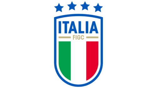
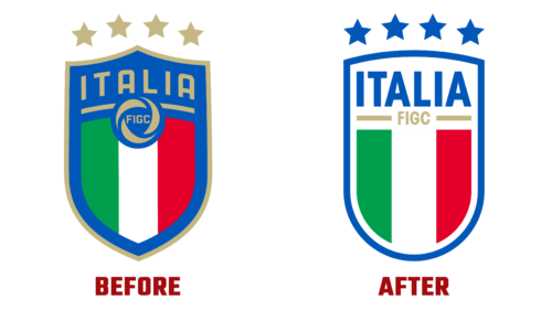
Like the previous one, the new logo shows four large stars, a reminder of stellar victories. They represent the four trophies won in 2006, 1982, 1938, and 1934. Their location remains at the top, outside the trim line. But this time, they are not gold but blue so that the logo fully corresponds to the team’s nickname – Azzurri. The frame and the word “Italia” are also painted in blue. And the width of the lines they have is the same.
The traditional shield was preserved but with a changed form. Thanks to the rounded bars, now it looks like a chevron. The sharp protrusions at the top and bottom are a thing of the past, so the logo is maximum similar to Scudetto, a miniature icon introduced in the 1920s to celebrate victories in the Serie A championship games. Thus, the distinctive features of the new emblem are:
- smooth lines;
- a small distance to the edge;
- elongation vertically;
- the colors of the Italian flag.
In addition, the improvised ball disappeared from the logo. Its place was taken by the large gold inscription “FIGC,” which used to be inside the ring. Now the badge has become simple and clear, as much as possible, associated with Italian soccer.


