


![]() ITV Logo PNG
ITV Logo PNG
Brevity is the soul of wit. The ITV logo fully confirms this truth. The emblem demonstrates simplicity and conciseness without losing its meaning. This approach on TV helps hold the audience’s attention, and the visual cue enhances memorability.
By the mid-20th century, British television was controlled by the BBC, funded by license fees, and operating without ads. In 1954, parliament created the Independent Television Authority to introduce commercial broadcasting through regional franchises.
The first broadcast aired on September 22, 1955, at 19:15 via Associated-Rediffusion. The evening included formal speeches, followed at 20:12 by the first TV ad for Gibbs SR toothpaste. Advertising slots sold quickly at £1,500 per minute. The BBC countered with a special radio episode of The Archers.
Expansion followed rapidly. ATV launched a weekend London service in February 1956, and the Midlands and the North joined in May. By 1962, the network covered fourteen regions through seventeen operators, sharing content nationally. Popular shows such as Sunday Night at the London Palladium and imports such as I Love Lucy attracted large audiences. In 1960, Granada introduced Coronation Street, which became a long-running series.
Franchise reviews in 1963–1991 reshaped ownership. In 1993, Thames Television lost its license to Carlton Television under new bidding rules. Market consolidation followed, with Granada and Carlton becoming dominant through acquisitions in the 1990s. In October 2003, regulators approved their merger. The deal closed in January 2004, forming ITV plc, which controlled Channel 3 in England and Wales. Digital channels ITV2, ITV3, and ITV4 were launched. In 2007, ITV bought Friends Reunited for £175 million and sold it in 2009 for £25 million. ITV Player, later ITVX, positioned the company against Sky and streaming services.
Meaning and History
![]()
Regional channels finally merged into a single company in 2002, when the ITV1 brand launched. They had broadcasts under different names and often used their decals instead of a common logo. However, the management decided it was necessary to unify the stations’ visual identity and, on several occasions, turned to specialists to create a universal design.
What is ITV?
ITV stands for Independent Television, one of the largest media companies in the United Kingdom, and its eponymous television network, launched in 1955. It broadcasts various sports programs, movies, TV series, documentaries, entertainment shows, news, and much more. ITV Studios produces some programs.
1955 – 1963
![]()
When the channel group first appeared, its name was slightly longer than it is now. It consisted of two words, “INDEPENDENT TELEVISION,” which were set in a simple black text logo. The only notable detail was the use of a serif typeface.
1963 – 1971
![]()
In 1963, there was a transition from the full name to the abbreviated one. The logo used both variants: “ITV” at the top and “INDEPENDENT TELEVISION” in a single line at the bottom. The serifs have disappeared from the letters.
1966 – 1973
![]()
The company finally dropped its full name and changed the font. “I,” “T,” and “V” became elongated, and the distance between them increased slightly.
1973 – 1986
![]()
Between 1973 and 1986, a monogram was featured in some marketing materials. In it, “I” and “V” were under the “T,” forming a harmonious figure.
1975 – 1980
![]()
Many viewers will recall the distinctive ITV logo featuring striped letters. This is the merit of the creators of the hypnotizing font Aki Lines.
1980 – 1993
![]()
In commercials, there was a modified version of the emblem, in which the inscription was normal in size and had small intervals between the characters.
1989 – 1998
![]()
In 1989, the English design studio Markell Pockett created a more complex logo for the broadcaster. She added sharp asymmetrical serifs and triangular notches to the letters. She complemented the lettering with a mysterious blue shape that replaced the entire right side of the “V.” As you know, the channels refused to use a common icon and opposed unification.
1998 – 2001
![]()
At the turn of the 20th and 21st centuries, ITV turned to English & Pockett to improve its identity. Part of the revamped image is an emblem with yellow lowercase letters on a blue background. The registered change was intended to appeal to a young, sophisticated audience.
2001 – 2002
![]()
In 2001, the company revised its logo to match its new name: ITV1. After the letters, the designers added the blue number “1” in a yellow rectangle.
2002 – 2004
![]()
The icon has been softened with color transitions. In addition to the gradient, a thin, unevenly colored border appeared, giving the emblem a three-dimensional effect. This design is by Bruce Dunlop and Associates.
2004 – 2006
![]()
The brand’s visual identity is minimalist again, with the 2D version of the 2001-2002 emblem. Each symbol was located separately in its quadrangle.
2006
![]()
In January 2006, Red Bee Media changed ITV1’s image beyond recognition. The TV company owners attempted to unify all the franchises under a single logo to attract new viewers. To expand the audience, they made the image more attractive. So, the blue-and-yellow era of ITV1 came to an end, and the black-and-yellow era began. A sunny color dominated the icon, serving as a background for white, sans-serif letters.
2006 – 2010
![]()
Specialists from three companies collaborated on the emblem’s new look simultaneously: ITV Creative, Pleix, and Blink Productions. All they did was change the lettering color to black.
2010 – 2013
![]()
The same companies as last time added a dark gradient at the bottom of the image. An original graphic technique made the logo three-dimensional.
2013 – 2018
![]()
In 2013, the modern era began for the television corporation. She again shortened her name to ITV and removed the “1” from the logo. Moreover, its distinctive mark began to look completely new: rectangles, gradients, and monochrome letters disappeared. Instead, stylish five-color lettering came in, and the font was changed to a rounded one that imitated handwriting. The branding’s color scheme changed depending on the theme of each movie, TV series, or show.
2019 – today
![]()
The logo changed from five colors to three colors. The font remains the same as before: rounded sans-serif letters connected.
Font and Colors
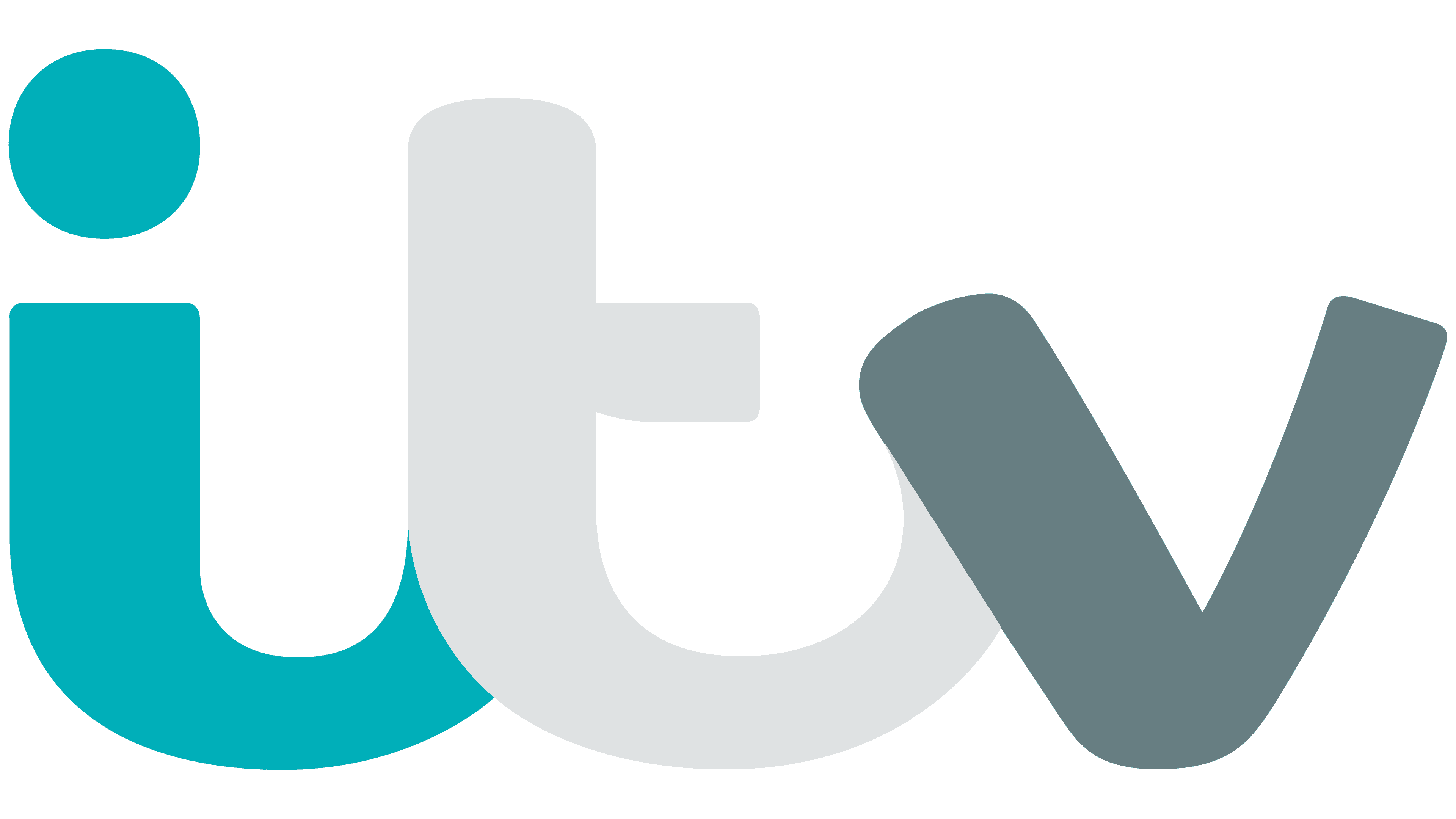
The broadcaster uses a single logo for all its channels. The last two redesigns have allowed her to ditch the formal style in favor of playful elements. Remarkably, the design was created by ITV specialists with some assistance from freelancers. Professional agencies were not involved in the process.
The developers have set the name to be written in asymmetric lowercase letters. No fonts were used; the style “I,” “t,” and “v” does not resemble any standard lettering.
The logo, like a chameleon, changes colors depending on the background. The basic version features a discreet color scheme consisting of blue, dark blue, and gray.