The legendary James Bond logo has become an icon of the film industry and a symbol of the spy genre. It represents a franchise associated with a series of films about a fictional British agent and is associated with qualities such as coolness, confidence, danger, and secrecy. This sign embodies the brand’s values, attracting the attention of fans and viewers.
James Bond: Brand overview
| Founded: | 1962 |
| Founder: | Eon Productions |
| Headquarters: | United States |
Meaning and History
Different versions of the James Bond logos contain the inscription “007”, in which the seven is stylized as a firearm. Why exactly is this combination of numbers? This is the code name of the main character of the novels and films. According to the spy himself, “00” means that he had to commit murder while performing a task. Later it was revealed that the two zeros testified to receiving a license to kill. And Bond was the seventh to do it. However, the cipher “007” became known long before Bondiana appeared. This is how the British magician John Dee signed his letters to the queen. In this case, the seven was a Kabbalistic sign, and “00” meant “for your eyes only.”
The name James Bond was not invented by the writer Ian Fleming – he took it from the cover of an ornithological book. According to another version, this was the name of one Welsh agent with whom the author personally knew. In any case, Fleming wanted the character’s name to be boring and unremarkable.
Designer Joe Caroff created the original James Bond logo. It was used in the advertising campaign leading up to the new film’s release and appeared on a poster drawn by American artist Mitchell Hooks. For his brilliant work, Joe received $300. Despite slight adjustments, the iconic emblem has been used for 60 years and still resembles the original version. Upon learning this, Joe asked the producers to mention him in the credits, at least as a waiter or driver, but they never responded. However, Eon Productions sent him a wristwatch with the engraving “007” and a congratulatory letter for the designer’s centenary.
What is James Bond?
James Bond is the title of a series of spy films and the name of its main character. The novels and stories by British author Ian Lancaster Fleming, who wrote stories about a Secret Intelligence Service officer, served as the basis for the brand. The image of the agent, known by code number 007, has been adapted for video games, comics, radio, and television. The first film about him was released in 1962 and set the canon for the Bond series. It was created by Eon Productions Ltd., which by 2021 had produced 25 action films about James Bond.
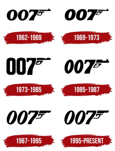
1962 – 1969
The film Dr. No debuted in 1962. Its promotional poster featured the inscription “007,” with the last digit stylized as a pistol grip and trigger. To its right was the barrel and trigger hook. This was the original logo created by Joe Caroff. The talented designer combined the agent’s code name and his favorite weapon – the Walther PPK. Despite being a covert intelligence officer, James Bond always took it on assignments. In real life, undercover agents never carry firearms to avoid inadvertently exposing themselves. Therefore, the gun best characterizes the notorious character.
1969 – 1973
The logo was slightly modified with the release of On Her Majesty’s Secret Service in 1969. Designers reduced the tilt of the digits and made them thicker. The pistol’s front sight became more ornate, and the trigger guard, which was previously rounded, acquired a rectangular shape.
1973 – 1985
In the new version, the numbers “007” were vertically aligned. The two zeros looked like the letter “O” because the designers wanted to integrate the emblem into the “ROGER MOORE” inscription on the promotional poster. Unfortunately, this spoiled the appearance of the stylized gun: it lost its visual balance.
1985 – 1987
A redesign of the emblem marked the release of another James Bond movie. The inscription was given its usual tilt, the barrel became thicker, and the trigger guard was enlarged. To make the front sight clear, artists depicted it as a “ladder.”
1987 – 1995
On The Living Daylights poster, the appearance of the firearm was simplified. Designers transformed the shape of the barrel and erased the line separating the trigger hook from the number “7”. The font also changed: it became thinner and more dynamic. The seven lost its characteristic rounding, and the gaps inside the zeros were slightly offset to enhance the tilt visually.
1995 – today
An emblem similar to the 1987 version was created for the seventeenth part of the Bond series. It looks just as clean and clear, thanks to removing some gun details. The smooth barrel, without a sight, has a streamlined shape, partly compensating for the lack of curves on the bend of the seven.
Font and Colors
The “007” digits on the James Bond logo since 1995 are italicized, bold, and serif-free. Based on them, the designer Filmhimmel created a font named 007 GoldenEye. The official version of the emblem is black and white, but it can take on different colors on posters.
James Bond color codes
| Black | Hex color: | #000000 |
|---|---|---|
| RGB: | 0 0 0 | |
| CMYK: | 0 0 0 100 | |
| Pantone: | PMS Process Black C |


