


![]() James Madison Dukes Logo PNG
James Madison Dukes Logo PNG
The James Madison Dukes logo represents the players’ courage, strength, determination, and nobility. It embodies the spirit of leadership and the will to win. At the same time, it is youthful and energetic, showing that sports are, first and foremost, a student hobby.
James Madison University was founded in 1908 in Harrisonburg, Virginia, as a teacher-training institution. Its women’s athletic tradition began early, while the first men’s basketball team did not appear until 1947. The players asked President Samuel Page Duke for towels and equipment, offering to name the team after him. He agreed, and Duke’s name was born. Around the same period, women’s teams used the name Duchesses.
JMU first fielded a football team in 1972. The 1975 season ended unbeaten with a VCAA title. In 1980, the Dukes moved from NCAA Division III to Division I-AA, now known as the FCS. The transition was difficult, with two 4-6 seasons, but by 1982, the team finished 8-3 and defeated Virginia on the road.
The Duke Dog mascot appeared in 1972-1973 and was created by Dr. Ray Sonner. Its live version was Bunker, an English bulldog owned by Professor Henry Myers. Bunker debuted on January 16, 1973, at a basketball game against George Mason University. In November 1982, the updated costumed Duke Dog appeared at the Convocation Center in a game against Virginia Military Institute, where JMU won 58-33. That year, Duchesses was dropped, and all teams became Dukes.
Football grew in the 1990s under Mickey Matthews. In 2004, JMU won the FCS national title, beating Montana 31-21 after three road playoff games. In 2010, it defeated Virginia Tech 21-16. Under Mike Houston, the Dukes won another FCS title in 2016, beating Youngstown State 28-14 after defeating North Dakota State. JMU reached the finals in 2017 and 2019, counts Charles Haley among its alumni, and moved to the Sun Belt Conference at the FBS level in 2022.
Meaning and History
![]()
Basketball teams are considered the oldest at the university. The women’s team was founded in 1920, and the men’s team in 1945 when the institution began admitting men. The basketball team appealed to the university’s president and promised to take his last name for the name if he provided them with equipment. That’s how the Dukes came to be. The name later spread to all the teams.
The James Madison Dukes logo has changed three times. The basic emblem varies slightly by sport, but the trademark dog and the acronym JMU are always present.
What is James Madison Dukes?
James Madison Dukes is a sporting community of women’s and men’s teams in various sports. They originated in 1920 when the first team was formed.
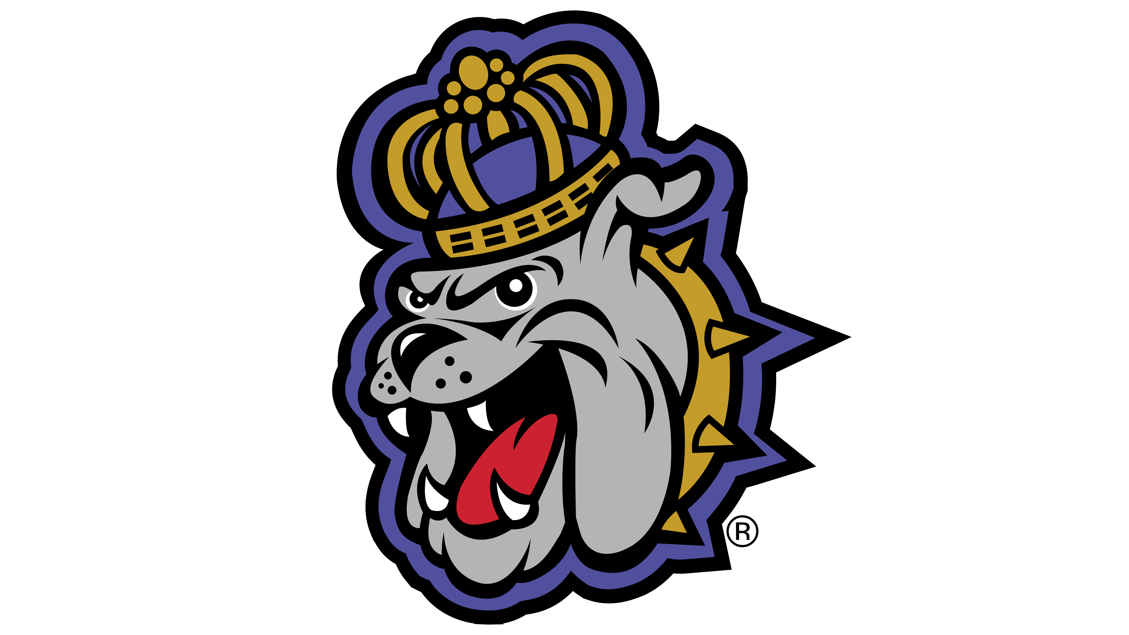
1986 – 2001
![]()
Even though most teams had come before and the Duke’s name had been used since ’47, the first logo for the school’s athletic movement was not designed until 1986. It featured a bulldog dressed in a crown, gown, and gold collar. The bearded dog stands right on top of the university’s acronym.
The dog has been the mascot of the sports movement at JAMES MADISON UNIVERSITY since 1972. Dr. Ray V. Sonner suggested the idea for the image.
The English bulldog breed was chosen because the university is in Harrisonburg, a town founded by English settlers. Bulldogs are famous for their powerful grip. Having seized an opponent, the dog does not let go of the prey under any circumstances until it achieves complete victory. Originally, the breed was used to fight bulls. An experienced dog had to grab an animal that weighed dozens of times more by the nose and press it to the ground. Therefore, in English culture, the bulldog symbolizes courage and determination. It is these qualities that the dog brings to the logo.
Standing on the university’s name, the dog growls, alerting the whole neighborhood to nimble, strong players defending the institution’s honor. The beast was supposed to represent power and to look intimidating. However, the dog looks more like a kind cartoon character.
The mascot was nicknamed Duke, and so were the teams themselves. The decision to duplicate the name stems from a desire to highlight the identity of the institution’s second principal, who was passionate about sports. The women’s school would not have become the university without his involvement. Samuel Duke insisted on expanding the institution’s powers by making it a Teacher’s College and then secured the name change to James Madison College. During his reign, the first women’s basketball team was organized out of female students, and then the men’s basketball team. So, both the athletes and the mascot were named after this active leader.
Dukes means “duke” in translation, but they didn’t want to portray a noble person as the mascot, believing it wouldn’t look spectacular and inspiring. So, they decided to use Duke’s dog. As Ray V. Sonner explained, his choice, such as a royal person as a duke, was to have only a bulldog.
From a noble title comes unusual dog clothing: a duke’s mantle and crown. The outfit appeared on The Dog in 1982.
Letters JMU, as if poured from gold, which gives the emblem greatness.
2002 – 2012
![]()
In 2001, the university’s Board of Visitors reorganized the athletic movement to comply with Title IX, the federal law against discrimination in educational institutions. There were too many athletes at the school, and they received special privileges and scholarships compared to other students. So, the decision was made to make scholarship teams that retained privileges and regular teams without privileges.
To soften the unpleasant decision, the transition process was spread over several years, and an attempt was made to emphasize the unity of the athletic movement and the importance of each sport by changing the logo.
They formed a whole composition from the dog and the abbreviation, putting both signs on a common lilac background. The color of the mantle and crown was also changed to lilac to match the background. The emblem demonstrated a special cohesion and togetherness.
2013 – 2016
![]()
In 2013, the university hired a new director, Jonathan R. Alger. With his arrival, the logo’s color scheme was changed. The dog and the backing became richer purple, giving the letters a lighter sandy hue. This shifted the emphasis from the university’s name to the mascot, making the athletes central to the logo. The basketball and soccer teams made significant strides in 2012-13. The saturated color showed the Dukes’ increased weight in the world of sports.
2017 – today
![]()
The last sign has become more mature and modern. The funny bulldog has been removed. The new emblem is consistent with the university’s visual mark and consists of the acronym JMU. The main difference from the JAMES MADISON UNIVERSITY logo is in the hues. The team’s colors are officially purple and gold, and the sign is painted accordingly.
The background depicts the diligence and talent that glorify and distinguish the school. The voluminous letters accentuate the impression, which seems to be backlit from below. The combination of light and shadow elevates the lettering above the background, indicating the prestige the teams bring to the university.
Font and Colors
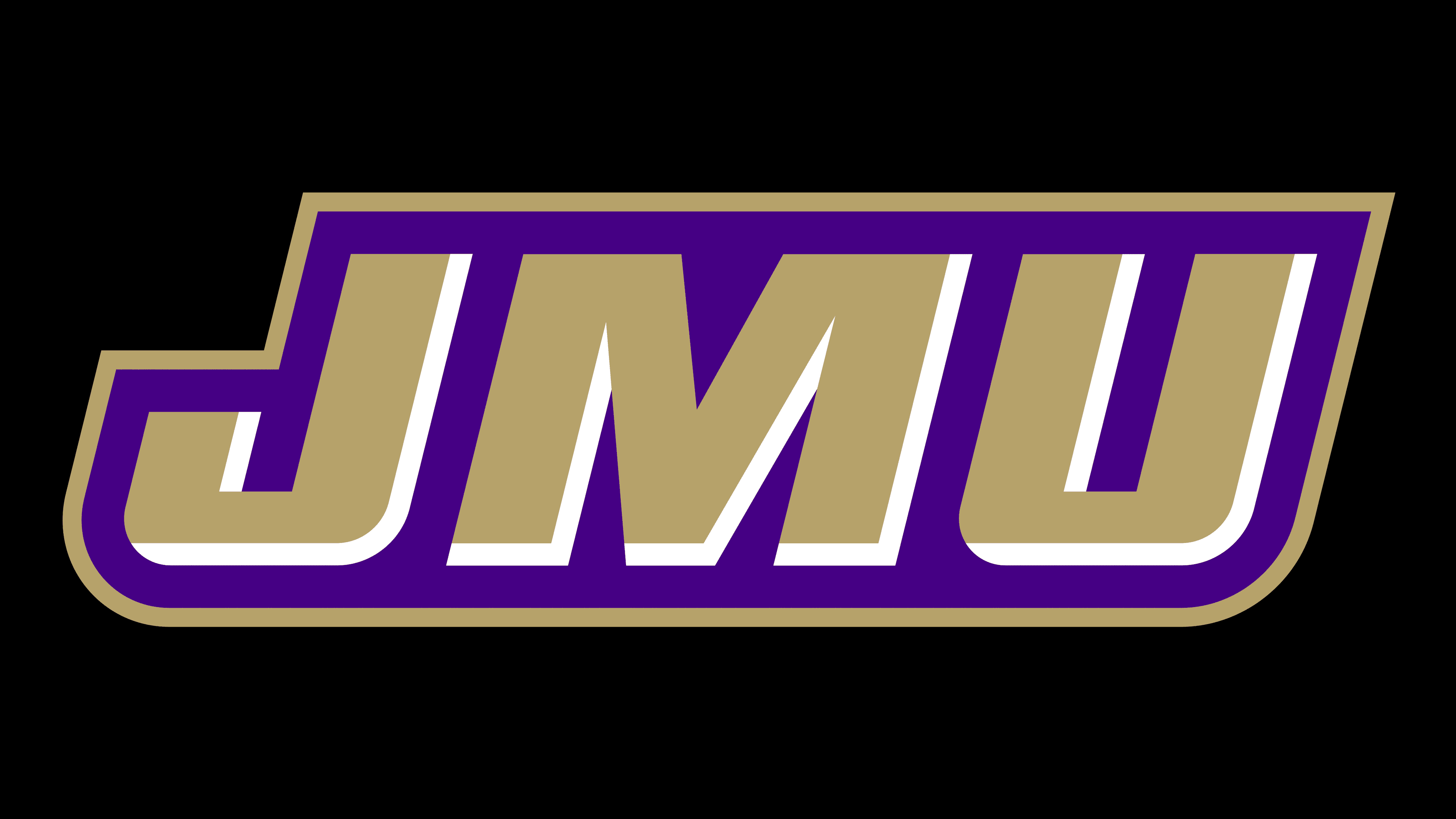
The primary colors of the emblem are purple and gold.
- Purple indicates hard work, prosperity, and talent.
- Gold indicates prestige, victories, and awards.
The lettering font is similar to Ramsey Extra Bold Extended Italic, but with a volume effect.