The Japan Transocean Air logo promises good fortune, prosperity, and kindness to all who use this airline’s services, as it incorporates Japan’s most significant symbol—the crane. The emblem suggests that the company has vast capabilities and is ready to share generously with travelers.
Japan Transocean Air: Brand overview
Japan Transocean Air Co. (JTA) has been a trusted name in the aviation industry for over five decades. Since its founding 1967 as Southwest Air Lines, JTA has built a reputation for exceptional passenger service from its base in Naha, Okinawa Prefecture, Japan. As Japan Airlines (JAL) is the primary domestic airline, JTA has consistently demonstrated its commitment to excellence.
JTA’s history began in 1967 when Southwest Airlines was established in Okinawa, Japan.
In 1993, Southwest Air Lines strategically rebranded and became Japan Transocean Air to further align with JAL’s extensive network and global presence.
Naha Airport is Japan Transocean Air’s vital hub connecting the capital city of Okinawa to the rest of Japan. This strategic hub is a critical conduit for JTA’s domestic operations, providing fast connections between Okinawa and major cities nationwide.
Meaning and History
What is Japan’s Transocean Air?
Japan Transocean Air, often abbreviated as JTA, is an airline based in Naha City, Okinawa Prefecture, Japan. With a rich history spanning several decades, JTA has established itself as a reliable carrier to cities and towns in Japan, particularly Okinawa Prefecture.
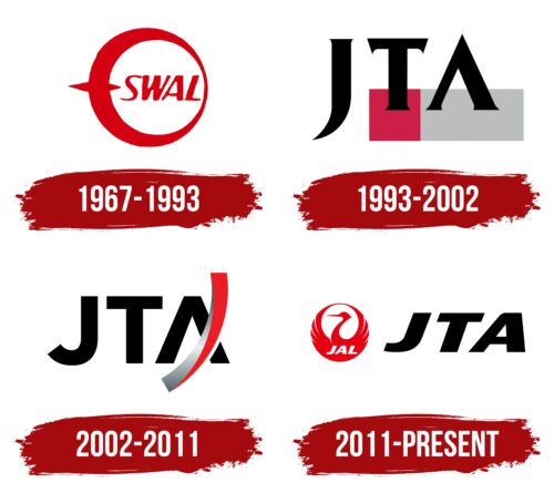
1967 – 1993
The newly established company chose the most common and well-known talisman to showcase its authenticity and connection to Japanese culture: the crane. This is highly valued culturally in the Land of the Rising Sun and worldwide. It symbolizes positive aspects such as tranquility, kindness, prosperity, love, luck, and peace. Its image is familiar and understood by people everywhere, making the crane a universal symbol that evokes positive emotions.
- The bird is depicted gracefully and in outline. Its powerful wings envelop a white sphere, ensuring calm, safety, and comfort.
- The shape of the crane’s wings, body, and head resembles a ring—a circular red frame. The body thickens on one side, while the other is slender, representing the wing tips.
- Two points are on the left: the larger one outside and the smaller one inside. These are the beak and tail, depicted schematically but intuitively recognizable.
The middle section features the text “SWAL,” the first name of the Japanese airline. It stands for “SouthWest Air Lines” and is written in uppercase, slightly italicized, to indicate the planes are always ready for takeoff. The italics convey internal dynamism, infusing the text with energy.
The letters are tall, sans-serif, with an optimal balance of narrow and wide strokes, naturally adding a sense of movement to the text. The color scheme includes red and white. Red symbolizes enjoyment, energy, the sun, and positivity, while white represents tranquility, prosperity, confidence, and peace. Together, they balance well, ensuring a good visual perception of the logo.
1993 – 2002
At first glance, it may seem that the era of the crane in the Japanese airline’s identity has ended. This is not the case. The crane’s image is still in the emblem, though it is now depicted fragmentarily and futuristically. The abstract representation includes the wing as the letter “J,” the sharp beak as “A,” and the bird’s body in flight with outstretched wings as “T.”
Why were these glyphs used? They emerged following the rebranding, which led to the new emblem. The abbreviation JTA stands for “Japan Transocean Air.” The logo has several other distinctive features that set it apart from the previous version.
- The text uses a bold, uppercase serif font. The serifs are so tiny they are almost indistinguishable on the ends of the thick letters. The sharp elements symbolize the crane’s sharp claws and beak.
- The last two glyphs stand on a horizontally elongated two-tone rectangle: “A” in a burgundy section and “T” in gray. These are traditional colors of the country the airline represents. Red is from the national flag, and gray is found in the plumage of the Japanese crane.
The letter “J” is drawn with a single stroke—soft, light, and smooth, reflecting the grace of the crane mascot. Its shape resembles the bird’s long neck, slightly curved as if echoing the head. The line looks like an elegant brushstroke—like a kanji character. This way, the aviation brand reflects its connection to flight and national authenticity.
This symbol holds significant meaning for the airline, aligning with its concept and cultural context. It leaves a lasting impression on travelers, inspiring them to use the services without intrusive or direct persuasion. The emblem signifies reliability, safety, comfort, and care.
2002 – 2011
The redesign of the logo initiated a new look for old elements. It was modernized while retaining all previous components. Abstraction and minimalism were introduced, reducing the national color and distinctiveness. This is evident in several aspects:
- The letters have no serifs.
- The glyphs lost their resemblance to a crane.
- The multicolored rectangle is absent.
Instead, there is now a curved arch that incorporates national motifs. It symbolizes several elements related to Japanese pride – the crane. The arc on the right resembles the crane’s graceful neck, flight path, the back of a passenger seat, a shield, an improvised crossbar of the “A,” and an airplane rudder. Both colors from the former rectangle, red and gray, have been retained. They are now more varied with the addition of a gradient, indicating the broad range of services for clients.
The brand name is written in a strict geometric sans-serif font, reflecting the airline’s seriousness. The bold glyphs are uniformly thick, and the “J” has a deep curve, resembling a hook. As seen in many national legends, the crane image is still discernible in some elements, symbolizing peace, prosperity, and hope for a bright future.
2011 – today
The logo of a Japanese airline combines lightness and strength. The bold, italicized black letters of “JTA” evoke confidence and reliability, showing the company’s dependability. Next to these letters, a red circle with a graceful crane figure in negative space adds a feeling of airiness and elegance. The red circle balances the powerful “JTA” letters, creating a harmonious look. The sans-serif font is wide and flowing, enhancing readability and visual appeal. The crane’s wings are raised and meet above its head, completing the circle.
The combination of the crane and the strong lettering shows aviation’s dual nature: the need for reliability and the freedom of flight. The crane’s upward wings symbolize aspiration and the pursuit of new heights, qualities that match the airline’s mission and services.
The red circle, a symbol in Japanese culture, represents the rising sun and conveys energy and passion. The elegant crane symbolizes longevity and good fortune and adds tradition and grace to the logo. The interplay between the strong “JTA” letters and the delicate crane captures the airline’s commitment to strength and finesse.
The design uses negative space to form the crane, showcasing the airline’s attention to detail and innovative approach. This creative element enhances visual appeal and makes the logo memorable and unique. The wide, flowing sans-serif font gives the logo a modern and dynamic look, while the bold italicization reinforces the brand’s strong presence and reliability.
The Japanese airline’s logo balances contrasting elements to convey a clear message. The robust “JTA” lettering represents strength and dependability, while the airy crane within the red circle symbolizes elegance, freedom, and high aspirations.


