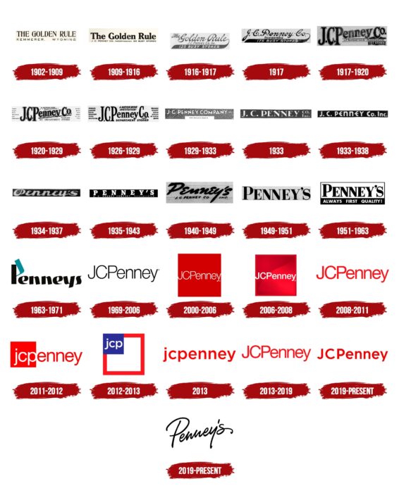
The JCPenney logo draws attention with its bright colors. The tone indicates discounts, selling essentials, constantly updating the assortment, and a large selection of products. The simplicity of the lines creates the feeling of a quick and easy purchase.
JCPenney: Brand overview
| Founded: | April 14, 1902 |
| Founder: | James Cash Penney, William Henry McManus |
| Headquarters: | Plano, Texas, U.S. |
| Website: | jcpenney.com |
Meaning and History
The future owner of the department store chain started the business from the bottom. After high school, he went to work at the Golden Rule store owned by Thomas Callahan and Guy Johnson. In 1902, the young man opened his point of sale and then participated in the foundation of two more. The young entrepreneur also bought the entire interest of his employers (Callahan and Johnson) when they dissolved their partnership in 1907.
In 1909, James C. Penney was already working in his own company. He moved his headquarters to Salt Lake City, Utah, to be nearer to the railroad and banks. In 1912, he had 34 stores in the Rocky Mountain area, and 12 months later, he consolidated all the outlets under one umbrella. The mother store was opened in 1904 in Kemmerer, Wyoming, and is still in existence today. During that time, more than one sign above its entrance had been changed, as the department stores had a total of 25 emblems.
1902 – 1909
In the early days, a simple store sign served as the logo. It had a rectangular shape, extended horizontally. It bears the name (The Golden Rule) and the facility’s location (Kemmerer, Wyoming) in two lines. The last two words are at a great distance from each other. In both cases, fine fonts are used: serif fonts at the top and chopped fonts at the bottom. The text is bordered in black.
1909 – 1916
In 1909 the border disappeared. The upper word combination became bold and the lower one, on the contrary, thin and small. Additional information appeared on the sign indicating the new owner, J. C. Penney.
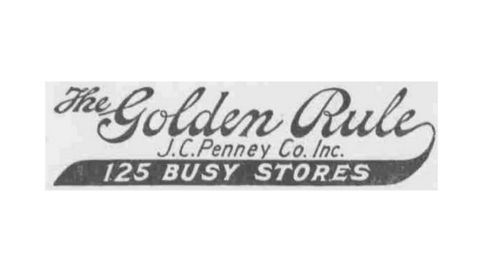
1916 – 1917
This was followed by an attempt to get away from the monotonous design of the logo, for which the artists added a curly line of a different color, which is directed downward. The inscription on it reads, “125 Busy Stores.” The top line was given a handwritten style with “Golden Rule” highlighted, while the article “The” is shifted up to the left and made small.
1917
After the rebranding, the content of the emblem changed dramatically. It reads “J.C. Penney Co.” in a semi-alphabetical handwritten italicized script, with the word “Incorporated” below. The number “125” in the third line has been changed to “175.
1917 – 1920
The designers continued the play with fonts. They made the top line bold, large, contoured, and slightly diagonal. Each letter in it has a thin trim line that is not flush with the black solid fill. The middle row is shallow and located between the two bands. The bottom line has been moved to the right corner. It is now marked “279 Stores”.
1920 – 1929
Much additional information appeared on the logo, placed to the right and left of the central inscription, aligned with the outer edges. Although the design style of the logo remained the same, the text became more meaningful. The diagonal part of the name was also underlined, so “J.C.P.” is sort of separate from “enney Co.
1926 – 1929
Until 1929, another emblem was used in parallel. It has no underlining; all the words are flat. The abbreviation “J.C.P.” is in a large, slightly elongated font. The rest of the name is placed approximately in the middle and begins under the “P” hat. The number of stores numbered in the chain has disappeared.
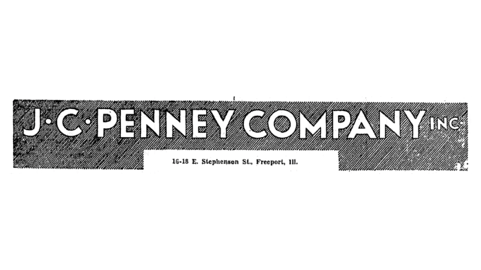
1929 – 1933
Minimalism is how the logo from this period can be characterized. The designers shaded the rectangle with thin solid lines, leaving only the white lettering “J.C. Penney Company Inc.” free. They placed the dots in the initials in the middle between the letters.
1933
In 1933 the logo with large font and thin serifs was used for a short period. The background of the rectangle became solid gray.
1933 – 1938
After the modifications, the names of the stores had a different style of spelling: in chopped letters in upper case. And in the “E,” the designers rounded and elongated the middle stroke, so it crosses the vertical line and comes out on both sides.
1934 – 1937
This emblem has an unusual design: the symbols are round and bold, the words are written with a mixture of lowercase and uppercase letters. A solid white stripe separates the top and bottom of the sign.
1935 – 1943
The updated icon is more streamlined: strict, flat, and geometric lettering. The background rectangle is repainted black. It has the word “Penney’s” on it, denoting the considerable number of stores that make up the main chain. There is a large inter-letter spacing between the signs, and the signs themselves are decorated with large serifs.
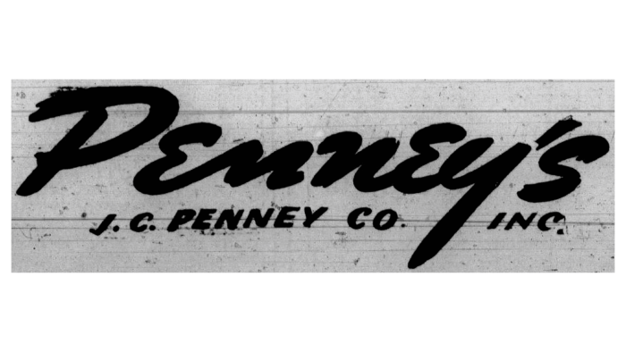
1940 – 1949
After experimenting with arranging the sign’s content, the developers opted for the “brush strokes” version. Therefore, the edges of the letters are jagged, with small stripes. The name is written carelessly, as if in a hurry. The non-conservative style signifies that the stores are close to the people and accessible to all. Only the first letter in “Penney’s” is capitalized; the rest are lowercase.
1949 – 1951
Despite the freestyle, the previous sign was hard to read, so the management decided to change to a strict design. The letters on the logo were now printed, large, bold, and facing each other closely.
1951 – 1963
The former logo is taken in a black frame, highlighting the name on a white background. At the bottom of the dark bar is the phrase “Always First Quality!”
1963 – 1971
The name of the retail chain received an unusual design. It is written in broad lines, so it looks as if it is handwritten with a flat poster pen. The upper half of the “P” is painted dark turquoise.
1969 – 2006
The redesign was handled by Italy’s best graphic artist, Heinz Waibl. He suggested a terse, simple, and visually clear version. For this purpose, the artist removed the dividing dots after the abbreviations of the name and joined the letters. It turned out to be innovative because the last name and the name of the department store owner stayed in place. The characters are all thin and elongated. And the developer removed the apostrophe and the “s.”
2000 – 2006
In 2000, the inscription had a background square, colored red. It well draws attention to the white name of the stores, which is located in the center in a single line.
2006 – 2008
The designers replaced the thin font with a bold font, keeping the basic style of the logo intact. They added a gradient to the square and a wave that separates the lighter shade of red from the darker shade.
2008 – 2011
The base disappeared: a blank white background with red lettering appeared instead of a square.
2011 – 2012
This logo was presented at the 83rd Academy Awards. Its structure again includes a red square, but it covers only the first three letters of the name – “JCP,” and the rest are in white space. By the way, the font has been changed from uppercase to lowercase, which seemed much more modern to the administration.
2012 – 2013
With the arrival of the new manager, the emblem was tweaked. A square appeared on it again. This time it is outlined, with a red line outlining a white space. There is another square in the upper left corner, a miniature blue one. It displays the name of the retail chain. The designers used Gotham font instead of Helvetica, but they kept the lowercase spelling.
May-September 2013
Experimentation with the logo brought a variant that customers did not like. It’s a simple lowercase lettering with a wide breakdown of letters on a white background.
2013 – 2019
After meeting fierce consumer outrage, the company returned the old logo – 2008.
2019 – today
In late fall 2019, the JCPenney store chain approved a redesign of the 2013 version, which had previously sparked protest among consumers. Designers moved the first three letters to the upper case and left the rest in the lower case. At the same time, the department store chain declared bankruptcy due to the COVID-19 pandemic.
2019 – today
Taking the former Penney’s name, the company established a new store. It is located in Hurst, Texas, and has a completely different concept. It now also houses a hair salon, coffee shops, a yoga studio, an additional Dallas Cowboys mini-store, and several other facilities in the same building. This has had a major impact on the logo: it’s much more stylish. The name is in italic handwriting and placed diagonally, upward. Overall, it looks like a personal signature.
Font and Colors
The evolution of the logo of this brand has gone through many modifications and has gone from a complex version to a simple one. Previously, it concentrated a lot of information and textual details, but now there is only the actual name.
Some of the latest JCPenney emblem typefaces are Helvetica and Gotham. In the first versions, the font was a wide, serif typeface. It had a finer spelling in 1969. The color palette is more consistent: all the early logos have black, the later ones have red. Blue was used once.
JCPenney color codes
| Red | Hex color: | #ee0000 |
|---|---|---|
| RGB: | 238 0 0 | |
| CMYK: | 0 100 100 7 | |
| Pantone: | PMS 172 C |
| Black | Hex color: | #000000 |
|---|---|---|
| RGB: | 0 0 0 | |
| CMYK: | 0 0 0 100 | |
| Pantone: | PMS Process Black C |

