


![]() JD.COM Logo PNG
JD.COM Logo PNG
A resource is a faithful and reliable assistant in choosing the necessary things. This is how the JD.com logo is positioned. The emblem conveys simplicity and ease of navigation. A certain amount of playfulness in the elements makes shopping fun.
JD.com began on June 18, 1998, when Liu Qiangdong opened a small counter in Beijing’s Zhongguancun tech district with about 12,000 yuan in savings. The business was named Jingdong, using parts of Liu’s name and his then-girlfriend’s name, Gong Xiaojing. He sold magneto-optical drives and focused on genuine products with official receipts in a market full of counterfeits.
By 2003, Jingdong had 12 stores and revenue above 10 million yuan. Then SARS hit, customers disappeared from the streets, and losses passed 8 million yuan. Liu moved sales to online bulletin boards, then launched jdlaser.com in 2004. In 2005, he closed all physical stores and switched fully to e-commerce.
In 2007, Liu built an in-house logistics team to control delivery and service quality, despite investor doubts. That year, Jingdong received about $10 million from Capital Today, changed its domain to 360buy.com, and became Jingdong Mall. In 2008, the platform expanded beyond electronics. In 2010, it opened to third-party sellers and entered a price war with Dangdang over books.
The company adopted JD.com in 2013 and listed on NASDAQ on May 22, 2014, raising $1.8 billion. During the 2010s, JD.com competed with Alibaba’s Tmall and Taobao through a warehouse-and-delivery model. It joined the Fortune Global 500 in 2016, spun off JD Logistics in 2017, listed in Hong Kong in 2020, and reported revenue of about $158.8 billion in 2024.
Meaning and History

JDcom is the leader in the Chinese market if we analyze the platform purely by product range. The company sells office equipment, clothing, shoes, pet products, and fitness equipment. The catalog of goods continues to increase daily, along with the site’s growing popularity in the Chinese market.
It’s not just about material goods. With the help of JD.com, the user can purchase tickets, download music or movies, make a gift to a loved one, etc. The platform’s main specialization is as an online shopping center. Additionally, the company has many partners whose products and services it advertises on the site.
What is JD.com?
First of all, it is an information system that enables any user to sell goods and services in the online market.
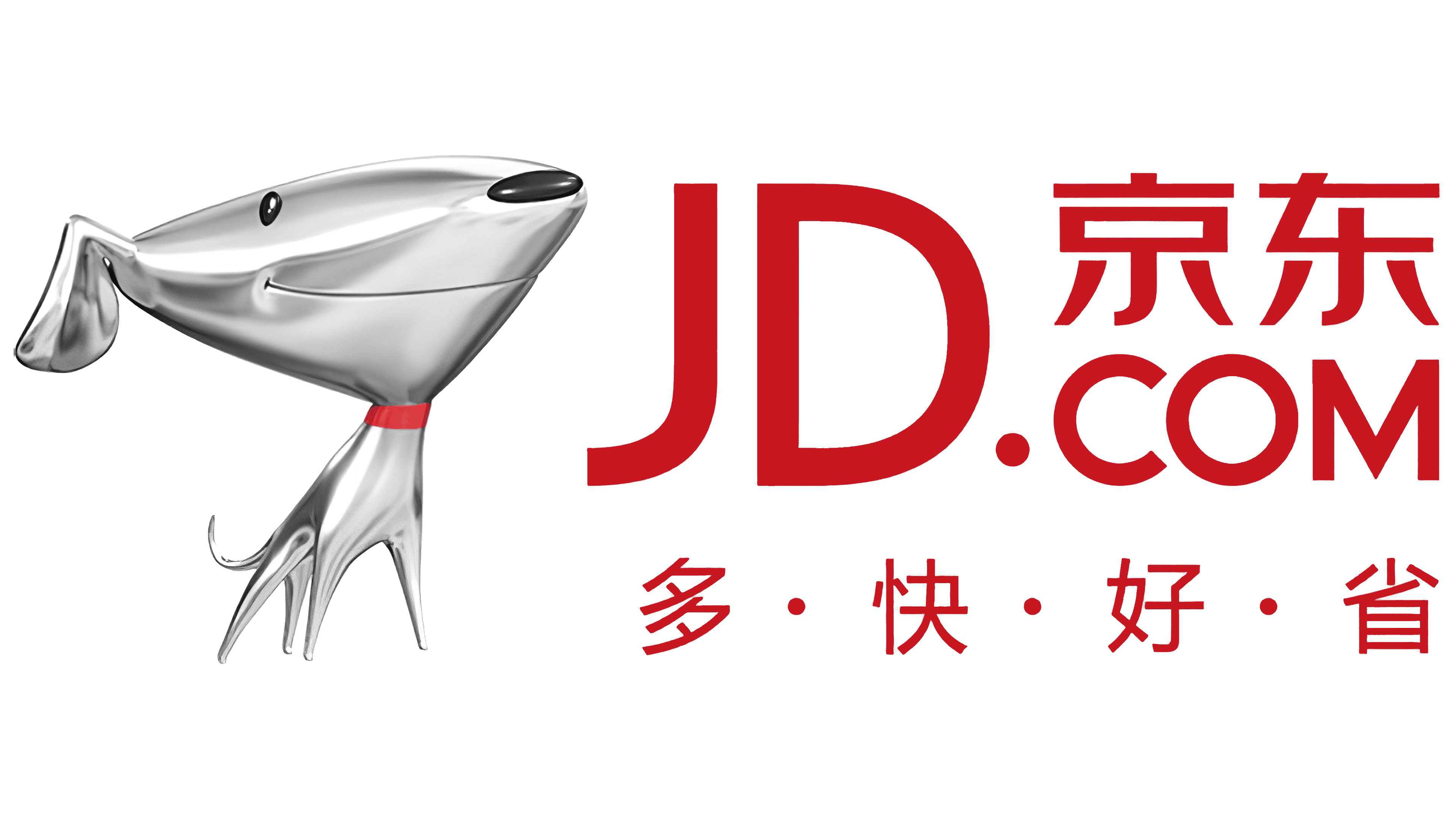
Such a versatile information system features a visually pleasing, recognizable logo. To date, it has not changed since the resource launched. The logo consists of a verbal inscription made in Latin letters and Chinese characters and an emblem. The brand name is in red, in a classic bold sans-serif font. Two Chinese characters from the site address are also presented in Latin letters. The image of a dog is used as an emblem. The color scheme uses a white gradient, making the dog appear gray. A feature of the emblem is the dog’s head, which is several times larger than its body. Immediately, there is a sense that the company is trying to evoke positive emotions in the target audience through the smile painted on the face. Also, a red collar immediately catches the eye, indicating that this character is homely and has a positive attitude towards any user.
Interestingly, the JD.com logo appears in several variations that differ only slightly. The most popular variation is that the dog is not to the left of the platform’s name but above it. At the same time, all elements are made on a solid red background. In this case, Chinese characters are removed from the logo.
Font and Colors
The verbal inscription on the logo is set in a classic, bold sans-serif font, with capital letters. In its structure, this typeface is most reminiscent of Ben Beckman Medium, Ace Sans Bold, and VVDS Praliner Medium. However, there are minor changes in the writing style.
Red is used for the main inscription, highlighting the logo’s brand name. Thus, a potential JD.COM client will immediately see the site address and be able to visit it after familiarizing themselves with the product range. In turn, a white gradient was used to depict the dog, except for the nose and eyes, which were black, and the collar, which was red. Even though the two logo elements use different color palettes, they still look harmonious and evoke positive emotions in customers.