The Jeju Air logo showcases the airline’s vibrant and business-oriented nature. The emblem invites travelers to explore the world and promises to take them to the most appealing destinations. It captivates with its brightness, joy, and expressiveness.
Jeju Air: Brand overview
Established in 2005, Jeju Air Co., Ltd. made history as the first budget airline in South Korea. Based in the bustling city of Jeju, the airline draws inspiration from the breathtaking Jeju Island. Born out of a collaboration between the Aekyung Group and the local government, Jeju Air set out to democratize air travel and make the wonders of Korea accessible to all.
Realizing that flying had become a luxury beyond the reach of many, the Aekyung Group and the Jeju Island government embarked on a mission to change the status quo. The result was Jeju Air, a pioneering budget airline that changed the industry and made flying affordable for everyone.
Since its inception, Jeju Air has rapidly expanded its reach, providing travelers with access to many domestic and international destinations. In addition to being a vital link between Jeju Island and major cities in South Korea, the airline has opened doors to exciting East Asian destinations such as Japan, China, Taiwan, the Philippines, and Vietnam.
Jeju Air has taken a significant step towards improving service quality and expanding its network by joining the esteemed Value Alliance.
Meaning and History
What is Jeju Air?
Jeju Air is recognized as South Korea’s first and largest South Korean low-cost airline, providing cost-effective customer service. The airline’s story begins with air transportation in South Korea, which made it more accessible to a wider audience. Jeju Air has become the market leader, outperforming its competitors.
2005 – 2015
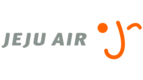
The main features of the Jeju Air logo are marketing, selling aviation services, and attracting potential passengers’ attention. The airline advertises itself by choosing the most powerful, accessible, and frequently used promotion tool—a logo. It instills confidence in future clients about reliability, safety, joy, and positivity. The logo represents a bridge between the ordinary and the festive, quickly transporting everyone to places filled with fun and excitement.
The brand conveys this through two key elements: text and graphics. These elements harmoniously balance each other at opposite ends of the aviation journey.
- The abstract image of a smiley face is depicted with a winking eye. This is created using three details: a small circle, an arc, and a hook. They are arranged to form two eyes and a nose. Simultaneously, this represents the glyph “j,” with the dot positioned beside the stroke, reminiscent of the scorching sun.
- The name, which is cool gray and close to silver, provides a refreshing effect. It contrasts well with the bright orange symbol, creating an atmosphere of calm, tranquility, and confidence. The bold, sans-serif letters indicate practicality, a positive reputation, and the absence of risks despite the low ticket prices.
The wide spacing between the words prevents them from merging, ensuring optimal readability on any screen. All the glyphs are smooth, clear, and minimalist, with a slight rightward slant that adds subtle dynamism to the logo.
The emblem is designed in an informal style, hinting at the company’s accessibility, as it is budget-friendly and offers affordable ticket prices. It invites travelers to use its services, cheerfully winking at anyone seeking an affordable yet reliable airline.
2015 – today
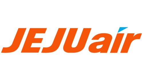
The logo’s bright red color is full of energy. It symbolizes the Korean airline’s readiness for action, drive to move forward, and professional growth aspirations. Key elements like the right-pointing triangle, a mix of uppercase and lowercase letters, and slanted glyphs create a sense of dynamic movement. These features create an atmosphere of business activity. The bold sans-serif font enhances readability and impact. A unique aspect is the lowercase “i,” topped with a blue triangle, symbolizing honesty, consistency, and commitment.
The red color is visually appealing; it aligns with the company’s core values and business goals. The blue triangle balances the energy of the logo, suggesting the airline balances ambition with wisdom and long-term vision.
The deliberate use of red highlights the airline’s passion and vitality, showing its proactive approach and dedication to growth. The bold font presents the brand as strong and reliable. The mix of upper and lowercase letters and the glyphs’ slope enhance the sense of movement and progress, embodying the airline’s mission.
The blue triangle atop the “i” adds a distinctive touch and conveys integrity and steadfastness. It balances the bold red with calmness and stability, representing the airline’s commitment to honesty and consistency in its operations. This design promises reliability and trustworthiness to customers.
The logo combines color, typography, and design elements to create a vibrant and meaningful brand representation. The bright red symbolizes energy and forward momentum, while the blue triangle adds balance and depth.


