Almost all entertainment programs use frivolous logos that characterize their essence. For example, the Jeopardy logo is made in a playful style because this TV project has a non-standard quiz show format. The internal dynamics of the emblem motivate to be resourceful and active.
Jeopardy: Brand overview
| Founded: | March 30, 1964 |
| Founder: | Merv Griffin |
| Headquarters: | United States |
Meaning and History
Griffin owes his wife the idea of launching a quiz show with a cash prize, which later gained immense popularity among Americans. She proposed this concept for the media mogul to create a game program in the format of questions and answers. On the flight to New York from Duluth, she told him, “Why not give the participants ready-made answers and let them come up with their questions?” The host liked the concept and went straight to NBC with it. The management supported the idea without even looking at the trial program.
Then the search began for a specific embodiment of an unprecedented television project because it was still raw and fraught with many contradictions and dangers. As a result, instead of “What’s the Question?” (as the show was originally called), the current name was chosen. At the same time, the idea of a question-and-answer quiz was not new: something similar existed in the 1940s. A similar format was used on CBS Television Quiz’s Gil Fates.
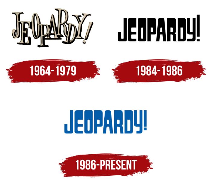
Gradually, the TV program gained immense popularity and even the approval of professional critics. In 2013, it was ranked #45 of the 60 Greatest Shows in US Television History. At the sight of its logo on the TV screen, viewers are still looking forward to an interesting and, at the same time, funny entertainment action. Over time, the Jeopardy game became a franchise: its concept was approved in other countries. In total, she has three emblems – however, they are of the same type of text, but this is where their similarity ends.
What is Jeopardy?
Jeopardy is an American television game show that has become a franchise and is now on television in many countries worldwide. The original version appeared in 1964 and has 38 seasons. The transmission has a non-standard format and is a quiz where you need to ask questions on already known answers. The creator of the transfer is Merv Griffin. The studio releasing it is Sony Pictures Television.
1964 – 1979
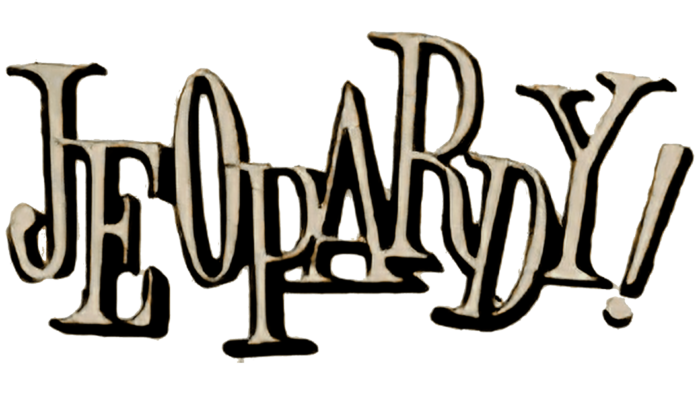
The very first Jeopardy logo features bouncing glyphs. Moreover, they are drawn since they were created by individual order, and the multi-level arrangement makes them jump. The symbols alternate: one is at the top, and the next is at the bottom. And so in succession. For example, “J,” “O,” “R,” and “Y” is much higher than “E,” “P,” “A,” and “D.” At the same time, all letters are capital, beige, with black shadows, including an exclamation mark (!), Which is mandatory in the full title of the TV show.
1984 – 1986
After a short pause, the game show was launched again on TV. The logo has been updated, but its concept remains the same: text without graphics since the letters themselves are like a picture. They are wide at the top and narrow at the bottom, except for the first and last. The massive inscription not only communicates the danger but also looks accordingly. At the same time, the exclamation mark (!) is much higher than the top of the line.
1986 – today
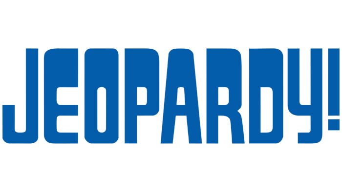
After the redesign, the logo has changed a little. The only update touched on the color: now, all letters are painted in blue instead of black. Otherwise, printed characters’ forms remained the same: a wide top, a narrow bottom, and elongated intra-letter gaps. The exclamation point is much shorter than before, as is the “y” hook.
Font and Colors
In the process of evolution, the Jeopardy logo has retained its original commitment to the text form. The reason is in the concept of the TV show because it has more to do with words than with pictures. The main focus of the redesign was almost always on the palette.
The developers chose an antiqua with one-sided shadows for the debut logo to make the inscription seem three-dimensional. Then there was a transition to the grotesque of individual design. Neither in the first nor in the second case do glyphs have analogs. The corporate palette consists of black, beige, and blue, which were used in logos of different periods.
Jeopardy color codes
| Lapis Lazuli | Hex color: | #035dab |
|---|---|---|
| RGB: | 3 93 171 | |
| CMYK: | 98 46 0 33 | |
| Pantone: | PMS 2945 C |


