


 Jetix Logo PNG
The Jetix logo became a recognizable symbol of the channel, adding playfulness and fun to its image. It embodies energy and activity and is associated with entertaining content. The bright, youthful design of the emblem attracts the attention of a child audience.
Jetix came from the long run of Fox Kids, the children’s block launched on Fox in the United States in 1990. In 1996, Fox Kids merged with Saban Entertainment to create Fox Kids Worldwide, bringing Power Rangers and other Saban properties under a single international structure. By the late 1990s, Fox Kids had grown beyond the U.S. market, with channels operating in Europe, Latin America, and the Middle East.
In September 2001, The Walt Disney Company acquired Fox Family Worldwide, including Saban Entertainment and the Fox Kids network. The deal gave Disney a large children’s television operation. Still, the Fox Kids name could not be used freely in every market. In January 2004, Fox Kids Europe, Fox Kids Latin America, and ABC Cable Networks Group introduced a replacement brand, Jetix, designed for action, adventure, and international use.
Jetix launched in the United States on February 14, 2004, as a programming block on Toon Disney and ABC Family. It competed with Toonami on Cartoon Network, aiming at viewers drawn to animated action and anime-style shows. The international rollout followed quickly. France became the first full Fox Kids channel to switch on August 28, 2004, while Germany completed the European rebrand in June 2005.
At its peak, Jetix reached about 137 million homes in 77 countries and 18 languages. Its schedule included Power Rangers, licensed anime, W.I.T.C.H., and Super Robot Monkey Team Hyperforce Go! Jetix Cards Online connected web play with TV rankings in 2004. In 2008 and 2009, Disney bought the remaining Jetix Europe shares and phased out the brand. Most channels became Disney XD or Disney Channel, and Jetix Play closed in the Middle East on September 1, 2010.
Meaning and History
When it was necessary to launch a new programming block on Toon Disney, the owner commissioned Spark Creative to develop the brand. The studio immediately got to work on the naming and considered several options, including Jetix – a made-up word associated with adventure. It sounded nice and was well-liked by children’s focus groups.
The Spark Creative team created the Jetix logo after having decided on the name. The process was led by Elaine Cantwell, who later opened Cantwell & Co. The American company Zoic Studios was responsible for the visual effects. This resulted in the creation of the mascot named Jay – a one-eyed, silver-colored creature with a red outline. On the emblem, he appears in his original form: a stylized letter “X” with a ball at its center. The upper ends of the “X” are pointed and resemble ears, which is why Jay is considered a sort of cat. He has neither hands nor legs, but he does have one large black eye, shifted slightly to the left. The mascot can transform into a rocket, submarine, and other objects in commercials. According to the fictional story, Jay was born in 1999. He is clever, intelligent, and positive, an ideal character for a children’s audience.
What is Jetix?
Jetix is a network of children’s television channels broadcast worldwide and available in more than 20 languages. The brand was launched in 2004 and became so successful that by the end of the year, it had completely replaced Fox Kids. Its history ended in 2009 when Disney bought Jetix and discontinued it. All channels were converted into Disney Channel or Disney XD.
2004 – 2009
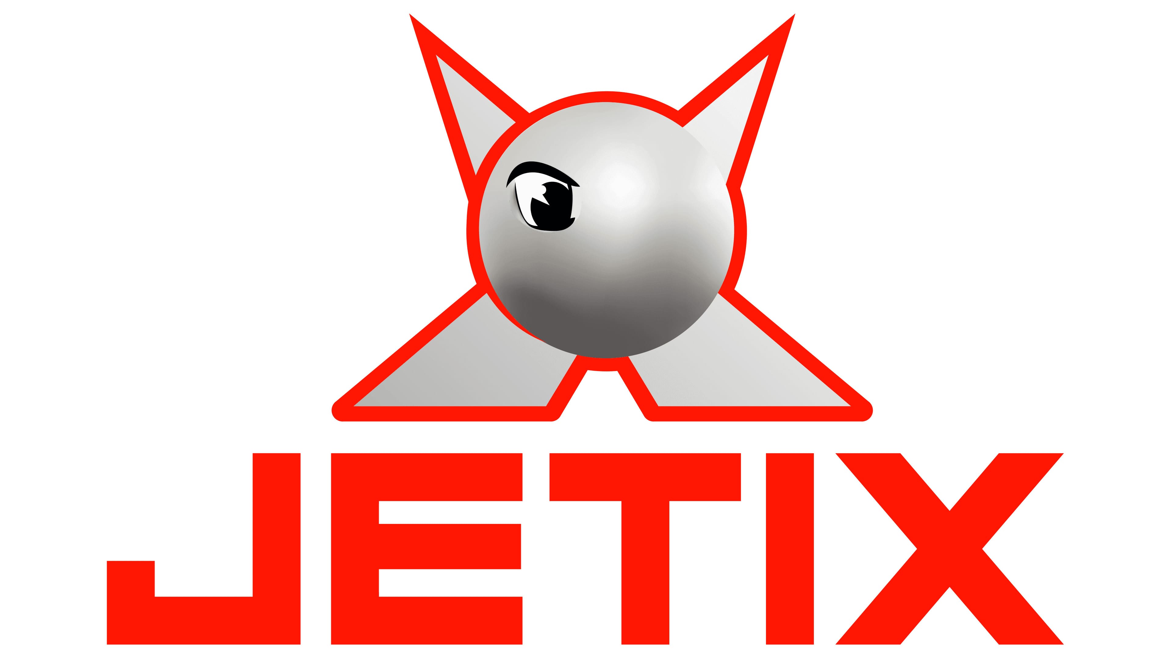
As already mentioned, the central element of the Jetix logo is its mascot. The creature’s face looks like a silver-gradient circle, giving it a three-dimensional appearance. The left half of the head depicts a cartoon eye with a large black pupil and a beautifully outlined eyelid. With just one eye, the artist conveyed Jay’s bold, expressive character. The basis for the circle is a semblance of the letter “X”: only four ends, protruding in different directions, are left here. The upper elements are triangular and resemble sharp cat ears.
The brand name is located at the bottom and is written in capital letters. The designers made it red because the channel’s target audience is active children who like bright, expressive designs. Thanks to this, the emblem embodies energy.
Font and Colors
A geometric, square-shaped font was specifically developed for the Jetix logo. It has no serifs, and all lines match the width, making the letters visually balanced. Based on the wordmark, channel fans created a free typeface named Jetix Revived.
The choice of colors for the emblem is determined by how the designers perceive the mascot, Jay. It combines red, white, black, and several shades of gray. The gradient creates a 3D effect, which children love.