


 Jewish World Logo PNG
The Jewish World logo represents the company’s global scope as it addresses issues of global justice and advocates for human rights. This is demonstrated by a simple symbol expressing hope for a better life free from poverty, injustice, and war.
American Jewish World Service was founded in Boston in 1985 by Larry Phillips to advance the Jewish idea of tikkun olam, or repairing the world. Rabbis, activists, and leaders joined the initiative, which provided aid regardless of origin or religion. Early work centered on small grants to local groups in developing countries and ties with communities.
In the early 1990s, AJWS expanded anti-poverty programs in Asia and Africa and built long-term partnerships with local organizations. Under her leadership, the group added programs for women’s rights and education. From 2000 to 2005, it joined campaigns against the genocide in Darfur and increased its budget and geographic reach.
By 2007, AJWS had introduced campaigns for Indigenous and sexual minority rights. Its work expanded in Latin America and the Caribbean in 2008, followed by a volunteer program for young American Jews in 2009. A 2011 review set three priorities: disaster relief, poverty reduction, and human rights, and added new standards for selecting partners.
Robert Bank succeeded Messinger as president in 2016. From 2017 to 2019, AJWS backed projects addressing gender violence and child marriage. Between 2020 and 2023, it expanded support for LGBT+ communities and anti-discrimination work. By 2023, the organization had awarded more than $300 million in grants and supported hundreds of local initiatives in over 30 countries.
Meaning and History
What is the Jewish World?
This global organization focuses on human rights advocacy and international development support. It embodies Jewish values of justice through actionable initiatives worldwide. The brand collaborates with local organizations to combat poverty, protect human rights, promote gender equality, and assist indigenous peoples in asserting their rights to resources and land. Special attention is given to marginalized groups that often face the greatest challenges. The organization fosters long-term change through grant funding, campaigns, and uniting people within and beyond the Jewish community.
1985 – today
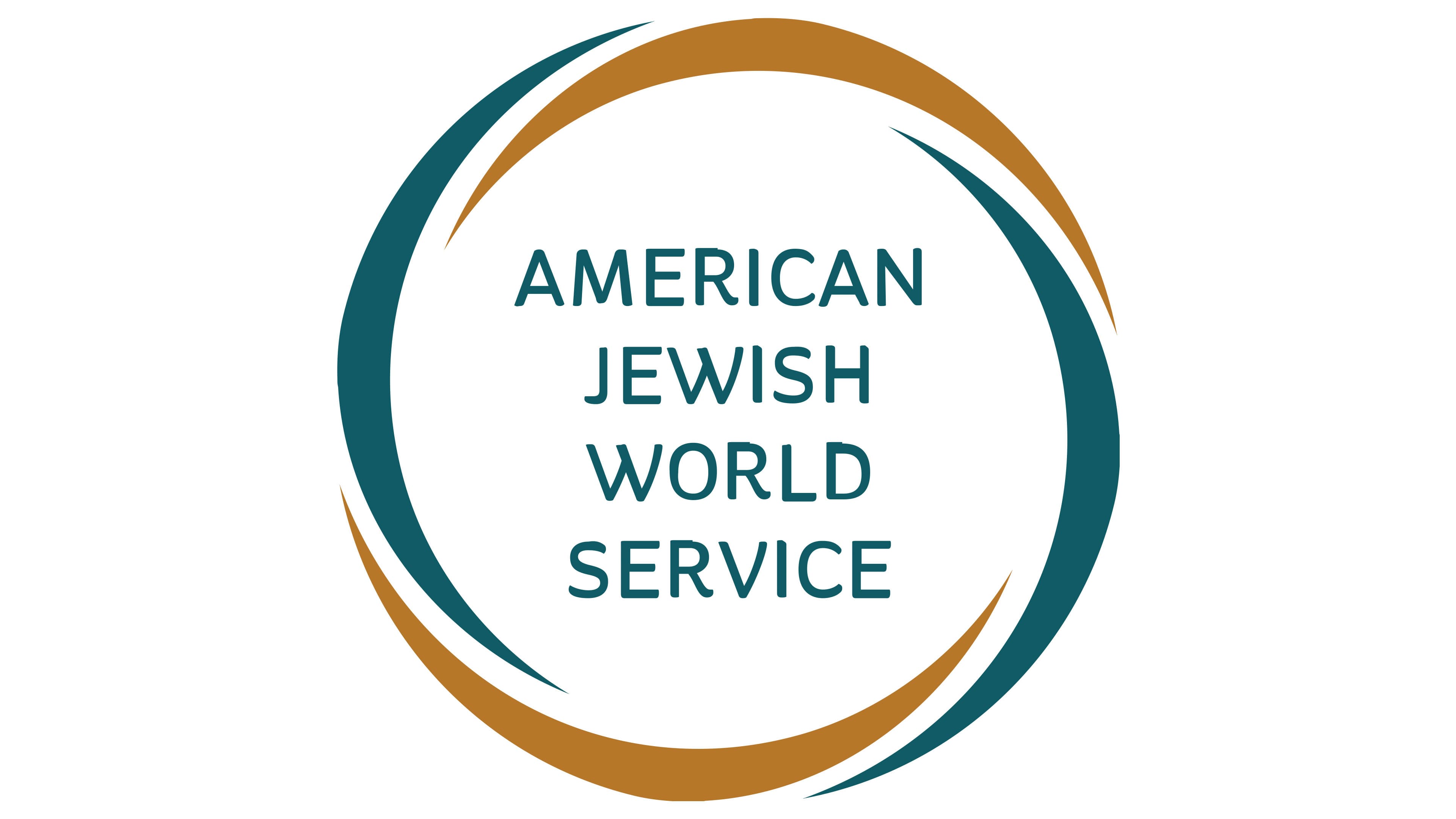
The Jewish World emblem resembles a circle but is not an actual circle. How is this possible? The design features short lines curved into arcs. Essentially, they look like classic brackets arranged unconventionally. These brackets are not aligned with the cardinal directions; they are slightly shifted rather than perfectly centered or positioned on the sides. One end of each arc overlaps with the next. This symbolizes the unity of organizations, mutual support among project participants, and the global nature of its mission.
The middle sections of the curved lines are thicker than their ends, giving the shapes a boomerang-like appearance. This ties well with the concept of a nonprofit organization fighting poverty. The logo visually conveys the idea that everything comes back like a boomerang: the more good a person does for others, the kinder the world becomes toward them. This idea is reflected in the organization’s visual identity, with its name centered on the improvised ring.
The text is divided into four centered lines in uppercase sans-serif font. All the glyphs are bold and rounded at the ends, emphasizing the organization’s friendliness. From a graphic perspective, four letters stand out:
- “R” with a gracefully curved leg and a flare at the top;
- “V” and “W” with an arc-shaped curve on their right strokes;
- “D” with a step-like design at the top.
Despite these distinctive features, all the characters are visible and easily readable. Two semi-circular elements are dark turquoise, and the other two arcs are rendered in a shade resembling dark gold. This palette reflects the organization’s high aspirations, humanity, and value to society.