


Vila Inglesa has fully updated the hotel’s image. In 2026, Papanapa redesigned the hotel’s brand in Campos do Jordão. The hotel has operated since 1948 and has long been connected with the city’s architecture. After Grupo Mazzaropi took over, the brand needed a presentation aimed at families seeking rest, quiet, and time together outside the city.
The hotel is associated with tradition, comfort, mountain views, and a calm atmosphere. Its history includes memorable moments, including the visit by Brazil’s national team in 1962. The previous mark felt intimate and homey. The handwritten name, thin line, and spaced-out word HOTEL created the impression of a small boutique hotel. For the brand’s new stage, it needed a warm, grown-up presentation that kept its status and connection to architectural heritage.
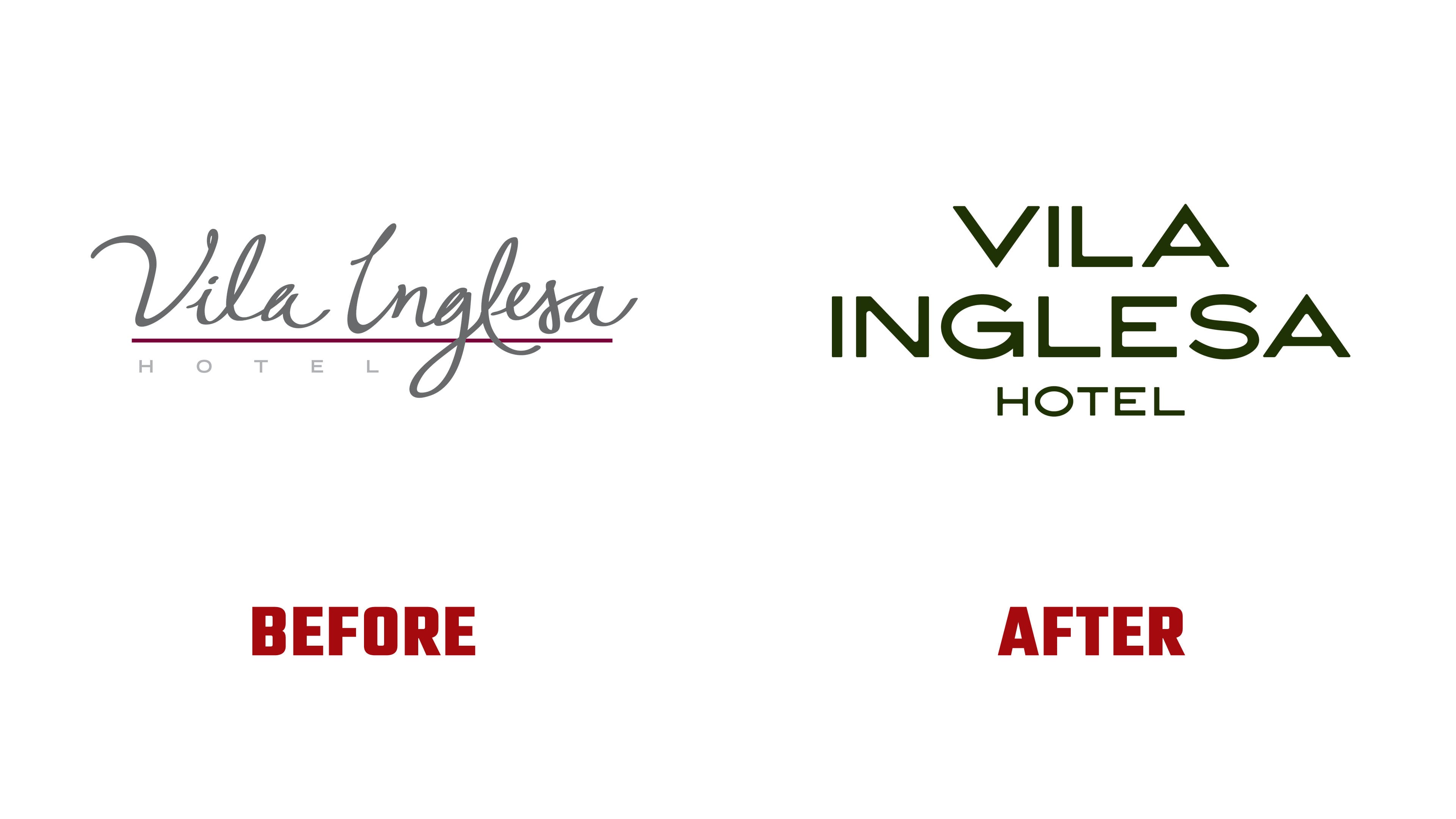
The new logo looks stricter and more architectural. The handwritten line was replaced with geometric letters, tight spacing, wide forms, and sharp cuts. The mark now feels more composed and more upscale. It is closer to a historic country hotel. References to the hotel’s architecture and the brand’s early look help preserve the link to the past. For returning guests, Vila Inglesa keeps continuity while looking more mature.
The logo shifts the focus from classic appeal for an adult audience to family travel while preserving elegance. The new mark is tied to order, privacy, and quiet comfort. The dark green color evokes the nature of Campos do Jordão, the quiet of the countryside, and a sense of protection. After the gray tone and burgundy line, the new color range feels softer and closer to rest among greenery.
The typography in the new identity became warmer in mood and easier in communication with the audience. It helps the brand speak to families in a softer voice while maintaining a premium level.
For Vila Inglesa, the rebrand became a way to reset how the hotel is perceived. The new logo presents the hotel as a place for families, where comfort, tradition, and the quiet beauty of the day come together in a complete experience that brings guests back.