Fantasy, humor, magic, and optimism – the core values inherent in the works of American puppeteer and director Brian Henson. These values are reflected in the Jim Henson Pictures logo. It symbolizes the rich legacy of the film studio, which makes wholesome family films and evokes positive emotions in the audience.
Jim Henson Pictures: Brand overview
| Founded: | July 21, 1995 – 2001 |
| Founder: | Brian Henson |
| Headquarters: | United States |
Meaning and History
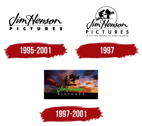
The name Jim Henson Pictures is a tribute to puppeteer Jim Henson, who created all the characters for The Muppet Show and provided the voice for one of them, Kermit the Frog. His son Brian followed in his father’s footsteps and eventually created a film studio to produce films where puppets would be perceived on par with live actors. Initially, the company’s logo only contained its name, arranged in two different fonts and divided by a long horizontal line. Later, an image of Kermit the Frog, The Muppet Show, and Sesame Street’s main character was added. The artists depicted him as a cameraman, sitting on a crane with a movie camera.
What is Jim Henson Pictures?
Jim Henson Pictures is a film studio that existed from 1995 to 2004 and became known for films featuring puppet characters: The Adventures of Elmo in Grouchland, Muppets from Space, Buddy, and others. It was located in the USA and collaborated with the American conglomerate Sony Pictures Entertainment for a long time. Its founder and owner was the famous puppeteer Brian Henson from New York, the son of the creator of The Muppet Show program.
1995 – 2001
The creativity of the film studio is evident in the use of two completely different fonts, which balance each other. For the phrase “Jim Henson,” designers chose an elegant handwritten font with decorative loops and curls. The first letter, “J,” stands alone, while the other letters are connected. A thin horizontal line is drawn below, where the word “PICTURES” is located. It is made in a bold capital font without serifs, similar to Limerick Serial Heavy by SoftMaker, Raiderfont Regular by Sharkshock, or Tondu Beta by The Northern Block. Both parts of the inscription are colored black.
1997
After the redesign, the wordmark was supplemented with a black silhouette of a frog sitting on a crane in front of a movie camera, overseeing the filming process. This is none other than Kermit the Frog, the famous showrunner and host of The Muppet Show. The amusing character with a triangular collar was chosen because of his close connection to Jim Henson, as the puppeteer had played his role throughout his life. He symbolized humor, wisdom, and benevolence, so he perfectly fits into the emblem of the film studio. The recognizable image became the identification mark of Jim Henson Pictures.
The style of the final word was slightly modified. The letters still lack serifs, but they are now thin and neat. This is how the designers likely wanted to balance the visually heavy top, where a large black drawing appeared. The new font is roughly similar to Limerick Serial Regular from SoftMaker but differs by having very wide inter-letter intervals, improving the inscription’s readability.
1997 – 2001
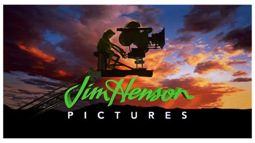
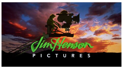
This logo was used in screensavers before some movies. It has a background in the form of a picturesque sky, on which a dark horizon and gray-orange clouds are depicted. The sunset landscape looks realistic because it’s not a drawing but a photograph. The sky is a common motif in the corporate identities of film companies. It can be encountered, for example, at Columbia Pictures.
Now the details are visible: the last rays of the setting sun illuminate the operator, the camera, and the crane. The emblem looks contemplative and romantic, invoking nostalgia in the viewers. A major role in this is played by its main character – Kermit the Frog. There are several reasons why he ended up on the logo.
- He is an unforgettable character with a bright appearance and unique voice, owed to his creator, Jim Henson.
- The cute frog is a model of kindness, wisdom, and optimism. His presence on the emblem suggests that the television studio’s movies inspire and bring joy.
- He symbolizes the creative legacy of Jim Henson. Viewers know him from various shows, including The Muppet Show and Sesame Street.
The designers adapted the inscription to the background color to make it visible. Therefore, the upper line has become bright green and has acquired darkened contours of uneven thickness, which make the letters appear three-dimensional. The bottom word is entirely white, as it is located in front of black hills.
Font and Colors
The bottom line of the late studio logo is made with a sans serif typeface, roughly similar to Gentleman Heavy from Juraj Chrastina. In this case, all letters are uppercase. However, the first two words are typed in the same font used in The Jim Henson Company emblem since 1988. It imitates sloppy handwriting with a right-hand tilt. Despite the lack of neatness, the inscription looks elegant due to decorative curls and loops.
The color scheme is very diverse because the designers wanted the image to look realistic. Blue sky, gray-pink clouds, green frog, silver lift – all darkened due to the lack of light. Only the name Jim Henson Pictures stands out brightly, colored white and several shades of green.


