


![]() John Lewis Logo PNG
John Lewis Logo PNG
Behind the retail emblem lies fashion, elegance, and style. The John Lewis & Partners logo is classic and flawless. Department store products allow you to create any image from scratch. The sign promises a business approach and English pedantry.
John Lewis was born in 1836 in Shepton Mallet and lost his parents at seven. After early work in the textile trade, he moved to London and joined Peter Robinson. In 1864, he opened a small shop on Oxford Street, earning 16 shillings on the first day.
The business grew into a department store by the 1880s, guided by strict pricing and no-debt policies. Long legal disputes with the landlord, Lord Howard de Walden, led to losses and a brief prison term in 1903. Competition from Debenhams intensified on the same street. In 1905, Lewis bought Peter Jones for £20,000 in cash. Control later passed to his son John Spedan Lewis, who introduced reforms after identifying a pay imbalance. He reduced working hours, added commissions, and improved staff conditions.
Between 1918 and 1920, Spedan launched internal communication, created a staff council, and began distributing shares to employees. A 1920 strike at the Oxford Street store exposed ongoing tensions. On April 18, 1929, he transferred ownership into a trust, forming John Lewis Partnership. Profits were shared among employees, known as Partners. The model contrasted with the centralized systems used by Marks & Spencer.
Expansion followed. In 1937, the group acquired Waitrose. In 1940, Selfridge Provincial Stores added regional sites. The Oxford Street store was destroyed during wartime bombing and rebuilt by 1953. A second trust deed in 1950 formalized employee ownership. Spedan retired in 1955. The pricing pledge remained in place until August 2022, when it was replaced amid pressure from online retailers and changing market conditions.
Meaning and History
![]()
John Lewis & Partners’ emblems have always been aristocratic, dating back to the opening of the first textile store in 1864. This emblem reflects the restrained British style throughout the vintage brand.
What is John Lewis?
John Lewis is a UK-based general-purpose department store chain. It is more than 100 years old, having appeared in 1864. Its founder is John Lewis, after whom it was named.
1864 – 1930
![]()
In the beginning, the company was known as John Lewis & Co, which became the basis for its logo. A coherent handwritten font was used for the name, where each letter was connected to its neighbors. Below the diagonal line was the first department store’s address: OXFORD ST., LONDON W. I.
1925 – 1940
![]()
In 1925, another emblem appeared, but without an address. The phrase “JOHN LEWIS & Co.” was written in an elegant typeface with varying line and serif weights.
1940 – 1956
![]()
The brand name changed again in the middle of the 20th century, although the concept remained unchanged. The first letters (“J” and “L”) have been lengthened and aligned in height. At the bottom was the inscription “AND COMPANY LIMITED,” divided into two parts.
1956 – 1960
![]()
Another change in the emblem took place in 1956. For the phrase “JOHN LEWIS,” the designers chose a strict bold type with large rectangular serifs. The second line (“OF OXFORD ST., LONDON W. I.”) was written in small sans serif letters.
1960 – 1972
![]()
In 1960, the address disappeared, and a handwritten-style font replaced the geometric serif. All letters except “J” and “L” have been converted to lowercase.
1972 – 1990
![]()
In the logo of 1972-1990. The font for the “John Lewis” lettering has been revised. This time, the developers used the classic Gill Sans Bold.
1990 – 2000
![]()
At the end of the 20th century, the company’s name began to be written in capital letters with short serifs. Black was replaced by green, which is now known as Partner Green. Spedan Lewis used to sign documents with this shade of ink.
2000 – 2018
![]()
The design firm Pentagram has slightly changed the character style. She brought back the Gill Sans Bold as in the 1972-1990 emblem, but made the lines thinner, rounded the dot above the “i,” and cut off the edges of each word’s first letter. The classic green color has been preserved.
2018 – today
![]()
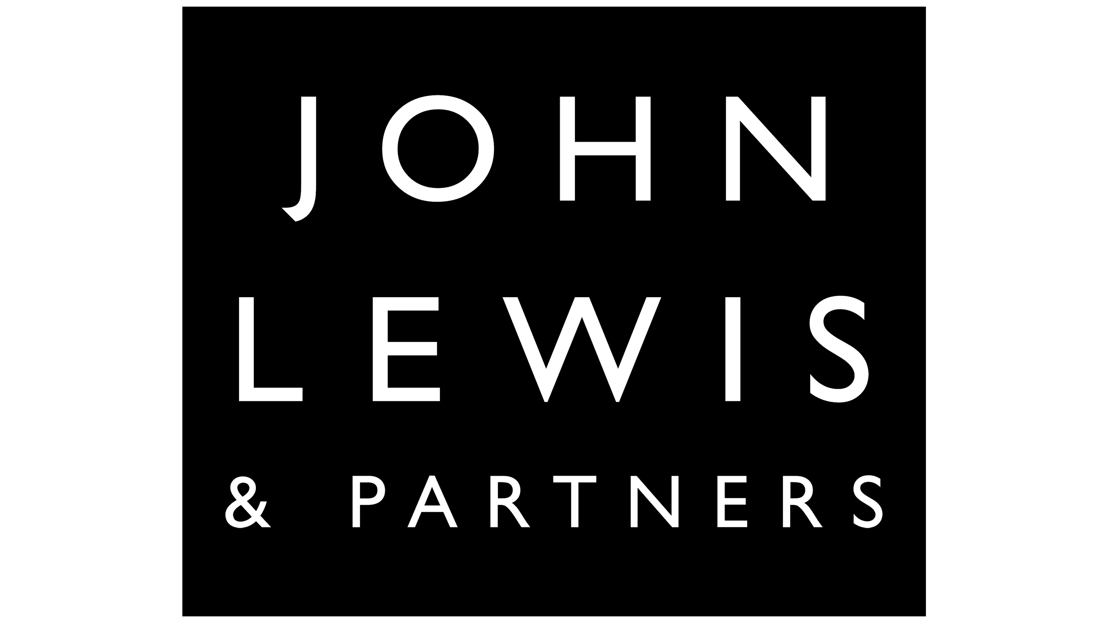
In June, the retail chain announced a name change. The executives added “Partners” to the name to highlight the unique business structure that makes its employees co-owners. Following the rebranding, the logo was modernized. Harry Pearce from Pentagram Studio offered his vision of a new style.
The design work took over three years. The result is a graphic sign with the words “John Lewis & Partners” in a black square. On the left, there are three quadrangles of different widths. Lined up in a row, they resemble a barcode, consistent with the concept of a chain of stores.
Font and Colors
The current emblem, Brand Lines, is based on an original 1960s design by Peter Hatch and Hans Schleger, specifically for the John Lewis Partnership. The Pentagram designers tried to keep the aspect ratio to make the rectangles look vintage. Abstraction presents John Lewis as a universal brand, not tied to any particular product.
The chain store’s latest logos use various modifications of the Gill font. The final version features thin strokes and large letter spacing. Pentagram created the typography. She also chose a color palette, preferring the classic black-and-white monochrome.
FAQ
Why has the John Lewis logo changed?
The brand changed its logo to better support its goals and highlight its unique employee-ownership model. The new logo, called ‘Brandlines,’ is inspired by a pattern created by Peter Hatch for the John Lewis Partnership in the 1960s.
The updated logo elevates and aligns the brand’s identity with modern ambitions. The redesign emphasizes the employee ownership model, which empowers employees and fosters a sense of collective responsibility.
Who designed the John Lewis logo?
The agency Pentagram redesigned the John Lewis logo. The new logo shows the company’s employee-owned nature. For the first time, John Lewis, Waitrose, and the John Lewis Partnership share the same visual identity.
Pentagram’s design emphasizes the unique ownership model, fostering a sense of collective responsibility and employee empowerment.
The redesign modernizes the brand while maintaining its historical roots. It uses precise proportions and elements inspired by past designs to create a cohesive and contemporary look. This approach ensures the logo reflects John Lewis’s tradition and forward-thinking nature.
What does the John Lewis logo mean?
The logo has a deep meaning. The design resembles a barcode, showing that the company is a retail business. Barcodes in stores reinforce the idea of shopping and the store’s product range.
The word “Partners” in the logo is important, too. It shows that employees are co-owners of the business. This part of the logo emphasizes the company’s model of giving shares to employees. This fosters a sense of ownership, responsibility, and motivation among staff, leading to a positive, inclusive work environment.
This logo represents the brand’s retail nature and employee partnership model.
Is John Lewis a PLC or a partnership?
The company’s full name is John Lewis Partnership PLC. “Partnership” is part of the brand name, and its legal status is a Public Limited Company (PLC). As a PLC, it is publicly traded and follows specific regulations for public companies.
The “Partnership” in the name is significant because it reflects the company’s unique business model. Employees are treated as partners and own a portion of the company, creating a sense of ownership and inclusion. Each employee shares in the profits and has a say in the business.
The brand is legally a PLC, and the “Partnership” name highlights its unique employee-ownership model, setting it apart from other businesses.
What font is John Lewis?
The logo uses a sleek, classic sans-serif typeface from the Gill Sans family. This font is known for its clean, modern look, making it a popular choice for many brands for its readability and timeless design.
This typeface in the logo conveys elegance and simplicity. It matches the brand’s focus on quality and reliability. The clean lines of the Gill Sans font make the logo easy to recognize and professional.
Is John Lewis Ltd?
The John Lewis retail chain is a PLC (Public Limited Company). This means the company is publicly traded and follows specific regulations for public corporations. Shareholders can buy and sell shares on the stock market.
As a PLC, John Lewis is larger and more transparent than private companies. This status allows John Lewis to raise capital from public investors to fund expansion and improvements. The brand has a unique partnership model in which employees are co-owners, sharing in profits and participating in decisions. This mix of being publicly traded and having an employee-ownership model makes the brand unique in the retail sector.