


![]() Jojo’s Bizarre Adventure Logo PNG
Jojo’s Bizarre Adventure Logo PNG
JoJo’s Bizarre Adventure logo combines the manga character’s style and quirkiness into the emblem; kindness and youth border on the dark sides of the soul. One and the other must be balanced so that a pattern of true character emerges.
Hirohiko Araki’s path to JoJo’s Bizarre Adventure began before the title existed. He debuted in 1980 with the western story Poker Under Arms, then released Cool Shock B.T. in 1983 and Baoh in 1984. By 1985, his style had already taken shape, with muscular figures, theatrical poses, violence, and supernatural power.
JoJo’s Bizarre Adventure began in Weekly Shonen Jump issues 1-2, which were released on January 1, 1987. It stood apart from series such as Dragon Ball and, later, Naruto, through its British setting, family curse, vampires, and layered battle logic. Phantom Blood introduced Jonathan Joestar and Dio Brando, while Battle Tendency ran from November 1987 to March 1989.
Stardust Crusaders, published from March 1989 to April 1992, became a turning point with Stands, supernatural entities tied to their users’ personalities. Diamond Is Unbreakable ran from 1992 to 1995, and Golden Wind ran from 1995 to 1999. Araki had planned a trilogy, yet continued after Part 3, an unusual move for Weekly Shonen Jump.
The franchise expanded through A.P.P.P.’s Stardust Crusaders OVA from 1993 to 2002, Capcom’s Heritage for the Future in 1998, and the move to Ultra Jump during Steel Ball Run in 2005. Gucci worked with Araki and Spur on Rohan Kishibe Goes to Gucci in 2011. David Production launched the TV anime in 2012, followed by Bandai Namco’s All Star Battle in 2014, Eyes of Heaven in 2016, and the 2017 live-action Diamond Is Unbreakable film. The manga has passed 100 million copies and continues in Ultra Jump with The JoJoLands.
Meaning and History
![]()
The comic book generally consists of nine storylines that follow a character named JoJo. Today, it is widely known for its sophisticated art style, which is in high demand. By 2021, JoJo’s Bizarre Adventure was a media franchise and the top-selling manga in history. It is licensed in North America by Viz Media, which has created several English-language anime series since 2005. They are united not only by common characteristics but also by a stylish visual identity mark. There are five English-language versions.
1993 – 2011
![]()
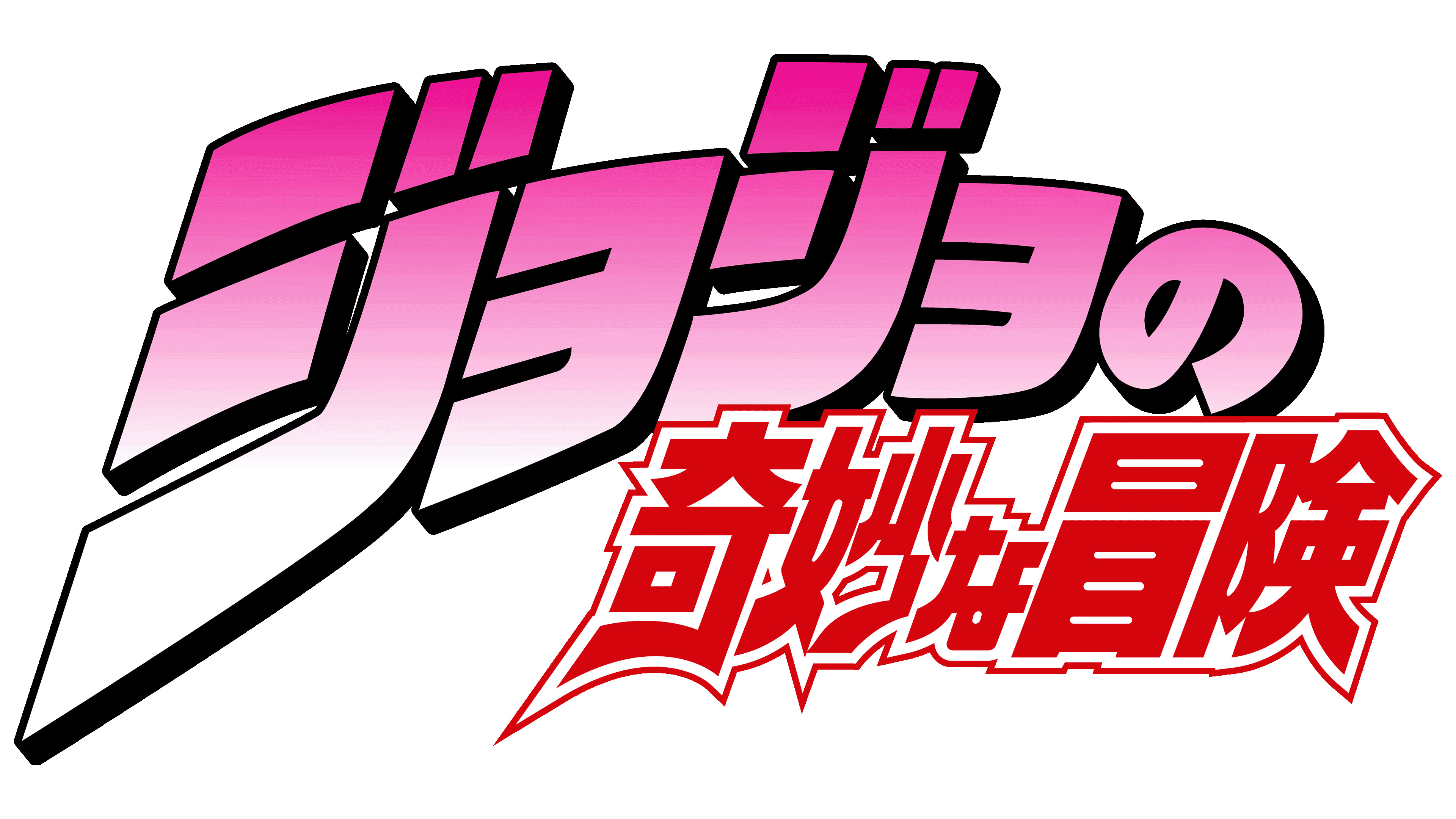
The debut logo features the full name of the franchise set against a black, gray, and white shadow background rendered with chaotic strokes and gradient transitions. The largest part is the first. The word “JoJo’s” is typed in a purple serif font. It takes up all the space of the horizontal rectangle, almost reaching the edges. Under it is the phrase “Bizarre Adventure,” aligned with the length of the top line. The bottom inscription is colored dark red and typed in classic uppercase letters. In “JoJo’s,” on the other hand, they are individual, with the serifs lengthened at the top that act as rungs.
2012 – 2018
![]()
In 2012, designers tweaked the English-language logo to match the Japanese version. So it has bold “JoJo’s” lettering with a pink gradient and an enlarged first “J.” The curved part at the bottom goes slightly to the left, reminiscent of a hockey stick. It’s so big that it takes up the bottom two rows where the rest of the franchise name is placed. “Bizarre” and “Adventure” are colored red and outlined with a double border. The inscriptions in the second and third rows are converted to lowercase (except for the first characters). The letters are so closely spaced that they have almost no intervals. The upper text is decorated with black shadows.
2014 – 2015
![]()
After the redesign, the English version of the logo got an additional inscription, “Stardust Crusades.” It is located at the bottom, under the main elements, and is painted gray with a gradient for contrast. On the right side of the letters, there are dark shadows. The font is bold, elongated, sans serif, with a slight rightward slant. The rest of the details remain the same.
2016
![]()
With the release of “Diamond Is Unbreakable,” the logo has been modified again. The designers removed the previous name and added a new one in a similar style. No other changes followed.
2018 – today
![]()
The logo for “JoJo’s Bizarre Adventure: Golden Wind” features a vibrant, expressive design that emphasizes the unique style of this installment in the renowned franchise. 2,018 significant changes were made to the logo, making it more symbolic and memorable.
The main focus of the emblem is on the “JOJO” text. The letters are in a large, uppercase font, giving the logo a sense of seriousness and importance. The second “O” in “JOJO” has a distinctive design: it is filled with black, and inside it is a cutout symbol in fuchsia color. This symbol resembles a ladybug, but instead of traditional spots, it is adorned with a heart-shaped spade, a playing-card symbol. This detail highlights the Italian roots of the “Golden Wind” setting and the danger lurking behind the outward beauty.
The colors are bright and intense. The pink (fuchsia) adds dynamism and energy to the emblem, emphasizing the story’s uniqueness and originality, while the black adds contrast and seriousness. This combination underscores the balance between aesthetics and drama, characteristic of the entire anime.
The lower part of the visual mark contains the full title of the series “JOJO’s Bizarre Adventure: Golden Wind.” The phrase “Golden Wind” evokes a sense of nobility and grandeur, aligning with the symbolism of the golden wind as new changes and forces permeate the story.
A line dividing the text on the logo appears to be pierced by an arrow. This element references an important plot point in the anime that centers on power and destiny, adding an extra layer of meaning to the emblem.
The logo encapsulates the anime’s atmosphere and themes, blending beauty with danger and external vibrancy with inner strength.
2021 – 2022
![]()
The logo for “JoJo’s Bizarre Adventure: Stone Ocean” is vibrant, much like the story it represents. The main font for “JOJO” is in large, uppercase letters, emphasizing the brand’s importance and recognizability. The letters are slightly rounded, with elegant lines, making them bold and soft, reflecting the dual nature of the series, a blend of drama and comedy, seriousness and absurdity.
The color palette features deep blue and green hues. Blue symbolizes calm, confidence, and stability, while green adds a touch of life, energy, and renewal. These colors are perfect for a story that, despite all its craziness, has a clear, structured narrative and well-defined characters.
In addition to the text, the central symbol is the image of a butterfly positioned between the words “STONE” and “OCEAN.” The butterfly, a symbol of transformation and freedom, is directly connected to the main character and her journey in “Stone Ocean.” The line running through the emblem creates a sense of movement and progress, highlighting the theme of change and development with the characters.
The logo’s style is inspired by the “Stone Ocean” events in the early 2000s, when style and individuality peaked. The emblem reflects this, retaining elements of that era, such as bold colors and daring design, while remaining relevant to modern audiences. It visually encapsulates what viewers can expect: a rich, dynamic, and thrilling story full of unexpected twists and profound transformations.
Font and Colors
The English version of the logo is in the same style as the Japanese one. The only difference between them is the letters corresponding to the language of the country for which the media franchise products are designed. The earlier logo versions were monotonous, while the current one is colorful and multi-semantic.

The updated logo’s text is a bold, smooth serif, reminiscent of the Mireille Medium and Pradell Bold fonts, with modified outlines. The color scheme always consisted of gradient transitions of light pink shades. Then neon fuchsia appeared, adding brightness, magic, and mystery to the emblem.