


![]() Joker Logo PNG
Joker Logo PNG
Tension arises from the first glance at the Joker logo. A character who hides behind a mask performs secret, dark deeds. His furtive gaze looks intimidating. The emblem warns: it is better not to fight with the Joker.
Meaning and History
![]()
The plot unfolds in 1981, when the fired clown Arthur Fleck begins a violent confrontation in the crumbling city of Gotham. He embarks on a fierce battle with the powers that be. The idea first occurred to the screenwriter in 2016, and over the next year, Phillips worked with Silver on the content. They were inspired by characters from 1970s comic books and by Martin Scorsese’s work. The film also has motifs from the 1988 Batman movie.
Filming took place in three cities: New York, Newark, and Jersey. The main working time for the film is September-December 2018. The finishing touches were put on the rest of the period, and in August 2019, the film was shown at the Venice International Film Festival, where it won the top award. It was released in cinemas in October and received positive reviews. The fact is that everyone noted at the highest level the acting, the staging, the music, the direction, but negatively greeted the display of mental illness and violence. One of the theaters that had an earlier shooting after screening The Dark Knight Rises even refused to show Joker.
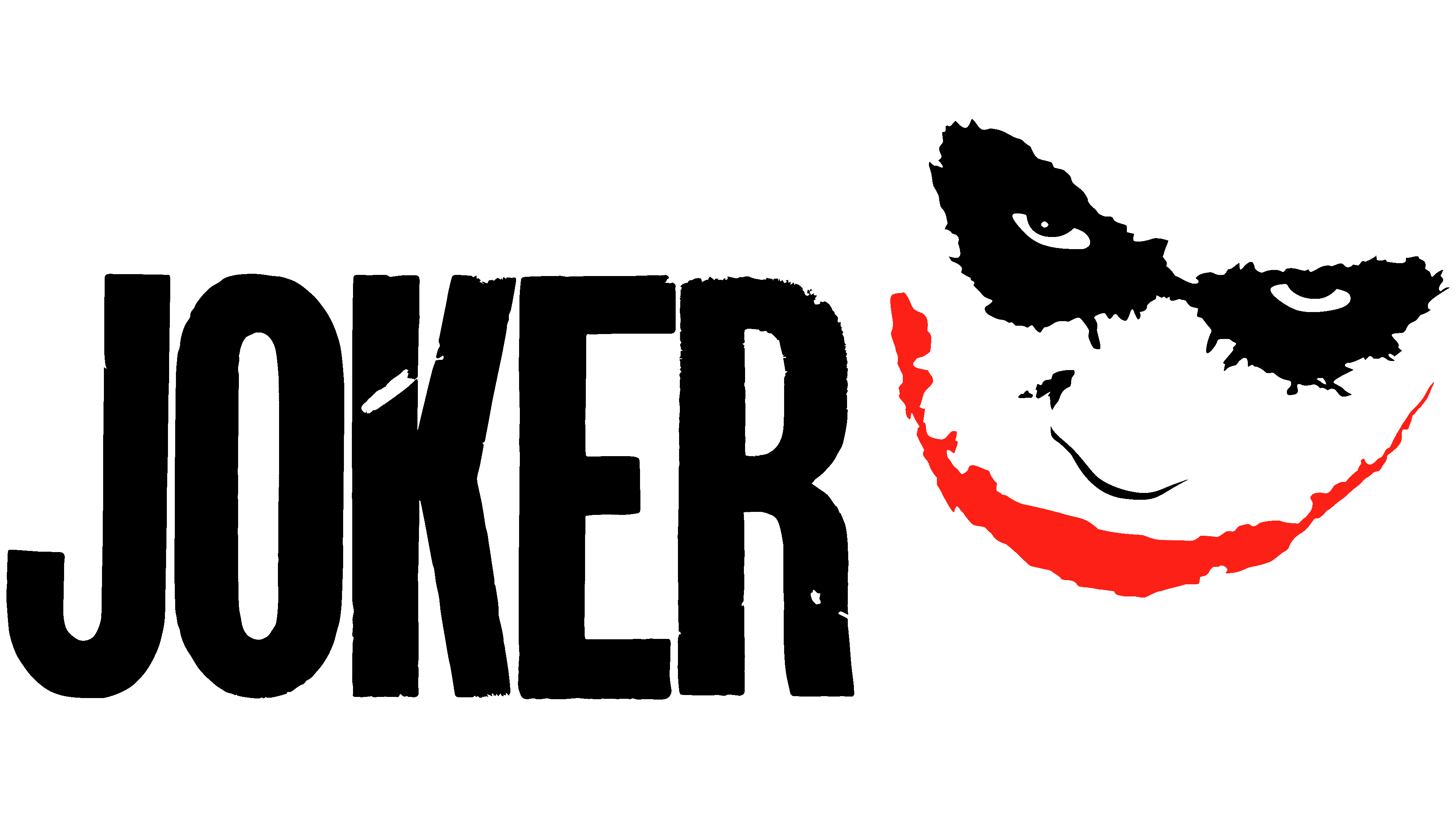
Despite the stark difference in opinion, the film was a resounding success, grossing over $1 billion and becoming the most-watched film of October 2019. At the box office, it ranked sixth. In addition, the psychological thriller won many prestigious awards. Now its logo is known worldwide, inflicting terror on fans and detractors alike. Because, in addition to the main emblem, there is an additional one, with a mystical-coward smirk of the main character.
It depicts Joker’s face as if it were a dark print on light paper. The eyes, appearing out of nowhere, stare fearfully sideways. The black pupils in the white eye sockets are truly frightening, and the black makeup around them feels like a jagged-edged mask. Below, the nose is painted in a contoured shape with a couple of strokes. The main emphasis is on the mouth, stretched out like a clown, literally from ear to ear. The creepy icon is located to the right of the movie title.
Font and Colors
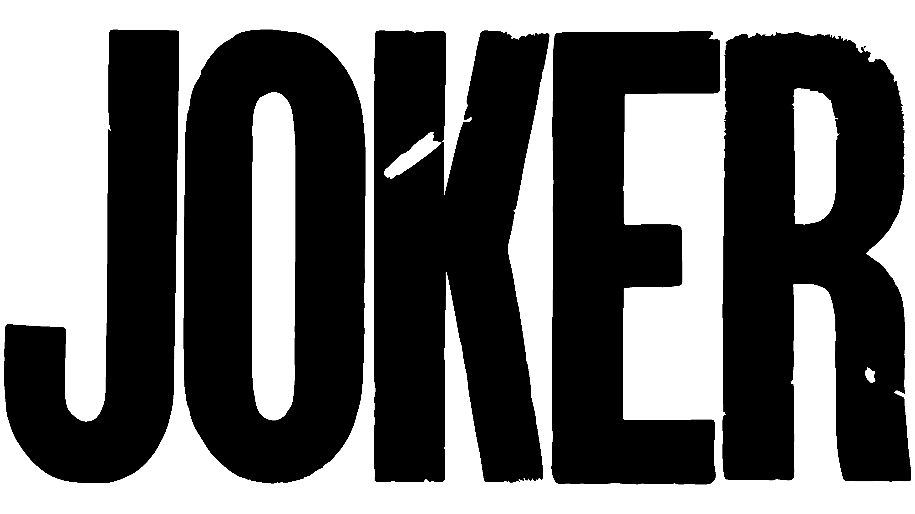
The main logo is textual; it contains only the word “Joker.” It is written in wide, elongated, upward-pointing characters. The font is grotesque, smooth, flat, classic typographic, and uppercase. The black letters have an irregular color: the black background reveals the extraneous “noise” found in old photographs. Therefore, the signs seem to have aged: they are covered with a network of mini-dashes, stripes, and scuffs, showing that not everything in this world is as perfect as others imagine. That everything has flaws, lacunae, inaccuracies, imperfections, problems.
To convey the film’s creepy atmosphere and its central idea, the developers chose the Gothic Joker typeface. Its author is KELGE Fonts agency.
The same task is performed by the official logo’s palette, which consists of black. It not only creates a gloomy atmosphere but also perfectly supports it, translating into a subconscious metamorphosis not so much of the main character as of those around him.