



Jordan’s Furniture shortened its name to Jordan’s and introduced a new logo after a 30-year pause in identity updates. The launch took place on March 2, 2026. The project was handled by MullenLowe Design Studio, which was connected to MullenLowe Boston, which later became TBWA\Chiat\Day Boston.
The company keeps its connection to furniture, the home, and the shopping experience. The word Furniture was removed from the name, logo, website, and communications. The brand is expanding its field beyond the furniture category. The new mark continues the line of the old Jordan’s logo.
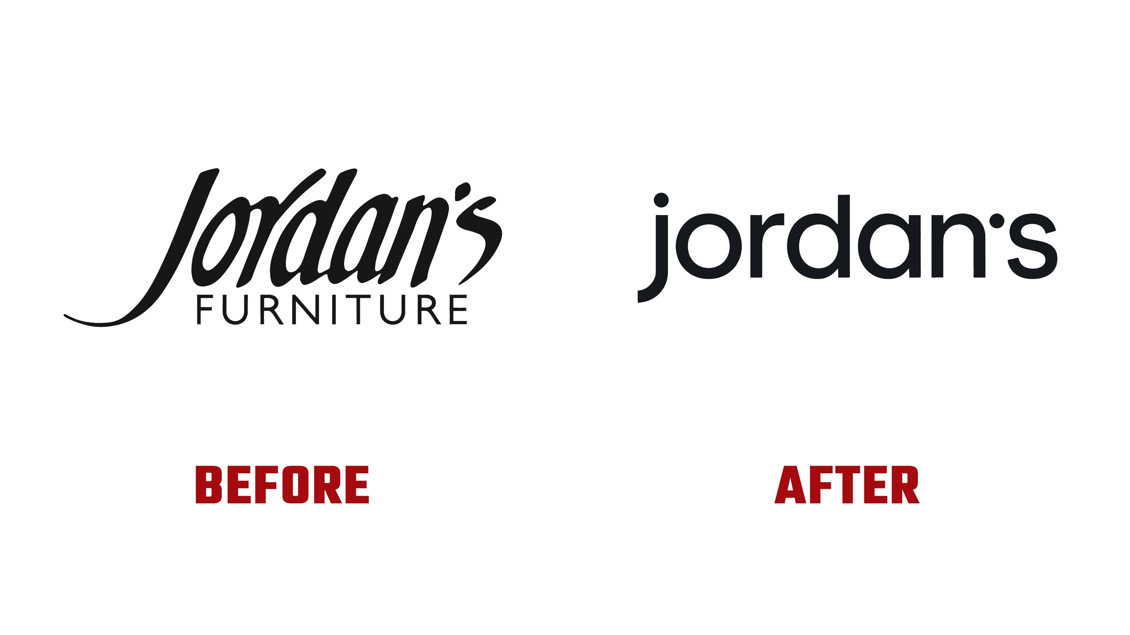
The identity is based on the lowercase spelling jordan’s and a separate small “j.” In the old logo, the name was set in a script typeface, with the word FURNITURE placed next to it. The script style left the system. CEO Josh Tatelman noted a desire to move away from the brand’s former script font.
The small “j” became the main symbol of the system. The team described it as lively, relaxed, and “sitting.” The shape of the letter evokes soft-silhouette furniture. The line recalls a comfortable seat, while the dot above the “j” looks like a wink.

The wordmark is built on rounded forms, compact short letters, and soft edges. The apostrophe was replaced with a dot, so the name feels more compact and better suited for digital use. The lowercase letters remove extra formality. The compact form helps the logo work in the full name and as a standalone “j.”
During the pitch, the team presented five directions. They included familiar serif options and bolder versions. The final form landed between the previous look and the new presentation. The brand kept a link to its old image, removed the heavy furniture tie from the name, and replaced the former script style.

The color system kept its connection to magenta and cobalt blue. Audiences already associated Jordan’s with those colors. The team considered moving completely away from the previous colors, then kept a familiar part of the image. The new logo works as an update while preserving the brand’s history.
For the brand, the logo change signaled a new role. The brand keeps its name, tone, and color memory, allowing longtime customers to continue recognizing the company.