The JT logo signifies the fusion of two cultures. It represents a newspaper striving to impartially acquaint the country’s residents with domestic and global events while improving their English language skills.
JT: Brand overview
| Founded: | 22 March 1897 |
| Founder: | News2u Holdings, Inc. |
| Headquarters: | Tokyo, Japan |
| Website: | japantimes.co.jp |
Meaning and History
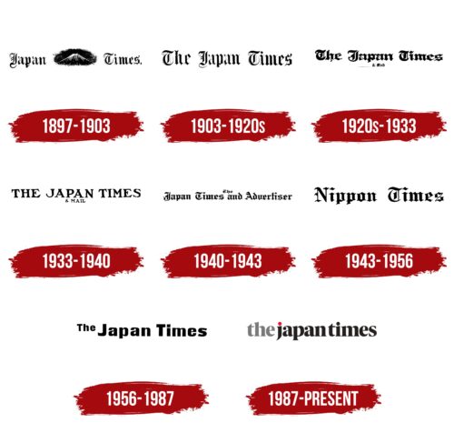
The newspaper emerged during the industrial revolution when Japanese society felt a connection with the outside world and began to take its rightful place on the world stage after a long period of isolation. Therefore, the birth of an English-language publication was entirely in line with the spirit of the times and the needs of the Japanese. The newsletter logos further underscored the newspaper’s connection with the English language through the use of specific fonts. The absorption of smaller publications and changes in ownership has driven the emblem rebrandings.
What is JT?
It is a Japanese publication in English that includes the daily newspaper The Japan Times, the Sunday weekly The Japan Times On Sunday, the weekly The Japan Times Weekly, and the bilingual issue The Japan Times Alpha. The main publication is a news sheet with a circulation of 44,000 copies.
1897 – 1903
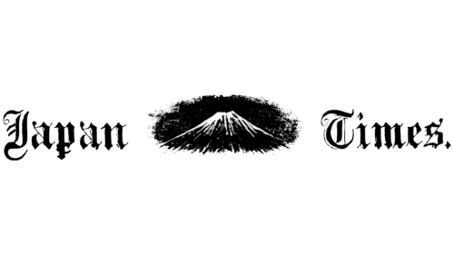
The newspaper’s logo font mirrored the well-known New York publication – The New York Times. However, unlike the foreign media, The Japan Times incorporated a graphic element in its emblem – the image of Mount Fujiyama. The highest peak is located near Tokyo, where the newspaper is published and is a business card of the country. Therefore, even for those who do not know English, one look at the publication’s logo is enough to understand that it refers to Japan.
1903 – 1920s
By the end of the 19th century, Motosada Zumoto, the newspaper’s founder, had taken the post of the country’s prime minister’s secretary and could no longer work on the publication. Therefore, he invited a native Japanese who had studied and lived in the US to return and head the sheet.
The visual identity under the new owner became closer to the usual logos of daily publications – the name in large letters. The inscription’s font is Old English to highlight the newspaper’s main feature – the foreign language.
1920s – 1933
In 1918, Times they have absorbed its competitor, Japan Mail, run by an English editor. The names of the two publications were combined, leading to a logo update. The emblem letters became thicker to show the merger, and under The Japan Times, they added Mail in small letters.
1933 – 1940
In 1933, the Japanese government finally managed to take control of the newspaper. Hitoshi Ashida, a protégé of the Japanese Ministry of Foreign Affairs, was appointed as the chief editor. The appointment immediately reflected on the logo’s style. The inscription received a more modern font with clear capital letters. The resemblance of the font to hieroglyphics and the intricate symbolism faded away.
1940 – 1943
In 1940, the news newspaper for diplomats, traders, and missionaries, Japan Advertiser, was absorbed. The joint publication was renamed The Japan Times and Advertiser. The unified logo returned to the old-fashioned font that Advertiser had used. It made the popular publication reminiscent of England. The word “The” is printed in small font at the top center to reduce the length of the inscription slightly.
1943 – 1956
In 1943, the newspaper changed its name again to Nippon Times. The Japanese word Nippon replaced English Japan, as English was banned in the country during World War II. The name represented a synthesis of two cultures and languages, reflecting the editorial board’s stance. The old-fashioned font was retained but became larger.
1956 – 1987
With the advent of Shintaro Fukushima’s administration, the visual mark of the publication transformed. The smooth, almost cursive letters of Japan Times with a small floating article presented a confident and interesting media that adhered to neutrality in the political sphere. The flying concept hinted at the newspaper’s distribution via airmail to neighboring countries.
1987 – today
Shintaro gave up ownership of the newspaper and sold shares to the automotive parts manufacturer Nifco, remaining as the editor. The new owners drastically changed the style.
In the emblem, a modern approach of a semi-transparent article and its fused writing with Japan was used. The publishing house is fully computerized, and the style of the title resembles an internet version.
Lowercase letters help distinguish between the name of the country and the printed publication. The elegant font with glyphs of varying thickness underscored the multifaceted issues and the ability to please various political forces and major business players.
Above the J, there’s a red dot. It is a prototype of the sun from the country’s flag. It demonstrated the adoption and setup of a color offset press in the publishing house.
Font and Colors
Black color is the primary in the logo. The palette perfectly matches the theme of printing and typographic ink. It indicates the color for the largest, most known, and oldest publication of this format.
The font of the inscription is Blacker Pro Display Extrabold.
JT color codes
| Sedona Red | Hex color: | #a71930 |
|---|---|---|
| RGB: | 167 30 49 | |
| CMYK: | 5 100 71 22 | |
| Pantone: | PMS 187 C |
| Sonoran Sand | Hex color: | #e3d4ad |
|---|---|---|
| RGB: | 227 212 173 | |
| CMYK: | 0 4 20 7 | |
| Pantone: | PMS 7501 C |
| Black | Hex color: | #000000 |
|---|---|---|
| RGB: | 0 0 0 | |
| CMYK: | 0 0 0 100 | |
| Pantone: | PMS Process Black C |


