


 Justice League Logo PNG
The Justice League logo conveys the film’s militant spirit. The emblem tells the story of superheroes’ courage and bravery as they stand guard and repel evil attacks with their abilities as a shield.
Justice League began as a key team concept in DC Comics. Its modern version emerged after editor Julius Schwartz revived the idea of a shared superhero group, with writer Gardner Fox and artist Mike Sekowsky developing the early stories. The team debuted in The Brave and the Bold #28, published in February and March 1960, and soon became a regular part of the publisher’s line.
The original lineup included Batman, Superman, Wonder Woman, Aquaman, Martian Manhunter, Green Lantern, and Flash. Their first stories used large-scale threats, including Starro the Conqueror, to show how separate heroes could work within one narrative. In October 1960, the debut’s success led to the launch of Justice League of America, a series built around team missions, alien invasions, magic, science fiction, and crossovers with the Justice Society.
During the 1970s, the roster expanded to include figures such as Green Arrow and Black Canary. At the same time, some stories reflected the period’s social issues. The 1980s brought major changes, including the Detroit-era lineup in 1984 and Justice League International in 1987, created by Keith Giffen, J. M. DeMatteis, and Kevin Maguire. That run used political satire, workplace tension, and humor rather than the usual solemn superhero tone.
In 1996, Grant Morrison and Howard Porter’s JLA returned the focus to the main icons. The 2001 animated series and the 2004 Justice League Unlimited introduced the team to television audiences. In 2011, the New 52 reboot revised the origin story, while the 2017 Warner Bros. film placed the group within the DC Extended Universe.
Meaning and History
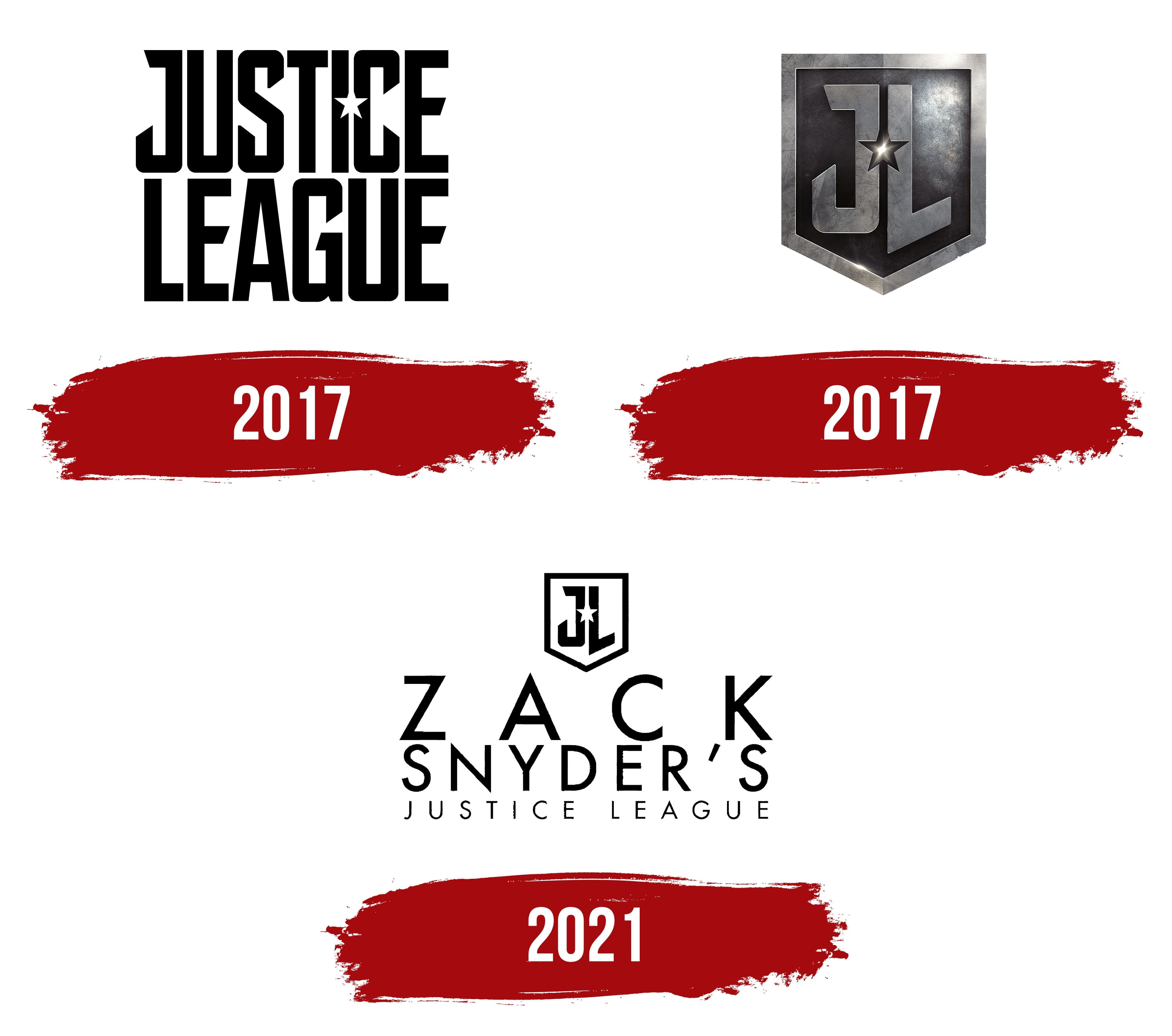
The film features Flash, Aquaman, Wonder Woman, Batman, and Cyborg. Director Zack Snyder has worked on the film since 2014. He left the project in 2016 after tragic events in his family. He finished shooting from a partially remade script by Joss Whedon. The film, released in 2017, cost the company $ 60 million. Disgruntled fans demanded the original Snyder picture, which is now more popular.
Warner Bros. designed the film’s logo in 2017 for the New York office of British design firm Pentagram, and it has remained unchanged.
What is Justice League?
A superhero film directed by Joseph Whedon and Zack Snyder, with the most expensive budget at the time ($300 million). It was released in theaters in 2017. It tells the story of the League’s confrontation with the Parademon army.
2017
The Justice League logo embodies its heroes’ strength, protection, and unity. The initials “JL” are used in this abbreviated emblem version, with a star between them. The star’s placement on the shield highlights the Justice League’s central importance in the superhero world, symbolizing its role as a defender of peace and justice.
The logo’s metallic tone and the surface’s rough texture convey solidity and reliability, evoking the heroes’ invincibility within the League. The shield holding the letters symbolizes protection, showing that the League is always vigilant and ready to safeguard humanity from any threat.
The star, shining brightly against the dark background, symbolizes hope, indicating that the Justice League is always prepared to illuminate the way and rescue in times of need.
2017
The emblem consists of two levels of lettering. The upper level reads Justice, and the second level reads League. Together, the composition forms a square and resembles superhero belt buckles. The compact arrangement of the letters reflects the cohesion that lets the team confront evil, combine abilities, and win.
All the inscriptions are in capital letters, indicating the superhumans’ special mission. Their tasks are at the highest level: saving humanity, fighting evil, and confronting the dark antiheroes.
The large letters hint at the League members’ superpowers and their unusual nature. They operate above ordinary people, and their abilities are greatly enhanced.
In the upper row, between the letters, a star is carved into the I and S. It resembles a hole from which a jet of light emerges, cutting through the darkness and signaling the approach of a brave, strong legion.
The hole’s shape directly indicates that the events occur in America and that everyone in the film lives there. The celestial luminary also evokes heroism. American service members received a Silver Star for special services and demonstrated courage. The element is also present on the flag of all U.S. Army units.
2021
Font and Colors
The logo’s main color is black. It demonstrates power and might. Heroes set the boundary, and they can’t be moved. No one will pass through. Sometimes, emblem variants with black backing and white letters are used. The color contrast shows the confrontation between good and evil. In this case, Justice League is written in white, and the background remains black. Darkness is coming, but good stays on guard and protects the world. The two-color variant often features the DC Comics logo, the name, and the authors’ names.
The font is slightly fancy and synthesizes Ultimatum MFV Mass Bold and Ramsey Semi Bold. All elements are angular, with pointed ends that resemble blades. The style conveys battles and armed confrontations, as well as the superheroes’ ability to defeat evil. The elements convey strength and determination.