![]() Justice Logo PNG
Justice Logo PNG
The playful and humorous Justice logo is designed to attract the attention of a potential customer base of girls aged 12 and under. After all, kids react to colorfulness, uniqueness, and brightness. The emblem is tailored to a specific age group thanks to its smooth lines, soft curves, and unique childlike style.
Meaning and History
![]()
The Justice logo evolved with the store, so at each pivotal stage, it looked different. The style change was so radical that the previous sign drastically differed from the subsequent one. For instance, the Tween Brands corporation created a store for girls and teenagers, transforming it into a large-scale empire with over 1,000 retail outlets (as of 2016). However, the format changed after the transition to Bluestar Alliance LLC, as the new owner converted the store to an online-only format. Naturally, its visual identity was also restructured.
The modernization affected all aspects of the emblem, from stylistic to conceptual. This measure was needed to attract many customers in a small format. To achieve this, designers used typographic and graphic techniques that operate on the subconscious and immediately convey their purpose to others. The transformation affected, first and foremost, the font and color.
What is Justice?
Justice is an American online store that sells clothing and accessories for girls aged 6-12. It was launched in this format in 2016. Although the brand’s official launch was in 2004, it originated in 1987. It was a large commercial network with a different name, which included several hundred points of sale. The headquarters has always been in New Albany, Ohio.
1987 – 1996
![]()
This sign indicated that it was a The Limited Too store. It was two-tiered.
- The inscription in the first line was made up of uppercase letters in white with a thin black stripe in the middle. The background was black for contrast. Serifs were absent. The inter-letter space was wide, so the glyphs were very free. They were geometric.
- The second row was occupied by the short word “too,” written in lowercase in a handwritten font. It was colored orange and was located under the uppercase “T” and “E.” It had a strong left tilt, making the line look diagonal. The lowercase “t” had an unusual shape and looked like a plus sign (+).
1996 – 2009
![]()
The particle “The” disappeared from the logo, so the inscription became single-level. In it, uppercase and lowercase letters alternated, making them appear to bounce. The emblem’s style was childlike, friendly, cheerful, and positive. This was confirmed by a single flower, which separated the words. It seemed like a small child drew it; it had wide petals and perfectly complemented the thin glyphs. The delicate pink color made it genuinely girly.
2009 – today
![]()
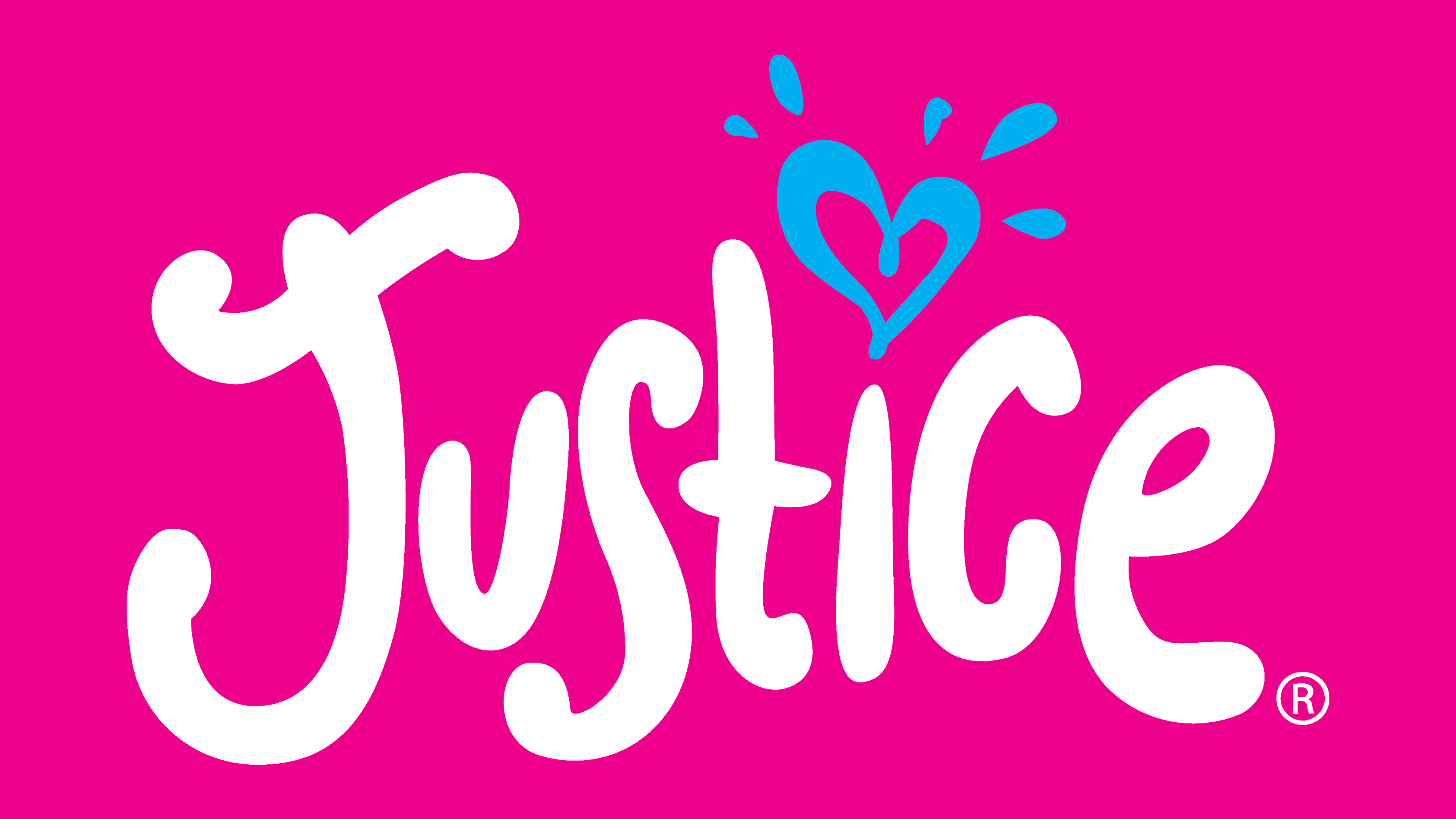
After rebranding, the company adopted a new logo and changed its name from Limited Too to Justice. It is also childlike, joyful, and cute, but more sparkling. The powdery pink transformed into neon pink, adding even more brightness to the emblem. The online store owners abandoned printed letters and chose a harmonious font variant that imitates a handwritten style, as if the inscription were made by a child’s hand.
Each glyph in the emblem is unique. But they all share one common feature: they are puffed. In particular, they have wide lines with rounded ends. There are practically no external angles – only internal ones, and even then, infrequently. The inscription is set like a hill, more precisely, a wave, with the middle part raised and the edges lowered. The classic dot over the “i” is replaced by a miniature blue heart with five teardrop strokes at the top.
Fonts and Colors

The Justice logo is text-based, focusing on the writing style. Fonts vary greatly in design depending on the emblem’s appearance year. For a long time, letters were geometric, with strict lines and even edges. Then, there was a transition to a childlike design with a prevalence of jumping glyphs in individual designs.
Color enhances the lightness of typography. For this, girly colors were chosen, ranging from pastels to neon hues. A soft shade of blue harmoniously complements bright fuchsia.