


![]() Kayak Logo PNG
Kayak Logo PNG
The Kayak logo says, “All inclusive. We offer the best vacation experience for customer satisfaction.” The emblem’s symbols represent a variety of tourist destinations and an exhaustive list of accommodation options for each. Rest will bring a reboot and recovery.
Kayak began in December 2003, when Steve Hafner, a co-founder of Orbitz, met developer Paul English at General Catalyst in Cambridge, Massachusetts. They wanted to build a travel search engine closer to Google than Expedia, showing flights and hotels across the market rather than only promoted listings from sites like Expedia and Travelocity. The company was founded in January 2004 as Travel Search Company, Inc. and renamed Kayak Software Corporation in August 2004. Kayak.com launched in February 2005.
Its model was based on paid clicks: users were sent to Orbitz, Travelocity, airline sites, and other partners, while Kayak earned money from referrals. In 2007, Kayak raised $196 million from General Catalyst, Sequoia Capital, and Accel Partners, using some of the proceeds to acquire SideStep. By 2008, Kayak reached 1 billion annual searches. In 2010, it bought Germany’s Swoodoo, its first major step into Europe.
In 2011, SideStep was shut down, and its traffic was redirected to Kayak.com. That year, Kayak launched white-label booking for partners including Travelocity and Air Canada. After a delayed IPO, Kayak went public on NASDAQ on July 20, 2012. Shares rose 26% on the first trading day.
On May 21, 2013, Priceline.com acquired Kayak for $2.1 billion in cash and stock. In 2018, Priceline became Booking Holdings, placing Kayak alongside Booking.com, Agoda, Rentalcars.com, and OpenTable. Google Travel became a major challenge after Google bought ITA Software in 2011.
Meaning and History
![]()
At first, the travel company had a different name: it was founded as Travel Search Company, Inc. Six months later, it was renamed Kayak Software Corporation (in August 2004), but the name was shortened to one word. In February 2005, the new service received its website and a mobile application. They are currently used in 30 countries worldwide. They are available in 18 languages, so the corporate logo is well-known in Europe, India, Mexico, Russia, Japan, New Zealand, and other countries.
The online travel service’s growth accelerated in 2007 when it received $196 million in investor funding to acquire the competitor SideStep. Several more lucrative acquisitions followed, including the German search engine Swoodoo. In 2011, Kayak management closed the SideStep site and transferred traffic to its own resource, Kayak.com.
In May 2013, Priceline.com (now Booking Holdings) acquired the online travel service for $2.1 billion. The biggest changes, of course, were reflected in the service’s identity. For all this time, he has had two emblems, almost identical.
What is Kayak?
Kayak is a mobile app and website for travel planning. The online service allows users to search for hotels and tickets to find the best option. Users can also compare prices, read reviews, find car rental offers, learn flight schedules, and even check weather forecasts. The company Kayak has existed since 2004 and is part of Booking Holdings.
2004 – 2017
![]()
The debut logo was introduced when the service launched, as it badly needed a visual identity mark. The “Kayak” inscription took over this role, made as a tabular inscription, as at the airport. The travel agency’s name is on a line and consists of single letters. Each symbol occurs on a separate bar, crossed out in the middle by a barely noticeable, thin stripe. Therefore, looking at the first logo, it seems the letters on it are about to change. The background is a vertical orange rectangle. The text is written in printed characters – strict, even, chopped. The corners of geometric shapes are rounded.
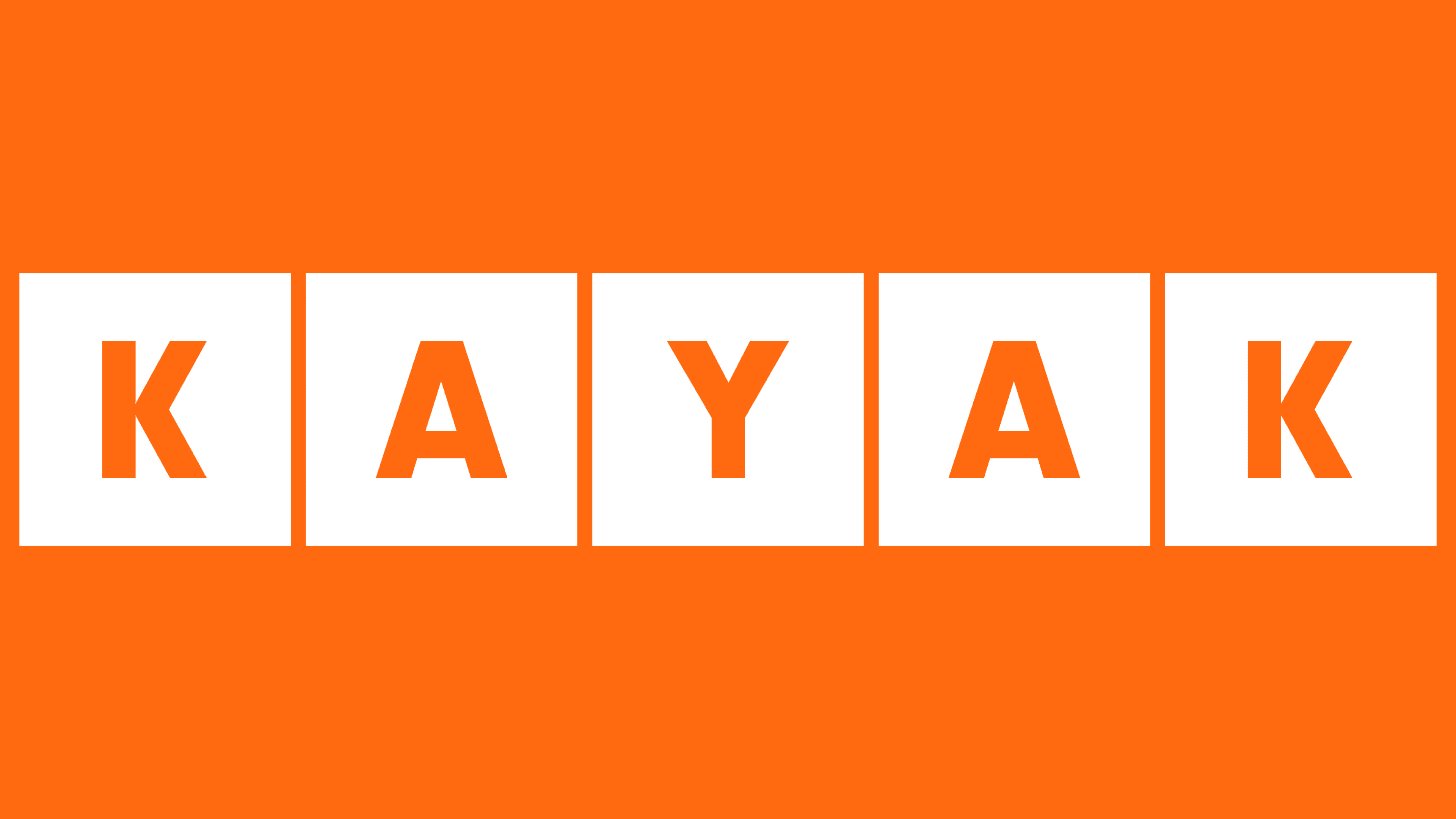
2017 – today
![]()
The logo’s redesign did not bring significant changes because the initial concept was very successful. The developers removed the thin gray line running along the entire word and changed the font to a more compact one. The inscription “Kayak” is made in straight, smooth letters with the usual sharp edges. The characters themselves are standard and bold, in uppercase. Another change has been made to the background rectangles. The designers have reduced them to squares, so the logo looks like a set of children’s alphabet blocks.
Font and Colors
Apart from minor changes that did not affect the picture’s visual perception and basic concept, the logo has hardly evolved. It always featured orange geometric shapes with white lettering. Each letter in the word “Kayak” has its individual space.
The authors chose a typeface identical to Noveo Sans Black by FontSite Inc. for the logo. This font is in use now. It was previously elongated but also belonged to the Sans Serif category; it was grotesque.
The logo’s most important component is the color palette. It transmits the energy that the travel agency directs toward finding new paths to the cherished goal. The squares are orange (soft # ff6907), and the letters are white. United in one space, these two colors represent movement and reliability.