


 Kentucky Wildcats Logo PNG
The Kentucky Wildcats logo is the personification of bestial strength and unrestraint, the fury of attacks, and the ability to withstand rivals. The emblem is an undisguised concentration of strength and energy, frightening the enemy and leading athletes to victory.
Kentucky’s athletic history began in the 1890s, when students organized football games against nearby colleges. Men’s basketball started in 1903, one year after the women’s program. In 1909, football coach Edwin Sweetland gave the teams the name Wildcats, referring to the fierce style of play. The nickname later spread across the university’s athletic programs.
In 1930, Adolph Rupp was hired as a basketball coach after working at the high school level. His tenure changed the program through demanding practices, fast breaks, and strict discipline. In 1932, Kentucky joined the Southeastern Conference, where it built long-term power. The team reached its first NCAA Final Four in 1942.
Rupp won his first national title in 1946. In 1948, the Fabulous Five beat Baylor 58-42 for Kentucky’s first official NCAA championship, followed by titles in 1949 and 1951. In 1958, the Fiddlin’ Five gave Rupp his fourth championship. In 1966, Kentucky lost the NCAA final 72-65 to Texas Western, whose all-Black starting lineup made the game a racial turning point in college basketball.
In 1969, Rupp signed his first Black player, Louisville center Tom Payne. He retired in 1972 after 41 seasons and 876 wins, then died in 1977 after Rupp Arena opened in Lexington in 1976. Joe B. Hall won the fifth NCAA title in 1978, Rick Pitino added the sixth in 1996, and the 1998 team beat Utah 78-69 after a major comeback against Duke. Kentucky reached 1,800 wins in 2001 and 2,000 in 2009. In 2012, John Calipari led the Wildcats to their eighth NCAA title, behind the UCLA Bruins in total championships.
Meaning and History
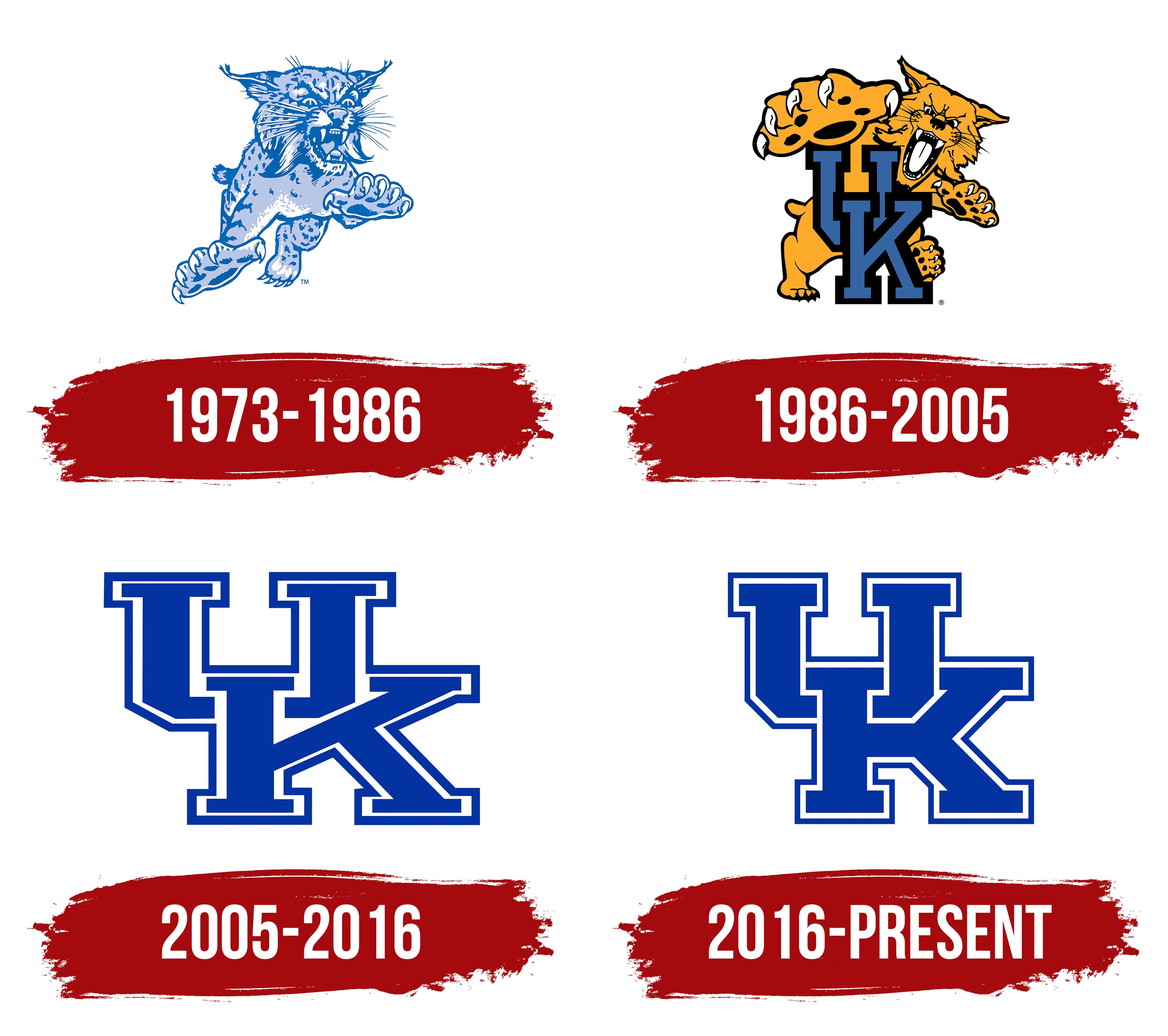
The national team’s logo has been changed three times to reflect the full connection with the university.
What is Kentucky Wildcats?
The University of Kentucky team consists of athletes in football, basketball, volleyball, baseball, swimming, track and field, softball, golf, tennis, and cross country.
1973 – 1986
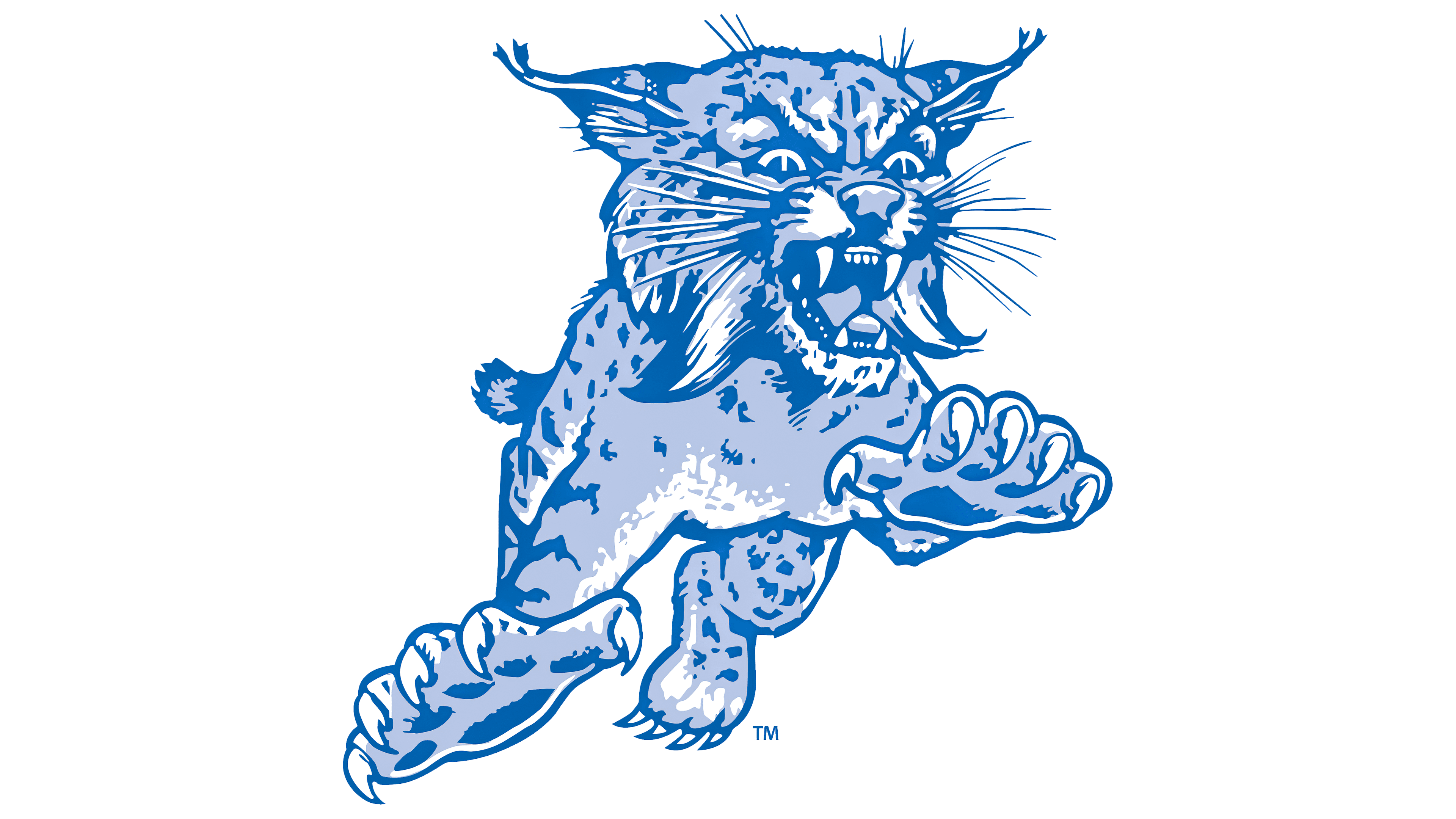
The Wildcats logo is inextricably linked to the team name. Initially, this was an assessment of the athletes’ game on the field: “They fought like wild cats,” said the head of the university department. It was said in 1909. Gradually, the athletes’ assertiveness and bestial strength became an official name.
Therefore, the first logo features a lynx. The emblem is very realistic. Demonstrates the animal jumping during the attack on prey. The image is very aggressive and wild, with fangs and extended claws. Its main task is to instill fear in opponents only when they see the emblem.
The image conveys pressure, strength, the will to win, and the message that the players never give up. They are only interested in winning.
The pale blue shading adds a sense of mist, stealth, and a surprise attack. Shows that opponents should expect defeat at any moment. University players know how to wait and choose the most unexpected moment to launch counterattacks.
Apparently, the lynx’s coloring also gave rise to the team’s fans’ main nickname, Big Blue Nation.
1986 – 2005
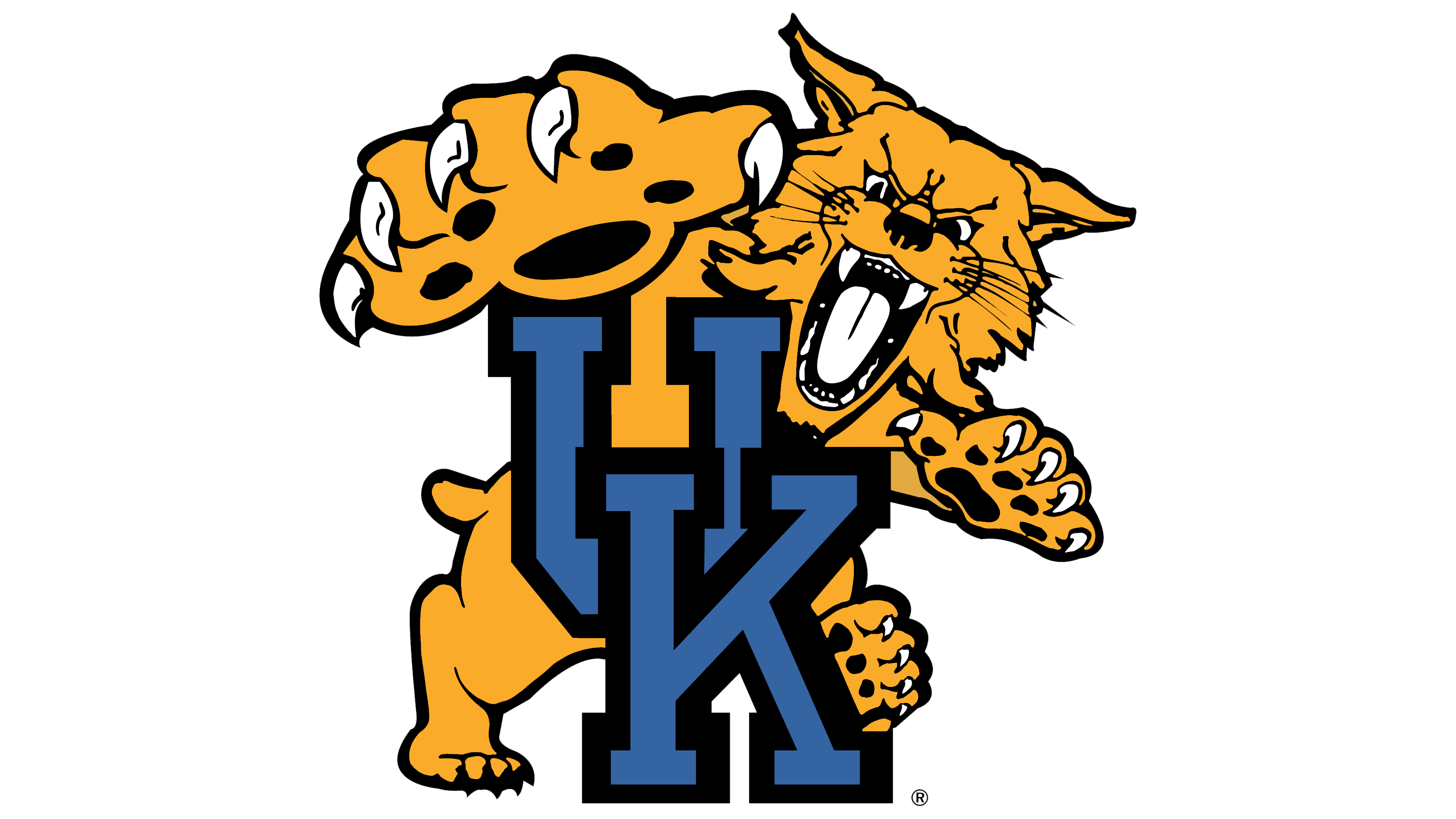
Three lynx varieties are considered the mascots of the Kentucky Wildcats. The first is a real animal, a lynx. The second is a cartoon, Scratch, for children’s fans. The third is costumed (in which one of the students has been dressing up since 1976). The first cat in disguise was Gary Tanner.
The second team logo looks more like a cartoon lynx. However, still aggressive and wild. She is located behind the university’s abbreviation and tries to reach anyone who comes too close with her paw.
This version of the visual sign showed the national team’s connection to the university. The animal is ready to showcase its power and essence, representing the University of Kentucky’s interests.
2005 – 2016
In 2005, the lynx image was removed from the team logo, and the visual sign repeated the university’s emblem, consisting of the two capital letters of the name: U and K. The elements are intertwined, like wrestlers in a sparring match. The image demonstrates the ideal sports capture and the institution’s close relationship with the sports teams.
2016 – today
The 2016 logo change is minor. This font change made the abbreviation more compact and removed gaps between letters. The sign demonstrates the national team’s unity, mutual support, and team spirit.
There are alternate versions of the common sign for each sport. Changes include using only the animal’s head or adding sports equipment to the main emblem.
Font and Colors
The primary color of the Kentucky Wildcats is blue. It personifies hard work, physical exercise, and enhanced training. To achieve results, athletes are ready to train with full dedication.
The logo’s additional color is white. Indicates the athletes’ first steps in the world of big sport.