The Kenya Airways logo fosters trust in the African airline and elevates its prestige on the international stage. It clearly and effectively represents the airline to travelers, who can easily recognize it as a modern carrier with significant capabilities.
Kenya Airways: Brand overview
Kenya Airways’ history began in 1977, following the dissolution of the East African Community and the subsequent closure of East African Airways. The Kenyan government officially established Kenya Airways as the national carrier on January 22, 1977.
The primary goal was to provide air transport services for the newly independent nation, both domestically and internationally. Initially, the airline operated with two Boeing 707-321 aircraft previously owned by East African Airways, focusing on regional routes within East Africa and flights to Europe to maintain economic and diplomatic ties. Throughout the 1980s, the company gradually expanded its route network by adding destinations in West Africa and increasing flight frequencies to Europe. However, financial challenges arose, leading to the need for government support to sustain operations.
In 1986, the company acquired its first Airbus A310, which modernized its fleet and enhanced efficiency on medium—and long-haul routes, improving its competitiveness.
In 1991, the Kenyan government announced plans to privatize the airline to enhance efficiency and attract private investment. The privatization process began in 1995 with the assistance of the International Finance Corporation (IFC) to ensure transparency and attract international investors. By 1996, the airline became the first African airline to complete a successful privatization, with KLM Royal Dutch Airlines acquiring a 26% stake as a partner. Joining the SkyTeam alliance as an associate member in 2000 expanded the airline’s cooperation opportunities with other major airlines and improved its global network. The company initiated a fleet renewal program 2002, ordering new Boeing aircraft to enhance operational efficiency and route network expansion.
2004, the company launched its first direct flight to China, reflecting the increasing economic cooperation between Africa and China. By 2006, it became a full member of the SkyTeam alliance, further solidifying its position in the international market and broadening its route network. From 2007 to 2008, the airline experienced rapid growth, expanding its route network in Africa, Asia, and the Middle East.
In 2011, the company unveiled the ambitious “Project Mawingu” expansion plan to expand its fleet and open new global destinations. By 2013, it had received its first Boeing 777-300ER, which enhanced long-haul flight operations. Despite facing financial challenges in 2014 due to high fleet renewal costs and decreased tourist traffic, the company initiated a restructuring program to address these issues.
In 2016, the company underwent significant restructuring, cutting staff and optimizing its route network. The company also worked with creditors to reorganize its debt.
In 2018, the airline reached a milestone by launching its first non-stop flight between Nairobi and New York, a momentous occasion for the company and African aviation in general.
In 2019, the Kenyan government revealed plans to nationalize the airline to bolster its financial standing and ensure long-term stability. Throughout 2020, the company continued its restructuring efforts, focusing on streamlining its route network and enhancing operational efficiency. Despite challenges faced by the global aviation sector, the airline maintained key routes, particularly within Africa. The nationalization process continued into 2021, with the Kenyan parliament approving a bill in July to establish the Kenya Aviation Corporation. This entity would encompass the airline, Kenya Airports Authority, and Aviation Investment Corporation to improve its financial outlook and boost its competitiveness. The company prioritized expanding its cargo operations, converting two-passenger Boeing 787s into freighter versions to meet the rising demand for air cargo transport.
In 2022, the company persisted in enhancing its financial performance, engaging in discussions with creditors to restructure its debt and exploring ways to reduce operational expenses. Additionally, the airline strengthened its partnerships with other African carriers, such as South African Airways, to create a more robust pan-African alliance. Looking ahead to 2023, the company announced intentions to modernize its fleet by considering the acquisition of new narrow-body aircraft to replace its aging Boeing 737s. This move aimed to improve fuel efficiency and environmental sustainability. Furthermore, the airline expanded its loyalty program, introducing new perks for frequent flyers and enhancing collaborations with businesses in the tourism and hospitality sectors.
Meaning and History
What is Kenya Airways?
Kenya’s national carrier, based in Nairobi, offers regular passenger and cargo services across an extensive network of destinations in Africa, Europe, Asia, and the Middle East. The company operates a modern and diverse fleet of narrow-body and wide-body aircraft, such as the Boeing 737, Boeing 787 Dreamliner, and Embraer E190, providing an optimal combination of capacity, comfort, and efficiency.
1977 – 2007
The significant leap in the development of the aviation services market has influenced the branding of many companies in this industry. One prominent example is Kenya Airways’ logo. It is simple, practical, informative, and progressive. These qualities are conveyed through a few elements tied together by a unique concept.
- Conciseness is achieved with minimal details—two elements fully expressing the idea of providing quality aviation services.
- Relevance is reflected in the visual identity, meeting customers’ expectations of the brand.
- Technological aspects are shown through the close connection between the company’s ideas and its actual capabilities, technical base, and level of preparation.
- Modernity is demonstrated through progressive typographic techniques and modernized graphic symbols.
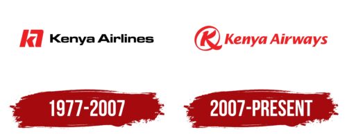
Together, these elements create a positive image of an airline with great potential and unprecedented opportunities. The logo’s design features a personalized mark in a perfect square, with the brand name’s abbreviation indicating leadership. It features a bold, lowercase “k.” This letter has a slight tilt and a clear depiction of a plane directed to the left, subtly incorporated into the right half of the first glyph, resembling a silhouette with two wings. Next is a curved stripe resembling a boomerang, representing a schematic “A.” This capital letter comprises two parts, one integrated into the lowercase “k.” This design symbolizes the unity of the employees, bonded by a shared idea of prosperity. It also demonstrates the connection between different points on the planet that the company is ready to link, forming air bridges. The name is placed on a separate line, showcasing the cohesion of the divisions and their work in tandem. The style of the text conveys the company’s high professionalism, undeniable practicality, accessibility to everyone, and readiness to meet customer needs with impeccable service. For this purpose, a squat sans-serif font with balanced angles and curves was chosen. The red mark symbolizes high energy, a willingness to give 100 percent to achieve dreams, peak enjoyment for passengers, and a drive for leadership. The black color used for the text represents the brand’s stability, serious nature, and thoughtful approach.
2007 – today
When it was time to modernize its identity, the African airline chose red for its logo. Red symbolizes relentless energy, peak emotionality, and the connection to the hot continent. This way, the company focused on authenticity, conveyed through the most intense color.
The other components have smooth features. Curved lines, soft bends, and wavy elements reflect:
- the convenience of the offered services;
- comfortable airplanes;
- accessibility for everyone;
- customer orientation.
Therefore, the emblem lacks rigid shapes and sharp serifs. Everything is smooth and even, conveying a sense of confidence, reliability, and stability to travelers despite scarlet.
The text is in an italic font, adding dynamism. The glyphs appear more lively as if they are moving forward, demonstrating that planes quickly transport passengers to their destinations while aiming to adhere to the arrival schedule.
The symbol has completely transformed: instead of an abstract geometric figure, there is now a specific circle with a capital “K” inside. The lines are thickened in some places, making the circle look like a tilted oval. This also carries symbolism: constant passenger transportation available at any time and the regularity of round-trip flights.


