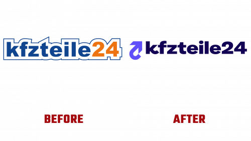
Germany’s leading car parts and accessories brand, kfzteile24, is taking a fresh turn by unveiling a vibrant new visual identity, including the kfzteile24 logo’s new design, symbolizing a contemporary and energetic approach toward the automotive market. The Berlin-based company, known for its triumphant online shops kfzteile24.de, autoteile24.de, and the carpardoo brand, has firmly established itself with an impressive range of over 3 million products.
kfzteile24’s commitment to excellence is demonstrated by its daily dispatch of around 10,000 parcels and an unwavering pledge to provide same-day delivery to commercial customers in Eastern Germany for orders placed before 2 p.m. However, the company’s branding, until recently, seemed trapped in the early 2000s, echoing a dot-com-era look that demanded a thorough makeover.
The old kfzteile24 logo, evidently past its prime, sported a lackluster sans serif typography encased in an oddly off-kilter stroke. While reflective of design aesthetics from the company’s inception, it had become increasingly out of touch with the modern and evolving face of kfzteile24.
With the new kfzteile24 logo design, the company has taken a significant stride towards modernity. This rejuvenated look features an energetic wordmark complemented by a sleek arrow icon. Though the arrow doesn’t harbor any concealed meaning, its flawless execution resonates with the road signage theme, enhancing the identity. The arrow’s animation infuses the brand with zest, while a three-line version enhances readability and allure.
The broader visual identity accompanying the new logo is bright and colorful, steering away from conventional car parts imagery and accentuating the online core of the enterprise. The brand’s fresh visual flair comes alive with elements like bold stripe compositions evocative of road signs and stylized car parts silhouettes. Further enriched by flat 3D animations and typographic stickers, the identity has some room to grow, particularly concerning some generic illustrations that feel detached from the overall theme.
One aspect that begs for attention is the website’s user interface and experience. The current design seems incongruent with the revitalized brand, trailing behind contemporary benchmarks.
In conclusion, the recently reimagined kfzteile24 logo and brand identity signal a welcome shift towards an engaging, up-to-date image that resonates with today’s automotive world. This transformation not only makes buying car parts a more inviting process but also repositions kfzteile24 as more than a mere seller. Instead, it presents the company as an innovative market leader, accelerating with confidence into the future of the automotive industry.


