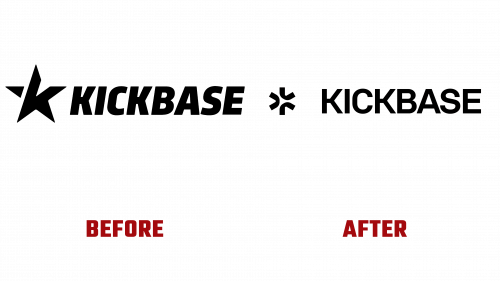
Kickbase, since its debut in 2013, has carved a niche for itself as the go-to fantasy football platform for enthusiasts of Germany’s renowned Bundesliga. With a robust community of 2 million managers globally, primarily based in Germany, Kickbase’s unique selling point has been its unparalleled real-time game experience. Beyond merely offering a fantasy league, it serves as a second screen for passionate football fans, translating the thrill of on-field actions directly into virtual points.
But Kickbase’s offerings extend far beyond mere statistics. The platform offers a comprehensive experience, tracking over 80 distinct game metrics, allowing users to compete in intimate leagues or up the ante by challenging the global community for high-stakes weekly prizes – with rewards as tangible as the coveted Mini Cooper. In a move to enrich user experience, Kickbase Studios consistently dishes out bespoke audio and video content, further enhancing engagement.
With its gaze fixed on expansion, including potential forays into football powerhouses like Spain’s La Liga and a broader ecosystem encompassing diverse content and collaborative endeavors, Kickbase heralded this vision with a rejuvenated brand identity. Crafted by the artistic prowess of Studio zur Strassen, with Mark O’Neill and Paris Seawell at the helm of motion design, this refreshed look encapsulates the brand’s forward-thinking ethos.
The erstwhile logo, characterized by a star motif, was satisfactory but perhaps didn’t fully encapsulate the dynamism of the football universe. The innovative new design, while a departure from the star, feels like its natural progression. This unique emblem, upon closer inspection, captures the essence of a football – rounded yet with a hint of asymmetry. Its edgy internal designs paired with the smoother exterior contours, embellished with nuanced ink-trap notches, bestow the logo with a contemporary, industrial feel.
This modern vibe extends to the wordmark, rendered in a modified version of the Volksans typeface. The “K” in the wordmark echoes the design intricacies of the logo, ensuring a cohesive brand appearance, albeit with a touch of austerity. The standout feature, however, is the bespoke typeface. Mirroring the traits of other industrial fonts, it harmoniously marries squared shapes with gentle curves. Its italicized version adds a dramatic flair, and a dedicated set of numerals further augments the brand’s refreshed look. KB Pitch combined with Volksans encapsulates Kickbase’s identity, seamlessly intertwining the fervor of football with avant-garde design elements.
To sum it up, Kickbase’s branding revamp stands as a clear reflection of its progressive journey, seamlessly blending the passion for football with state-of-the-art design elements.


