Young projects presented on the service are immediately visible on the emblem. The Kickstarter logo is like tender sprouts that have just sprouted from the ground. The sign hints at monetary investments that can be used to support project participants.
Kickstarter: Brand overview
| Founded: | April 28, 2009 |
| Founder: | Perry Chen, Yancey Strickler, Charles Adler |
| Headquarters: | Brooklyn, New York, U.S. |
| Website: | kickstarter.com |
Meaning and History
The main focus of the platform is creative projects. They can represent any field: design, film, technology, music, publishing, comics, fashion, dance, theater, photography, etc. In total, there are 13 groups and 36 subgroups. The collection of investment funds from the public follows the same scheme for all. Applicants themselves set the deadline and choose the purpose of funding. If the conditions are not met (the goal is not achieved on time), the money is not collected.
Commissions drive Kickstarter. Moreover, it is available to potential sponsors and applicants from all over the world. However, unlike most other investment or fundraising forums, this site does not put forward ownership of works or projects. No wonder the style of her logo looks as friendly and attractive as possible. He immediately tunes in to the positive. In total, she has her two emblems.
What is Kickstarter?
It is a web resource for attracting cash investments. He helps to raise funds to implement various crowdfunding projects and finances creative, scientific, technical, production ideas of a different nature.
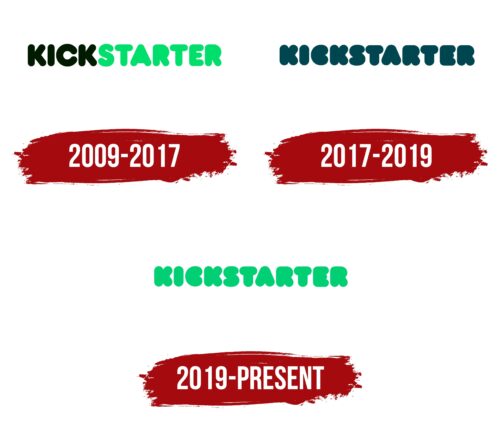
2009 – 2017
The first logo contains the name of the crowdfunding company. The creators decided to focus on her activities. To make everything clear at once, they visually divided the word into two parts, highlighting them with two shades of green: “KICK” is written in dark spruce, “STARTER” – in mint-emerald – capital letters, thick, bold, with rounded ends. “A” and “R” have no internal gaps.
2017 – 2019
In its current version, the designers have changed the style of writing the word “Kickstarter”: now it is one-color. Signs are blurred due to the lack of in-letter gaps. Symbols are recognizable only by their contours. The letters are very wide, sans serif, rounded, so they look like balloons.
2019 – today
The new Kickstarter logo, like all previous ones, contains the name of this crowdfunding platform. The font has not changed at all: the inscription consists of bubble glyphs with wide rounded lines. The absence of intra-letter gaps makes the word mark original and recognizable. But the color is now completely different: the familiar dark turquoise has been replaced with a light green shade, similar to the one used for the second half of the word (“STARTER”) in the 2009-2017 emblem. The transition from a dark palette to a light palette made it possible to make the letters more legible, despite their massiveness.
Kickstarter: Interesting Facts
Kickstarter started in 2009 and has become a game-changer in crowdfunding, helping artists, musicians, filmmakers, designers, and other creators get their projects funded by the public. This platform has made funding for creative projects accessible and built a community that supports new ideas.
- First Funded Project: The first project to get funded was “Drawing for Dollars” by Dan McComas in 2009, raising just $35. It showed that even small, simple ideas could find support.
- Big Successes: Some Kickstarter projects have been huge hits, like the Pebble Smartwatch, which raised over $10 million in 2012. This proves that Kickstarter can support big tech projects, too.
- An all-or-nothing Approach requires projects to hit their funding goal by a deadline or no money changes hands. This pushes creators to set realistic goals and backers to act quickly.
- Worldwide Platform: Kickstarter isn’t just in the U.S.; it helps creators worldwide, bringing various projects to life and expanding the backer community.
- Wide Range of Projects: With categories from art to technology, Kickstarter supports various creative efforts, showing flexibility and broad appeal.
- Supporting Good Causes: It’s also a platform for projects with social or environmental goals, like “The Ocean Cleanup,” showing its use for global good.
- Modern Patronage: Kickstarter updates the old idea of patronage, letting anyone support creators directly, bypassing traditional funding routes like publishers or studios.
- Creator Control: This allows creators to fully control their work, leading to more innovative and unique projects.
- Engaging Community: Backers often get rewards, building a community around each project, with backers invested in seeing the project succeed.
- Creative Industry Impact: Kickstarter has significantly impacted the creative industry, offering an alternative funding path for emerging talents, launching careers, and bringing innovative products to the market.
Kickstarter goes beyond just funding; it fosters a culture of supporting creativity and innovation, allowing creators worldwide to bring unique projects to life and redefine creative possibilities.
Font and Colors
It is a wordmark developed from the name of a web service. The Kickstarter lettering is stretched out over a white background. In the opening version, it is two-part, which are highlighted in different colors. But in the current version, the word is unified and executed in a different font, which makes the letters seem super-thick.
Both Kickstarter emblems use a rounded typeface. The style is grotesque, echoing two types of fonts: Frankfurter Normal and RNS Baruta Black. Moreover, the letters are so thick that they do not form gaps. There is only a small border between the signs themselves.
The palette is divided into two periods: before 2017 and after. Previously, two versions of green prevailed: dark spruce and emerald. Now the logo is monochrome and consists of dark cyan color.
FAQ
What is the slogan of Kickstarter?
The company’s slogan is “Bring a creative project to life.” This slogan embodies the company’s mission: to provide a platform for creators to share innovative ideas and seek funding from a community of backers who believe in their vision.
The slogan reflects the brand’s core mission to support creativity. The brand offers artists, designers, filmmakers, musicians, and creators a space to showcase their projects and gather the resources needed to make them real, empowering individuals to pursue their passions.
“Bring a creative project to life” emphasizes the power of community support. It highlights how backers play a vital role in turning dreams into reality. This message resonates with creators seeking funding and supporters who want to be part of the creative process, as well as the brand’s commitment to fostering creativity and innovation through community support.
When did Kickstarter come out?
The company launched on April 28, 2009. Since then, the platform has grown and evolved. To balance principles and profits, it became a public benefit corporation.
As a Public Benefit Corporation, the brand focuses on social good and community impact. This ensures the company supports creativity and innovation while maintaining ethical practices. The platform has funded many projects, from films and music to technology and design, creating a vibrant community of creators and supporters.
Is Kickstarter still a thing?
The brand is still active and is a major crowdfunding platform for creative projects. Kickstarter, PBC is an American public benefit corporation based in Brooklyn, New York. The platform helps create creative projects by connecting creators with backers worldwide.
The brand supports creativity in many fields, including art, design, technology, film, and music. The platform stays relevant by evolving and adapting to the needs of creators and backers. It offers a user-friendly interface, effective marketing tools, and strong project management support. This helps creators successfully launch and complete their projects.
Who invented Kickstarter?
The brand was created by Perry Chen, Yancey Strickler, and Charles Adler. They wanted to build a platform where people could fund creative projects through a community of backers.
Perry Chen devised the idea in 2001 when he wanted to organize a concert but didn’t have the money. He imagined a system where fans could pledge money to support the event. If enough money were raised, the concert would happen. This idea eventually became the Kickstarter model.
The company officially launched on April 28, 2009. It quickly became popular because it offered a new way for creators to fund their projects without relying on traditional methods like loans or grants.
The brand has become a leading crowdfunding platform, helping to bring many creative projects to life. Perry Chen, Yancey Strickler, and Charles Adler’s vision and collaboration have changed how creative ideas are funded and realized.
What font is the Kickstarter logo?
The logo uses the Frankfurter font, known for its bubble, round, and smooth appearance. This sans-serif font gives the logo a friendly and approachable look, matching the brand’s mission to foster creativity and community.
Frankfurter’s playful design makes the logo stand out and gives it a unique identity. The font’s style conveys fun and creativity, appealing to artists, designers, and other creatives who use the platform.
This font gives the logo a friendly and approachable look, aligning with the brand’s mission to support creativity and build a community.
What is a Kickstarter campaign?
A Kickstarter campaign is a fundraising effort on the Kickstarter platform designed to support creative projects with clear goals and strategies. These projects include art, design, technology, film, music, and games.
To start a campaign, creators present their ideas in detail, including descriptions, images, and videos. They set a funding goal and a deadline. The campaign page lists the rewards backers will get for their support, ranging from thank-you notes to exclusive merchandise or early access to the product.
Backers pledge money to help the creator reach their funding goal. If the campaign meets its goal by the deadline, the pledged funds are collected, and the creator gets the money to bring the project to life. If the campaign doesn’t meet its goal, no money is collected, and backers are not charged.
The campaigns are popular because they let creators control their projects and connect directly with their audience.
