


![]() Kids WB Logo PNG
Kids WB Logo PNG
The Kids WB logo is full of childhood, bright colors, dreams, and joy. The emblem transports the viewer to a fantasy world, protecting children’s hearts and minds from the early onset of maturity. The sign indicates the channel’s child-oriented content.
Kids’ WB was planned by Time Warner in July 1994, months before The WB Television Network launched on January 11, 1995. Warner Bros. Entertainment and Tribune Broadcasting created the network, and its children’s block was designed to compete with Fox Kids. Jean MacCurdy, head of Warner Bros. Television Animation, was put in charge.
Kids’ WB debuted on September 9, 1995, with a three-hour Saturday block and a one-hour weekday afternoon slot. Its first season brought Animaniacs back to Warner Bros. from Fox Kids, alongside The Sylvester & Tweety Mysteries, Batman: The Animated Series, and Freakazoid!, which was connected to Steven Spielberg’s Amblin Entertainment. Warner Bros. also used Kraft Foods promotions and an AOL preview for early online marketing.
From 1995 to 1998, the block relied on Warner Bros. Animation titles such as Pinky and the Brain, Batman Beyond, and Static Shock. In 1999, Kids’ WB acquired Pokémon, which had previously been syndicated on Fox-affiliated stations. By May 1999, Pokémon reached a 40% audience share among children. Yu-Gi-Oh!, Jackie Chan Adventures, and “Mucha Lucha!” later joined the schedule.
In 2001, a weekday slot briefly became Toonami on Kids’ WB, bringing Cartoon Network titles such as Sailor Moon and Dragon Ball Z to broadcast TV. After WB and UPN merged into The CW in 2006, Kids’ WB moved there on September 23. Cable competition and stricter children’s ad rules weakened the block, and its final broadcast aired on May 17, 2008. The online version launched on April 29, 2008, using Looney Tunes, Hanna-Barbera, and DC Comics archives, and closed on May 17, 2015.
Meaning and History
![]()
The block’s logo changed several times during its development. However, the program’s affiliation with a well-known film company is evident in all versions.
What is Kids WB?
Kids WB is a children’s programming block on The WB network, which aired hits such as “Buffy the Vampire Slayer,” “Smallville,” and “Supernatural.” The block began in 1995 and closed for TV in 2008, transitioning to an online space.
1995 – 1997
![]()
At the beginning of its existence, the block was little known and was broadcast for only an hour a day. It targeted boys, while another company channel, Secret Slumber Party, targeted girls.
The program’s first logo is done carelessly, like a sketch. Elements are chaotically scattered across the base and grouped in non-standard ways. Combining three bright colors adds saturation to the composition, and the absence of fill-in in some elements creates a sense of incompleteness.
Overall, the logo resembles a child’s drawing, which may have been the original intention.
The composition’s basis is a yellow circle. It indicates the broadcasting point and the button on the remote. It embodies a special enclosed children’s universe, alluding to the unity of the four brothers who organized the studio. This impression is reinforced by the yellow letter B (Brothers), which has become part of the circle.
Behind the “B” is a partially colored exclamation mark. It adds expression to the image, hinting at the dynamics of changing events, a short and fiery animated series.
Like a lightning bolt, the letter W extends beyond the circle, symbolizing a desire to grow and increase airtime. The element indicates the presence of a larger, older companion to the film company.
The love for children is inscribed in red: Kids.
The abbreviation WB stands for Warner Bros., but can also be interpreted as “World Bank.” This is significant because the channel featured the studio’s best and most famous animated films.
1997 – 2008
![]()
The programs became popular, and their broadcast times were extended to morning and evening releases, totaling 3 to 4 hours a day. The logo underwent a rebranding, bringing its style closer to Warner Bros. Studios, where commercials for The WB were filmed.
The emblem elements were aligned and grouped. However, the composition remained bright and colorful: white letters and inscriptions, outlined in yellow, were set against a purple background, with a lilac exclamation mark and surrounded by a bold red line.
The colorful details symbolized the world of childhood. Red added energy, yellow brought joy, purple hinted at knowledge and development, and white pointed to purity, the audience’s youth, and the absence of harmful content for children.
Although other significant events occurred on the channel since 1997, such as renaming the daytime block to Toonami in 2001 and exchanging shows with Cartoon Network Toonami, or the even more significant 2006 merger of The WB with UPN into The CW, the logo did not change.
The merger of unprofitable channels did not bring profit, and broadcasting was discontinued after two years. The 5-hour Saturday airtime was sold to 4Kids Entertainment. In the same year, Warner Bros. announced the channel and its children’s block would relocate to the online space. Kids WB received five sub-blocks: a family block, a section for toddlers, and three blocks broadcasting specific shows only (Scooby-Doo, Looney Tunes, and DC Kids).
2009 – 2015
![]()
The channel’s logo becomes more harmonious. It hints at three themes:
- The studio owner’s visual identity inspires the overall motif. The emblem’s structure resembles the film company’s shield, featuring the first two letters of the name.
- The left-leaning inscription and the resulting contours of the figure resemble a heart. The image communicates love for children and passion for their work. Channel and website staff live for the cartoons.
- The image shows the first program logo featuring the left-leaning inscription, demonstrating continuity for the resource and the popular network.
The word “Kids” is placed above the letter W, emphasizing the importance of the children’s world.
2015 – 2016
![]()
By 2013, the content had declined sharply, likely due to low demand. In 2015, the site split into three separate ones for Scooby and the other two shows. The Kids WB programs disappeared.
All resources had separate websites but belonged to a common group named “Children’s City” on the emblem. The logo was designed as a rectangular plaque with a gradient from sandy to yellow and a blue inscription.
The combination of colors transports the viewer to a joyful world of childhood. The gradient shows the “rising degree of rise” in pleasure due to the appearance of three favorite sites rather than one.
2016 – 2019
![]()
A year later, Warner Bros. decided they had made a mistake by closing the well-known brand, so they combined the two children’s cartoon channels into WBKids GO! The new portal adopted a visual identity closely aligned with the film company’s logo, highlighting the site’s affiliation. The word “kids” was added at the bottom of the Warner Bros. shield, with playful, dancing letters, to emphasize the child-oriented content. The orange color of the inscription indicated a special community where children were united by their love for cartoons.
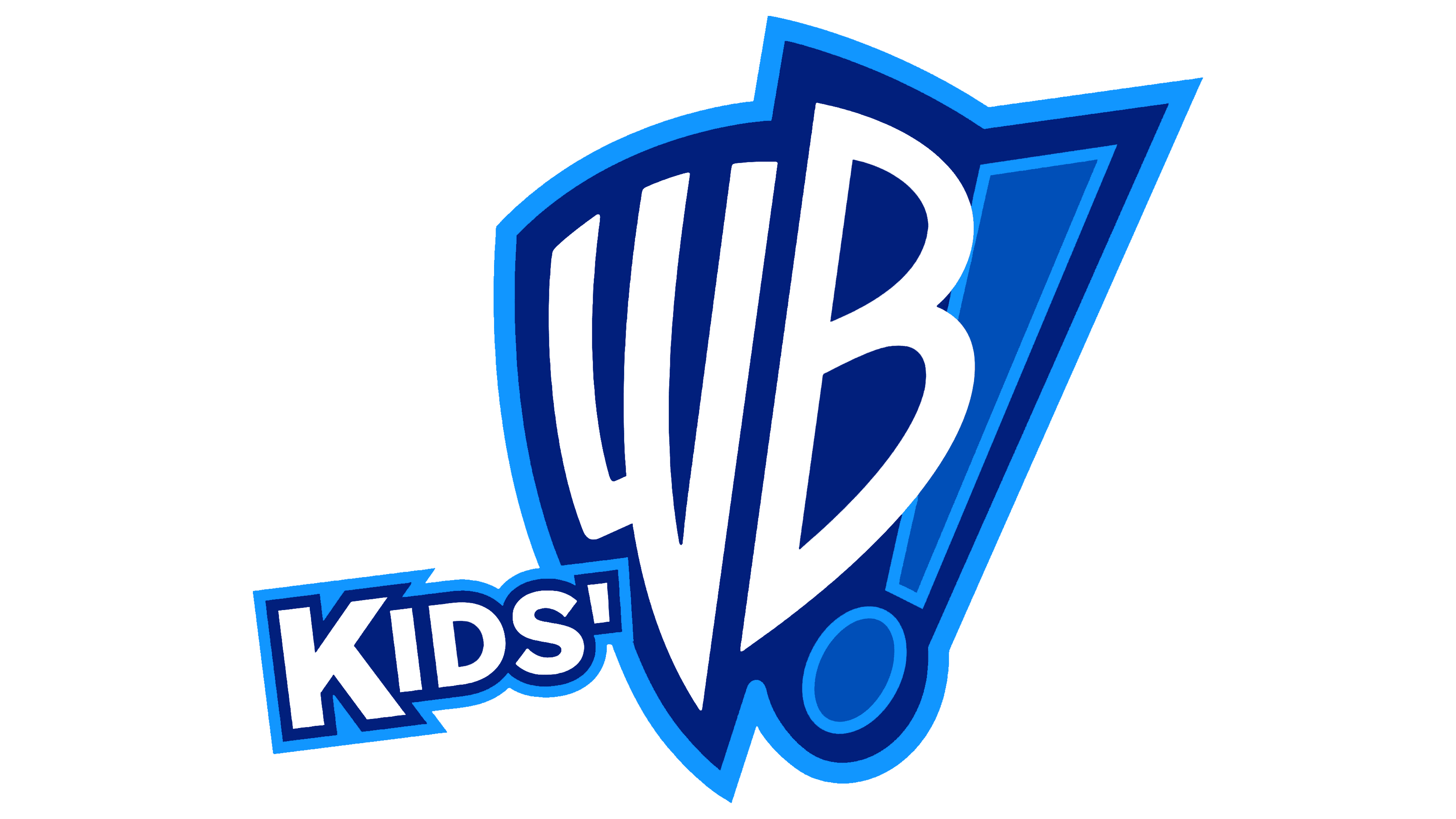
2019 – today
![]()
The site significantly expanded its collection, including ABC hits “The Flintstones” and “Tom and Jerry” from Metro-Goldwyn-Mayer.
The resource’s logo maintained the focus on Warner Bros. The image fully corresponds to the film studio’s emblem. It’s a blue shield with the studio’s name abbreviation, where the letters W and B repeat its shape.
The history of the shield, which appears on all company logos today, is not well documented. The shield partially resembles the coat of arms of the Polish city of Krasnosielc, where the Warner family, who founded the studio, emigrated. This reflects the heraldic element and the careful attitude toward a person’s inner world.
From the children’s channel perspective, the shield symbolizes the protection of childhood and the creation of a universe filled with dreams, joy, and adventures.
Please let me know if you need any further translations.
Font and Colors

The emblem’s main color is sky blue, symbolizing childhood, dreams, and happiness. Cartoons transport children to a fantasy world, allowing them to develop their imagination. Blue is often considered a boy’s color, confirming the orientation towards a male audience.
The white color of the uppercase letters expresses purity, good intentions, and the program’s focus on young viewers.