The emblem looks like a piece of canvas and directly indicates the company’s direction. In addition to fabrics, the buyer can find everything necessary for housekeeping in the network stores. This is exactly what the KiK logo says.
KiK: Brand overview
| Founded: | April 1994 |
| Founder: | Stefan Heinig, Tengelmann Group |
| Headquarters: | Bönen, Germany |
| Website: | kik.de |
Meaning and History
KiK is a joint project of the Tengelmann Group holding and the entrepreneur Jost-Stefan Heinig. This chain of discount stores was established in 1994 and immediately became successful thanks to its business model. She has been selling inexpensive textiles from the first days, making them generally available to all consumers. Even its name, which stands for “Kunde ist König” (“The client is king”), speaks of customer focus.
The word “kik” is reflected in the logo: it is in italics and shown inside a square. The design changed only once – in 2013 when executives invested about 20 million euros in improving the branches and renewing the corporate identity.
What is Kik?
KiK stands for “Kunde ist König,” which translates to “Customer is King” and shows the extent to which the clothing store chain cares about customer comfort. KiK has its headquarters in Germany and approximately 3,500 retail locations in various European countries. It sells inexpensive toys, home textiles, footwear, and clothing for the entire family. The assortment rarely changes, as the company focuses on basic style.
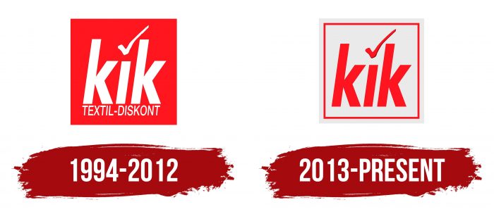
1994 – 2012
In its first year of operation, the German textile discounter began using the square logo in red. The rectangle contained two white captions: the company’s name with a checkmark instead of a dot above the letter “i” and the phrase “TEXTIL-DISKONT.” The latter rather accurately characterized the main specialization of the enterprise.
2013 – today
KiK has spared no expense to overhaul its branches and develop a new wordmark as we approach its tenth anniversary. The designers have modernized the square a bit, making it silver and adding a quadrangular frame. The center acronym turned red, and the word “TEXTIL-DISKONT” was removed because customers already knew what the business was doing.
KiK: Interesting Facts
KiK is a store in Germany that sells cheap clothes and other things for your home. They like to ensure their customers are happy and don’t spend too much money.
- How It Started: In 1994, Stefan Heinig and the Tengelmann Group opened the first KiK store in Düsseldorf, Germany. Now, KiK has more than 3,500 stores in several European countries.
- Cheap Stuff: KiK sells all kinds of things like clothes, stuff for your house, toys, and things you might want for different seasons, all at really low prices. This is why many people who want to save money like shopping there.
- Growing Fast: KiK got big, really fast. In just a few years, they had opened their thousandth store. They keep opening more stores in Austria, Slovenia, Hungary, and the Czech Republic.
- Thinking About the Planet: Although KiK is all about low prices, it also tries to be good for the environment. It sells things made from organic cotton and recycles old clothes.
- Jobs for Lots of People: KiK is a big European company that has hired many people. Its workers are happy and have chances to get better jobs.
- Shopping Online: KiK also lets you buy things online, so you don’t have to go to the store. This is how they keep up with changing shopping habits.
- Helping the Community: KiK helps out with different causes, like helping kids, helping after disasters, and making sure everyone is included in the community.
- Selling More Than Clothes: Besides clothes, you can also find things for your house, beauty stuff, things for pets, and even some food at KiK. This means they have a little bit of everything.
- How They Advertise: KiK’s ads tell you they sell affordable stuff for your whole family. Their slogan, “Customer is King,” shows they care about making customers happy.
KiK has grown from just one store to a big European name by selling affordable things and caring about customers’ needs. They’ve faced some challenges but keep getting bigger and staying important in the market for cheap retail.
Font and Colors
The checkmark above the letter “i” can be interpreted as a quality mark and confirmation of the widest range. It has survived even after the global identity update because it is the most recognizable KiK symbol that buyers are used to seeing in combination with the square shape of the logo. The minimalistic design does not imply the use of additional design elements. The discounter’s emblem is just short lettering enclosed in a laconic geometric shape.
The first-word mark KiK Textilien und Non-Food GmbH contained a three-letter brand name, and the phrase “TEXTIL-DISKONT,” due to its unusual pronunciation and spelling (from the point of view of German grammar), managed to become a separate trademark. The developers used two different fonts for the text. The first is bold sans-serif italic lowercase. The second is an oblique grotesque in the upper register. The typeface of the word “kik” has not changed since the redesign.
But the color scheme, on the contrary, has evolved noticeably. The creators of the new logo have abandoned the classic red + white combination and opted for a red and silver palette. Moreover, they changed the distribution of colors, making the square light and placing a bright company name in it to immediately catch the eye. These experiments are part of a massive store redesign that has replaced red with silver, which now dominates KiK’s logo and every branch’s interior.
KiK color codes
| Neon Red | Hex color: | #ff151f |
|---|---|---|
| RGB: | 255 21 31 | |
| CMYK: | 0 92 88 0 | |
| Pantone: | PMS Bright Red C |
| Platinum | Hex color: | #eaeaea |
|---|---|---|
| RGB: | 234 234 234 | |
| CMYK: | 0 0 0 8 | |
| Pantone: | PMS 663 C |
