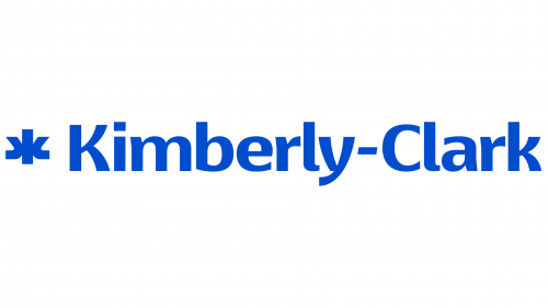
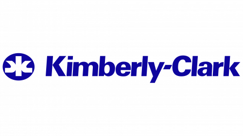
Kimberly-Clark, a leader in personal care products, has introduced a new brand identity designed by the Chicago-based agency Someoddpilot. This updated look reflects the company’s modern approach while honoring its heritage. The goal is to ensure clarity and recognizability across all platforms.
The new logo features a sleek monogram and a distinctive wordmark. The wordmark uses Isaco Type’s Basel Neue Bold, a typeface known for its clean, modern lines. This font choice emphasizes a strong visual presence with tighter kerning and a uniquely tilted hyphen. The letters, especially the curved segments of the “K,” “b,” and “y,” add a subtle touch of expressiveness within a corporate context.
A notable change in the identity is the redesign of the K-C monogram. Previously an oval, it now features more balanced and fluid curves. This aims to create a friendlier and more approachable look while maintaining legibility at various sizes. The gentler curves suggest a softer, modern character without straying too far from the previous design.
The redesign incorporates Lato, a versatile font designed by Łukasz Dziedzic. Lato’s widespread availability and extensive style range make it a popular digital and print media choice. Its inclusion in Kimberly-Clark’s branding ensures consistency across various applications, from packaging to digital interfaces.
The new color palette features clean, modern tones that align with Kimberly-Clark’s commitment to innovation and quality. The primary colors are designed to be versatile, working well in both digital and print formats. These colors help create a cohesive visual language that supports the brand’s overall message.
Graphic elements emphasize simplicity and clarity. Clean lines and precise forms reflect the company’s focus on efficiency and reliability. The logo’s design ensures it stands out across different mediums, whether on product packaging, websites, or corporate documents.
The new identity’s use of space and alignment contributes to a well-balanced and professional appearance. Each element is carefully positioned to create a harmonious and visually appealing layout. This attention to detail underscores Kimberly-Clark’s dedication to excellence in its operations.


