


![]()
Kinnie, Malta’s national soft drink known for its bittersweet orange flavor and Mediterranean herbs, has unveiled a new look. The rebrand, developed by the agency bluemarlin, aims to preserve the brand’s heritage while making it relevant to a new audience.
Since its launch in 1952, the drink has become an integral part of the Maltese identity. Its flavor and character are tied to local culture, and a Kinnie bottle is associated with coastal leisure and a sunny climate. However, the brand faced the challenge of expanding beyond its home island. To enter the international market, it needed a modern visual language that could appeal to younger consumers while maintaining authenticity.
![]()
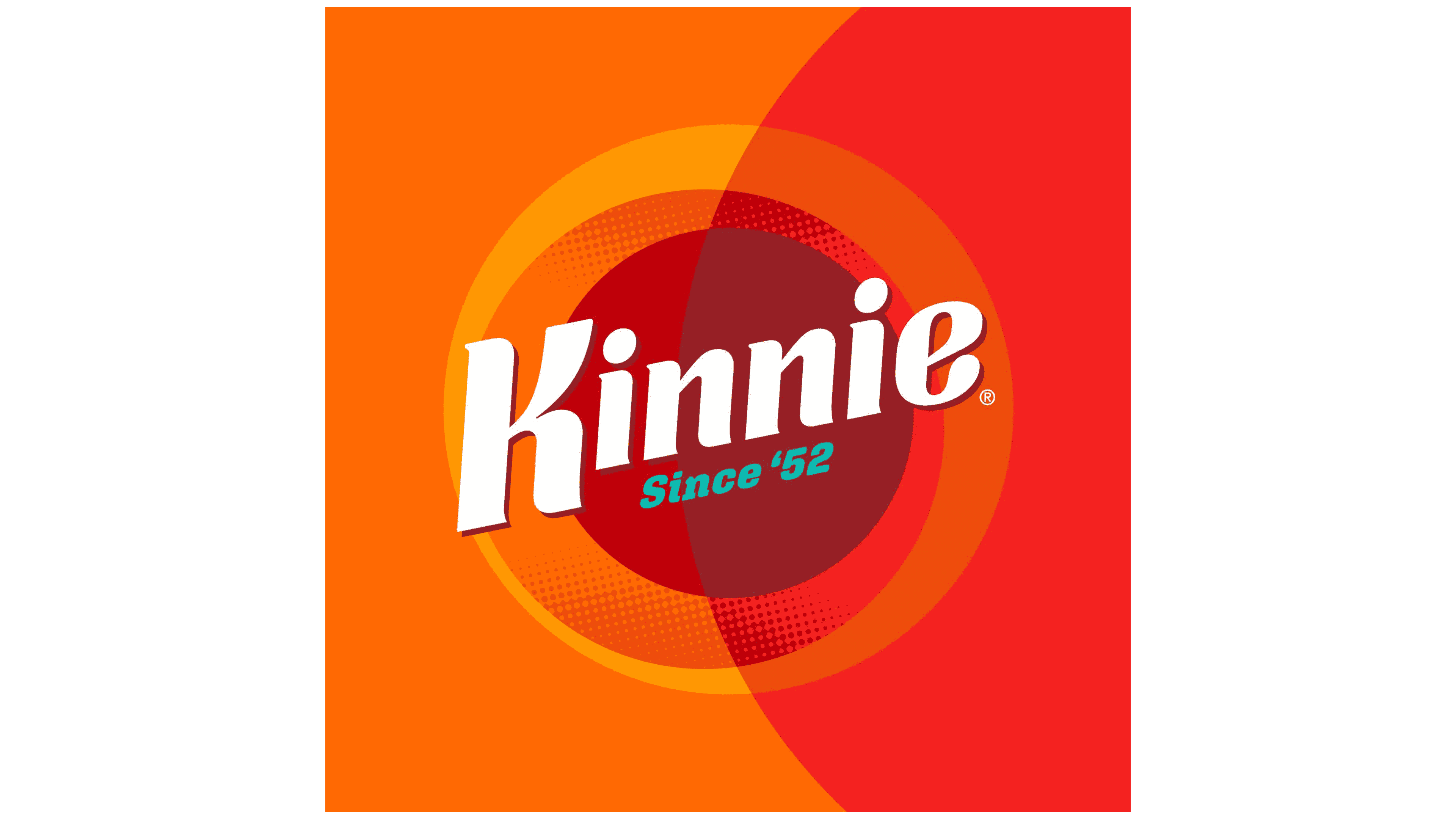
The new logo retains the spirit of the 1950s but has been adapted for the digital environment. Energetic slanted letters create an impression of lightness and movement. The letter K has been given an elegant curve that adds dynamism to the logo. The inscription Since ’52 emphasizes the brand’s history and continuity.
The logo’s form is connected to the sun and citrus fruits, which are key symbols of the drink. The graphics use gradients and soft shadows that reference Kinnie’s flavor balance. The color system combines warm orange tones with contrasting turquoise and dark red accents. The palette reflects the drink’s bitterness and sweetness, making the style distinctive and recognizable.
The composition incorporates textural elements, including brushstrokes, color splashes, and graphic lines. These visual techniques make the identity more flexible. It is applied across different formats, including packaging, outdoor advertising, social media, and digital interfaces.
The rebrand highlights Kinnie’s effort to combine tradition and modernity. The packaging remains tied to the drink’s historic image but visually appears modern to attract younger consumers and support entry into new markets.
![]()
The updated style will be applied to bottles, used in advertising campaigns, featured on social media, and showcased at international events. The goal is to preserve Kinnie’s position as a symbol of Malta while presenting it as a drink appealing to a global audience.