![]() Klasky Csupo Inc Logo PNG
Klasky Csupo Inc Logo PNG
The status of this company is “complicated,” as its history is not so much rich as it is confusing. Therefore, the Klasky-Csupo logo is also intricate, like the company itself. However, the complexity does not interfere with its readability: each element is separate but visible. This approach to identity makes the animated brand original in the world of children’s fantasies.
Klasky Csupo was founded in Hollywood in 1982 by American designer Arlene Klasky and Hungarian animator Gabor Csupo. Csupo had moved from Hungary to Los Angeles in the late 1970s, where he met Klasky. The studio first worked on commercial animation and music videos, building a small client base before moving into television.
The breakthrough came in 1987, when Fox hired Klasky Csupo to produce animated shorts for The Tracey Ullman Show. These segments introduced the early screen version of The Simpsons, created by Matt Groening. When The Simpsons became a full Fox series in 1989, Klasky Csupo produced its first three seasons before production shifted elsewhere.
The studio’s own major success began in 1991 with Rugrats on Nickelodeon. Created by Arlene Klasky, Gabor Csupo, and Paul Germain, the series followed babies as they interpreted the adult world through their own logic. Its rough, uneven animation style set it apart from Disney’s smoother look. Rugrats ran until 2004, returned in 2021, and was followed by The Rugrats Movie in 1998, Rugrats in Paris in 2000, and Rugrats Go Wild in 2003.
During the 1990s and early 2000s, Klasky Csupo became one of Nickelodeon’s main animation partners. Its other series included Aaahh!!! Real Monsters in 1994, The Wild Thornberrys in 1996, and Rocket Power in 2001, while Cartoon Network was building its own original animation lineup. The studio grew to more than 500 employees. Still, it later scaled back operations after major shows ended and the animation market changed.
Meaning and History
![]()
A creative team is a complex structure. This is vividly confirmed by the animation studio Klasky-Csupo, which has grown from two people to 550. It does not have a static identity: it is always at work and in creative search, so at different times, it collaborated with various TV channels and film studios. It has many successful projects, well recognized by its original emblem, as intricate as its owner.
The logo’s defining characteristic is its multi-structured nature, which harmoniously forms a single sign. With its help, designers managed to convey the team’s versatility, openness to various projects, and readiness to take on work of any complexity by segmenting it. At the same time, each emblem fragment looks whole and original.
What is Klasky-Csupo?
Klasky-Csupo is an American animation studio from Hollywood (Los Angeles, California). It was formed in 1982 by producer Arlene Klasky and animator Gabor Csupo, who named it after their last names. There are many legendary periods in its history. For example, it shot the first episodes of The Simpsons for Gracie Films and 20th Century Fox, and worked with Nickelodeon on the Rugrats series. Now the company is engaged in video, reality shows, comics, animated clips, and cartoons.
1989 – 1999, 2001 – 2002
![]()
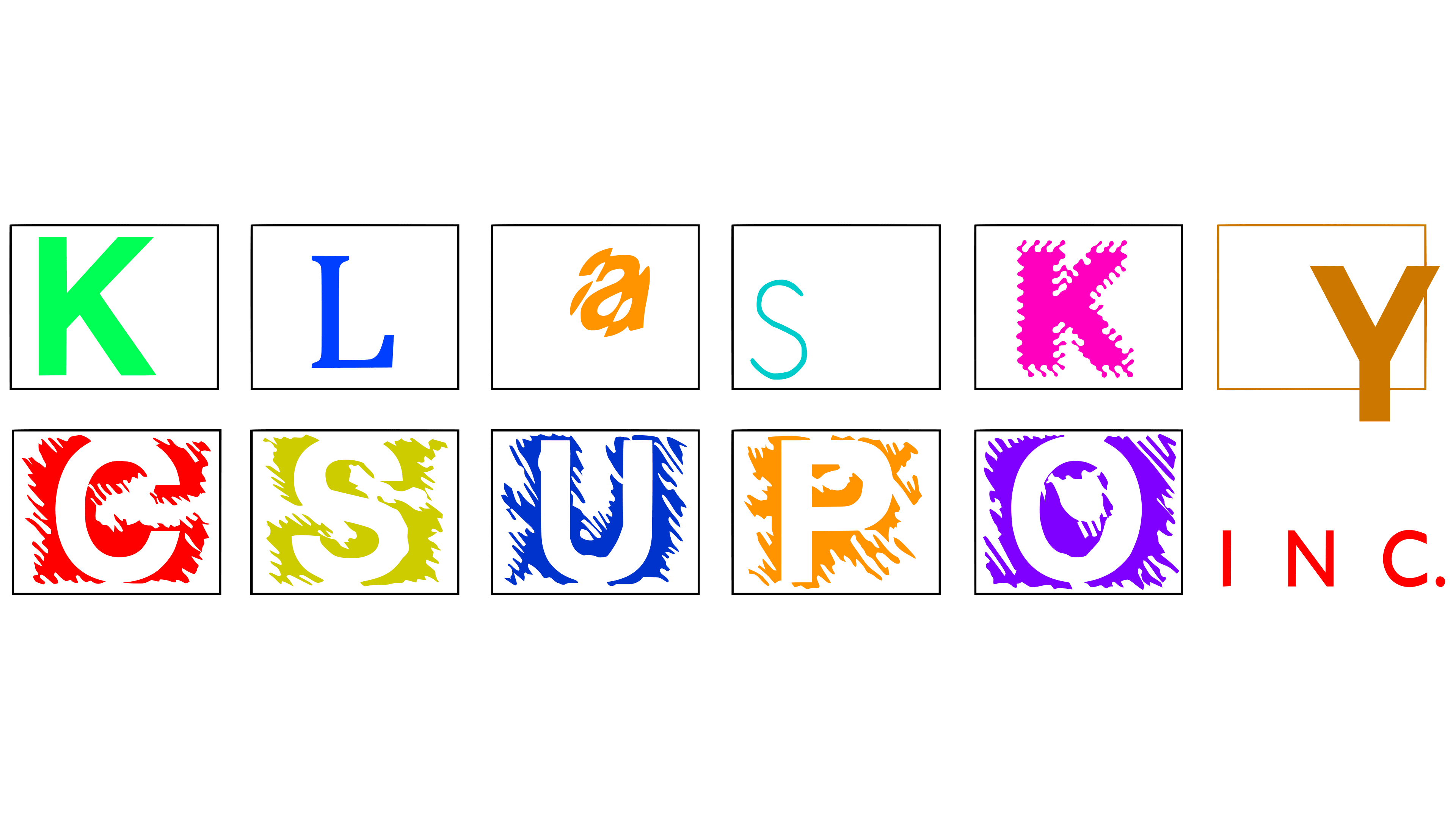
The Klasky-Csupo logo consists of the name, where each letter is separated by its own “home.” Of course, glyphs are distinguished not only by their locations but also by their appearance. Their space is marked by miniature rectangles corresponding to the number of letters in the word.
- The top line contains six identical geometric figures, each with its own symbol. Some of them have a clear form (for example, the first “K”), others have a blurred one (the second “K”). The capital “S” is made from a thread-like, curved line; “a” seems to be assembled from shards of glass; and the leg of the purple “Y” extends far beyond the bottom border.
- The second row contains five vertical rectangles, each representing a single letter from the surname Csupo. Here, all signs are identical: white, standing out in negative space, hatched with small black stripes. The spot for the sixth figure is taken up by the inscription “Inc.” aligned on both sides. It’s smaller than the other symbols and much thinner.
Several uppercase font types are used for the glyphs. The only exception is “a”: it is the only one that is lowercase.
1991 – 2008, 2012, 2021 – today
![]()
Modernization touched upon the form of letters. The structure of the animation studio’s emblem remained the same: a two-level inscription with glyphs in separate rectangles. In the top line, there are no identical signs; they all differ in style and font. “S” is shifted to the center and enlarged; “a” is extended diagonally; the first “K” has merged with the rectangle’s edge; and the second has become stroke-like and spiky. In the lower row, the letters were set against a solid black background, so they appear as if depicted in negative space.
2003, 2008, 2016
![]()
In the Klasky-Csupo logo of this period, there are rectangles and squares. They are expertly balanced, so they are almost unnoticed. This was achieved by transforming the letters within them. The glyphs are shifted so much that they harmonize with the geometric figures, preventing them from defining their shapes precisely. For instance, the letters in the first row are segmented and placed on the dividing lines, while in the second row, they are brought to the edge so they merge with the outer background. The upper and lower levels are united by a thin black-and-white strip (depending on the line’s location).
Font and Colors
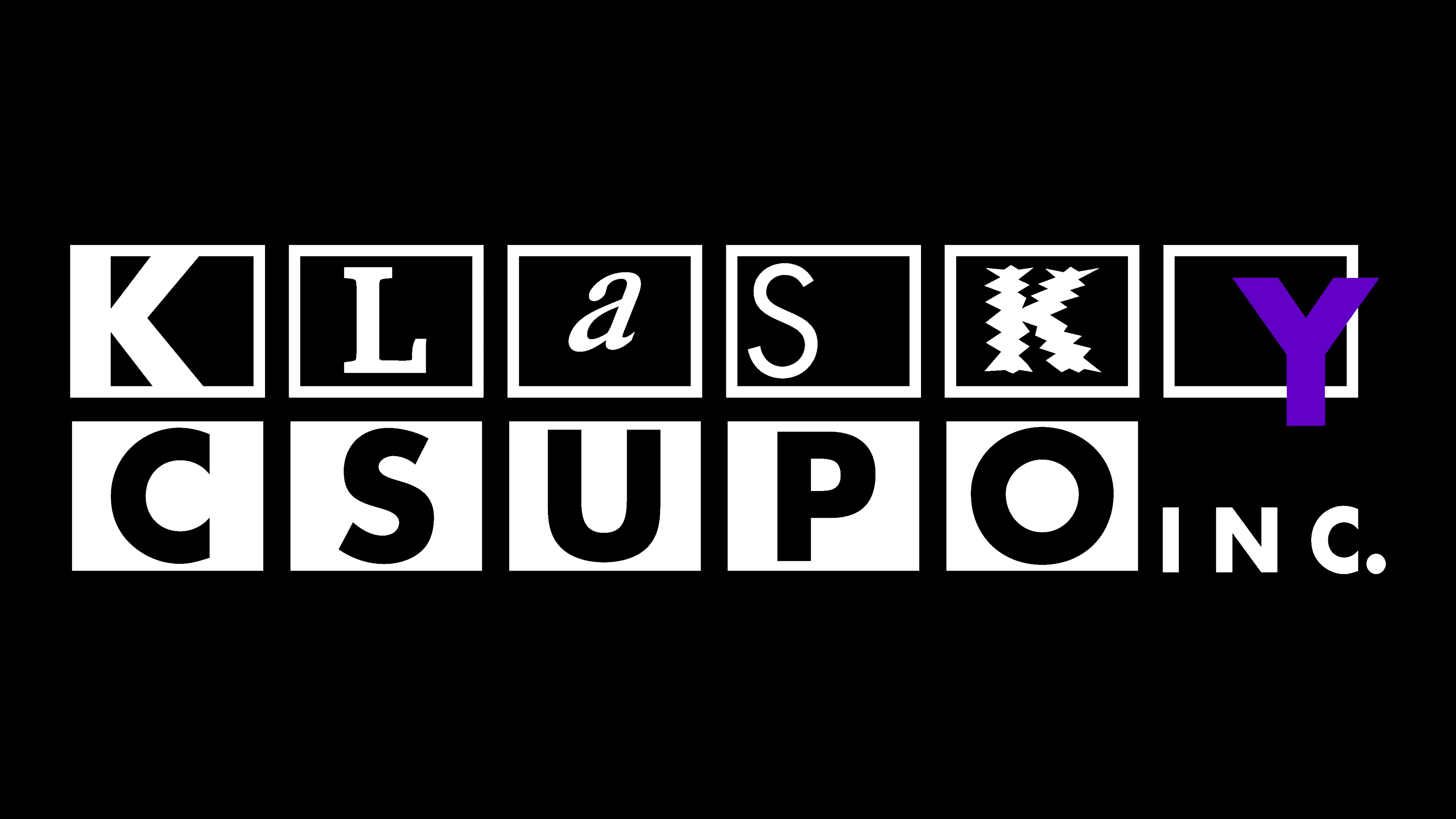
This is a textual symbol, so its typography plays a primary role. Especially since each letter virtually doesn’t repeat any other. They are set in different fonts, depending on the version and the year the emblem appeared. For “a,” the designers used Times New Roman and Shatter; for “L,” Permian and Melior; for “K,” Helvetica Bold; for “CSUPO,” Keedy Sans Bold and Futura. The latter font type also sets “S,” “Y,” and “INC.” Also, the logo includes inscriptions made in Letraset Process and Garish Monde (KLaSKY).
Unlike the variety of fonts, the palette is sparse and monochromatic. But there is an exception: among the black-and-white spectrum, there is one bright spot. It’s the letter “Y,” colored a pleasant purple.