The Kmart logo is a testament to the former grandeur of the chain’s department stores. The emblem has monumentality, reliability, and superiority over competitors. To buyers, symbols point to spacious areas filled with goods.
Kmart: Brand overview
| Founded: | 1962 |
| Founder: | S. S. Kresge |
| Headquarters: | Hoffman Estates, Illinois, US |
| Website: | kmart.com |
Meaning and History
Starting in 1897 as a 5-cent store, and from 1962 as Kmart, discount stores gradually developed into a whole network. In 1912, the founder of the corporation, Sebastian Spering Kresge, had 85 stores with a turnover of 10 million dollars; in 1924, already 257. Later, his successors continued active expansion, which peaked in the 90s with the number of outlets – 2486, located worldwide. However, supermarkets could not properly build a strategy and keep prices low, which led to an outflow of customers to Walmart and bankruptcy declared in 2002. The new management that brought Kmart and Sears together was not interested in the brand’s prosperity and led it to a second bankruptcy in 2018.
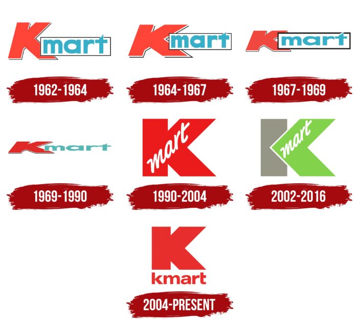
The logo has a long history associated with the change of brand owners. There are six main transformations of the emblem. However, the corporate letter K has always remained part of the composition.
What is Kmart?
The American chain of big-box stores was opened by S.S. Kresge Company in 1962 and operated worldwide. Today, the brand is owned by Transformco and is represented by 33 stores in the United States.
1962 – 1964
Since 1962, S.S. The Kresge Company began opening large department stores called Kmart. The idea for the emblem and its red and turquoise colors were carried over into the new logo from the old one used by S.S. Kresge for their earlier stores (two red S’s on top of each other and a capital K in turquoise representing the entrepreneur’s first and last name).
For supermarkets, only K was used, adding the word “market” to it as an abbreviation for Kresge mart.
A red three-dimensional K with a white stroke and a shadow was the basis of the logo. She was easy to remember. The red color attracted attention. It was the personification of something large-scale and promising (the area of new stores reached 7.5 thousand square meters, which was significantly more than what Kresge had previously offered). The use of italics with a forward slant showed the movement and development of the brand.
The word mart began from the center of the lower leg of the K. It was placed on a white framed plate and written in a straight turquoise script. The inscription indicated a new format of stores offering a wide range of goods.
1964 – 1967
By ’64, Keymart is introducing new customer acquisition strategies. For example, special discounts in the blue color Blue Light Special with a flashing lamp in the sale sector. Innovation has become a hallmark of the store and made it famous. Due to the expansion and increase in popularity, the logo was slightly revised, making the first letter K wider and longer, and the word mart was raised to the junction of the legs of the K, which balanced the composition.
1967 – 1969
The new logo, introduced in 1967, shifted the emphasis from the letter K to the word “market,” making it large and the black frame around it bold. In the 60s in America, an active fight against poverty was carried out, wages were raised, benefits were given out, and people preferred to buy goods in bulk in large stores. The big word mart attracted attention, letting shoppers know they’d find a wide range of discounted items here. In addition, in the 66th year, the founder of the brand, Kresge, passed away, so the letter K in the emblem has lost its relevance.
1969 – 1990
The company went through a transformation and, over time, changed its name to KMart Corporation, leaving the era of Kresge behind and giving a new “breath” to the letter K, which now personified the name of the company. As a symbol of new energy, it has acquired a more intense red color. The heavy italics made it smaller and made it possible to combine the mart prefix into a single array, showing that the “K” markets have become the “Kmart” brand.
1990 – 2004
In the 80s, Kmart declined, so the decision was made to update and improve the network. In 1987, Kresge’s stores, which had opened before department stores and their sister discount stores, Jupiter, sold off. And for Kmart, they changed the logo, carried out the reconstruction of stores, and updated the assortment.
The logo of this time fully reflected all the innovations. It consisted of a bright red letter K, inside of which mart was written in white capital letters. The sale of old stamps was reflected in reducing the logo to K. However, thanks to the red color, the emblem gained dynamism and pressure, which demonstrated the company’s desire for forward, leadership, and market dominance.
The combination of white and red showed novelty, a new start, a different concept and approach to management. Handwriting mart symbolized the necessary purchases for the home, associated with a list of necessary things that can be purchased in stores.
Rebranding has borne fruit – the 90s were the most successful for the network.
2002 – 2016
Prosperity did not last long. The company filed for bankruptcy and closed 300 department stores. The logo of this period was designed for five refurbished stores, representing the future of the brand after the reorganization.
The main support line of the letter K became gray, which symbolized bankruptcy. However, the legs of the letter had a light green color, like young green growth on an old trunk. She pointed to the preservation of part of the stores. The green color of the right, forward-looking part of the logo showed the expected revival. He left the grey, desert color behind him.
The white edging of the green half pushed this part of the letter forward and to the fore, separating it from the past. Showing leadership is focused on reopening trading and maintaining the network. White color symbolized a new beginning, a start from scratch.
This concept made the logo optimistic despite the difficult times.
The word “market” moved to a greenfield in the upper leg of the letter K. It showed the update of the range and prices.
The logo was not distributed to other outlets and ceased to exist after closing the last of the five stores in Moreton.
2004 – today
In 2003, the bankruptcy case was closed. The old firm was transformed into Kmart Holdings Corporation. It acquired Sears in 2004 to become Sears Holdings in 2005. During the merger, Super Kmarts were renamed simply Kmarts, and a new logo was developed for all stores.
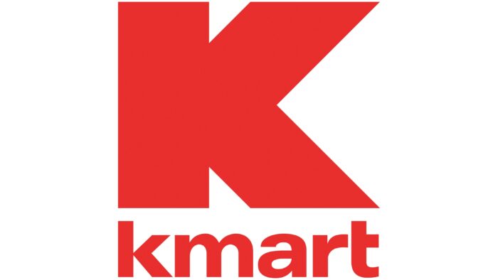
The emblem has acquired two levels. On the top was a large red letter K. She showed that now all the stores of this brand are united under one name. The return of the red hue is a symbol of energy, transformation, and an active pace of development. Below, along the length of the top letter, in smaller print, the word Kmart is the full name of the brand that customers are used to.
In 2018, the holding company also went bankrupt, and all of its assets, including Kmart stores, were bought by a private company Transformco in 2019. It continued to gradually close stores, and in 2021 there were 33 working Kmart outlets left.
Font and Colors
The main colors of the emblem are red and turquoise.
- Red – energy, movement, scale symbol.
- Turquoise – good luck and overcoming difficulties. Discount stores helped people in difficult situations to buy inexpensive things. And a visit to a discount store could turn into good luck in the form of a low price in blue.
The font in the latest emblem matches the Univers Next Pro 740 Extended Heavy with a slightly modified “t.”
Kmart color codes
| Pigment Red | Hex color: | #e82e2c |
|---|---|---|
| RGB: | 232 46 44 | |
| CMYK: | 0 80 81 9 | |
| Pantone: | PMS Bright Red C |
