The Kohler logo is so simple that it exudes minimalism and austerity. This makes sense, as the company the emblem belongs to deals with serious work related to strictly practical items critically needed in everyday life. Its two-dimensional design makes the symbol understandable and clearly visible to everyone.
Kohler: Brand overview
Meaning and History
It all started when industrialist, businessman, and politician John Michael Kohler bought a steel foundry from his father-in-law. Charles Silberzahn actively facilitated this. After securing rights to the company, the new owner changed its name. There were two reasons for this. The first was to indicate that the enterprise belonged to him and his family; the second was that the businessman’s surname matched the name of the city where the foundry was located. Hence, a well-thought-out marketing move was made, and so the Kohler logo contains nothing but a single word, which was enough for the visual identity to be recognizable.
What is Kohler?
Kohler is an American manufacturer of plumbing fixtures, engines, generators, furniture, and tile. It started with the production of agricultural tools and iron decorative items. The founders of the company are John Michael Kohler and Charles Silberzahn, who bought a steel foundry from Jacob Vollrath in 1873. Its headquarters is located in Kohler, Wisconsin.
Old
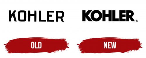
The Kohler emblem is text-based. It uses the company name in capital letters. The bold black letters are clearly visible against any background, distinguished by their perfect geometry. Almost all glyphs are strict, straight, and direct, with precise angles. The only exceptions are the “R” with a semi-rounded top part and the “O” with smoothly flowing sides, though it has a distinct rectangle in the center. The crossbar of the “H” is raised higher than usual and occupies the upper half of the letter. The leg of the “K” is also positioned much higher than the center, starting at the top stroke.
New
After the redesign, the Kohler logo became more imposing. It consists of a massive inscription made with geometric glyphs. The letters are two-dimensional, chiseled, extra-bold, and straight. They have perfectly smooth edges, indicating the utmost precision and flawlessness of the manufactured products. The “O” has been shaped into a wide ring, the top part of the “R” is aligned to the center, the start of the “K” legs has been moved to the middle of the vertical stroke, and the crossbar of the “H” is placed in its usual position. At the end of the line is a circle with a miniature “R” in the center – a symbol of a registered trademark.
Font and Colors
The inscription in the Kohler emblem is set in a grotesque typeface – a smooth font in upper case, similar to Spartan MB Black. The bold letters add seriousness and speak of high responsibility for the offered products.
The corporate palette, like the company’s approach to product manufacturing, is practical and serious. Mostly, the glyphs are colored in black – the most common in typography, as it is neutral but clearly visible on any background. At the same time, this color creates a sense of refinement and elegance.

