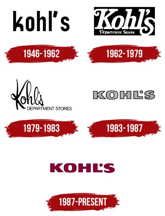
Kohl’s logo is as large as a wide, sprawling department store chain. The emblem shows that the basic, most sought-after goods are sold here. Their impressive list is reflected in the strong and massive elements of the emblem.
Kohl’s: Brand overview
| Founded: | September 12, 1962 |
| Founder: | Maxwell Kohl |
| Headquarters: | Menomonee Falls, Wisconsin, U.S. |
| Website: | kohls.com |
Meaning and History
Even though the official year of the appearance of the chain of grocery stores is considered 1946, their origins go much deeper – in 1927. That’s when a Pole created a retail outlet that sold various food items and standard household goods. But he did not stop there and went on to become more successful. After opening a supermarket in 1946, the entrepreneur decided to enlarge his business, and in 1962 he became the owner of the chain.
In 1972 the controlling interest was taken over by British American Tobacco, but the Kohl family was still in charge. At the end of the 70s of the last century, the trading company was purchased by BATUS Corporation. In 1992 a group of investors made Kohl’s a public chain. The company has been actively developing, opening new stores, and expanding its range all this time. In 1986 it had 40 department stores, and then in two years added another 27 stores. During the 2000s, the chain covered 49 states.
In addition, the brand introduced progressive technologies. For example, it launched its card system, QR code payments, and Apple Pay. Its assortment also became broader: it included not only groceries but also food, jewelry, clothing, and so on. Kohl’s pays a lot of attention to visual identity. To strengthen its position on the market, the brand hired the advertising agency DeVito/Verdi from New York, which worked out its image down to the last detail. The department stores had four different types of emblems that also acted as signage throughout their existence.
1946 – 1962
Although the company was called Kohl’s Food Stores, the logo featured only one word, “kohl’s.” However, the logo’s association with the founding family remained unchanged despite changing status and department store owners. The inscription was written in lower-case bold type. The only thin element was the upper right stroke “k.” A large apostrophe of unusual shape was between the “l” and the “s.” It looked like a vertical trapezoid, turned slightly diagonally. The last letter was far from the others, so the distance between it and the other characters was greater.
1962 – 1979
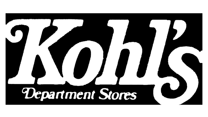
After the change of owners, the brand underwent its first redesign, after which its symbols changed dramatically in style. According to the English spelling, the first letter in the lettering was transferred to the upper case, while the others remained in the lower case. All the characters were serifed, and the “K” and “s” were also serifed. The inscription was slanted, almost entirely coherent, as the letters were joined together. A space was preserved only between the “o” and the “h.”
The last character in the word “Kohl’s” exceeded the lower border and took two lines. Under the main name of the brand appeared its second part – “Department Stores.” The word combination was located at the bottom and written in the fine print. The apostrophe became classic and distinct. The entire text was white. A black rectangle served as the background.
1979 – 1983
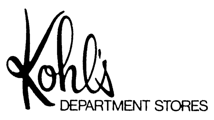
The next facelift of the new look brought an intricate logo. Instead of typewritten characters, it was written in cursive but without italics because the stroke was strictly vertical. The word “Kohl’s” took the form of a personal signature to give the impression that the chain of stores was personalized and owned by one individual rather than a group of businessmen. This gave customers more confidence in the stores and took the company to a higher level of development.
The letters in the logo were thin, large, sans serif. The main emphasis was on the looping writing style: all characters had loops except for the “s.” The “K” was the uppercase and largest, extending beyond the bottom line. At the bottom was the second part of the brand name, made in typewritten type. The developers removed the dark background, so they repainted the text in black to contrast well with the white space.
1983 – 1987
The changes in 1985 were significant. As a result, the management of the chain of stores approved a radically different logo. The word combination “Department Stores” disappeared from it as the brand became widely recognized. This allowed the owners to shorten the inscription and make the logo universal to denote the brand and the company. The emblem now represented broad printed letters, without a solid fill, with a bold outline.
1987 – today
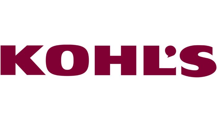
A new logo Kohl’s, namely the letters, was given a solid cherry color filling where the outline was. Now it is used everywhere – in marketing, signs, labels, and business papers. The word “Kohl’s” is typed in broad printed characters with the same inter-letter space between all the characters. The apostrophe does not look like a comma but like a bold dot with a miniature stroke at the bottom.
Kohl’s: Interesting Facts
Kohl’s Corporation, more commonly known as Kohl’s, is a major American department store with a rich history and a distinctive business approach that sets it apart.
- Start and Growth: Beginning with a single supermarket in 1946 by Polish immigrant Maxwell Kohl in Milwaukee, Wisconsin, Kohl’s opened its first department store in 1962. It now has over 1,100 stores across 49 states, making it a leading department store chain in the U.S.
- Unique Retail Strategy: Kohl’s stores are mainly in suburban shopping centers, not large malls, making it easier for customers to visit and shop.
- Kohl’s Cash Program: Kohl’s Cash rewards customers with store credit during promotional periods, encouraging repeat business and building loyalty.
- Sustainability Efforts: Kohl’s is committed to using solar panels at many stores and participating in green initiatives to minimize its environmental impact.
- Exclusive Partnerships: Kohl’s offers unique products through partnerships with well-known brands and celebrities, including Vera Wang and Lauren Conrad, attracting a wide range of customers.
- Embracing Technology: Investing in digital and omnichannel retailing, Kohl’s offers customers convenient shopping options, such as buying online and picking up in-store.
- Health and Wellness Products: Kohl’s is expanding its offerings to include health and wellness items, meeting the increasing consumer interest in fitness and well-being.
- Kohl’s Cares: This charity program donates 100% of net profit from certain merchandise to children’s health and education initiatives, showcasing Kohl’s commitment to community support.
- Inclusive Fashion: Kohl’s provides adaptive clothing for people with disabilities, emphasizing inclusivity in its fashion lines.
- Real Estate Ownership: Uniquely, Kohl’s owns most of its store properties, which offers financial benefits and greater control over store locations and costs.
Kohl’s has thrived by focusing on customer needs, strategic partnerships, sustainability, technological advancements, and community involvement. These elements have driven its growth and cemented its place in the competitive retail market.
Font and Colors
The retail chain’s identity has evolved from a simple form to… simple. It had the most complex look between the debut and the current logo. This is due to the composite name, which contained several words.
While the early versions of the logo used a thin typeface, the current version is in a very bold and squat Helvetica family font. The current Kohl’s logo palette consists of a combination of white and burgundy #800033. It was first used in 1985, and before that time, black and white monochrome prevailed.
Kohl’s color codes
| Burgundy | Hex color: | #800033 |
|---|---|---|
| RGB: | 128 0 51 | |
| CMYK: | 0 100 60 50 | |
| Pantone: | PMS 7426 C |

