


![]() Kumon Logo PNG
Kumon Logo PNG
The Kumon logo symbolizes the learning process grounded in a child’s independent effort. The emblem promotes ideas of consistency, gradual progress, positive emotions as children develop abilities, and a love of learning.
Kumon began in Osaka, Japan, in spring 1954, when high school math teacher Toru Kumon saw a weak arithmetic test score in his son Takeshi’s notebook. Instead of hiring a tutor, he created daily worksheets that progressed from basic problems to more advanced material. The method was based on independent progress after full mastery of the previous level.
Takeshi was solving university-level math by sixth grade, and neighbors soon asked Toru to teach their children. In 1955, the first Kumon learning center opened in Moriguchi, Osaka Prefecture. In 1958, Toru founded the Osaka Institute of Mathematics, the structure from which the company grew. By 1969, enrollment across the centers had passed 10,000 students.
In 1974, Toru published The Secret of Kumon Mathematics, explaining the method and helping double enrollment within two years. The same year, the first overseas center opened in New York after a Japanese family in the United States asked to continue the program. During the 1970s, centers appeared in Taiwan, Brazil, and Germany, first serving Japanese communities and later local students.
Takeshi Kumon took over management in October 1978. In 1980, materials for English study by Japanese speakers were developed. By 1985, global enrollment reached 1.4 million, and by 1993 it exceeded 2 million. After Toru Kumon’s death on July 25, 1995, Takeshi led further expansion. The total passed 3 million students in 2001 and 4 million in 2006. Competitors such as Sylvan Learning and Mathnasium used tutor-led models, while Kumon kept its worksheet-based system.
Meaning and History
![]()
The method only received its current visual identity, reflecting the organization’s values and beliefs, in 2002. This was the company’s second logo.
What is Kumon?
Developmental workbooks for mathematics and the English language are used by around 4 million children worldwide.
1958 – 1980
After the university was established, the program lacked a logo. The method simply attracted supporters. The founder and his colleagues were busy testing the methodology, developing, improving, and spreading the program.
1980 – 2004
![]()
The founder’s son, for whom the first sheets were once developed, took over the organization’s global development and its programs. In 1978, he became the head of the Kumon Institute of Education, and thanks to his efforts, the first center in Europe opened in 1979. Under Takeshi Kumon’s leadership, the first logo was also created.
The emblem consists of a blue square with rounded corners and a double inscription with the methodology’s name. The name is taken from Toru Kumon, the founder of this learning system.
The dark blue background represents intellect, mentality, deep mental processes, and gradual immersion into the mysteries of science. Inside the square, the letter K is inscribed, grouped from separate glowing dots. They symbolize:
- Neurons are awakened by mathematical exercises and their connections, accelerating thought processes.
- Numerous students are learning through the program, their heads like ignited dots, illuminated by thought.
- Moving through a task chain helps one comprehend science from the simple to the complex.
- A barcode confirms the workbook’s originality.
Below the square, the methodology’s full name is placed. Even lower, the logo is fully repeated, but in black, with the K from the dots arranged to the right of the name.
In the smallest font, Kumon is indicated as a center for teaching math and language. The logo resembles a sticker on a workbook with a QR code.
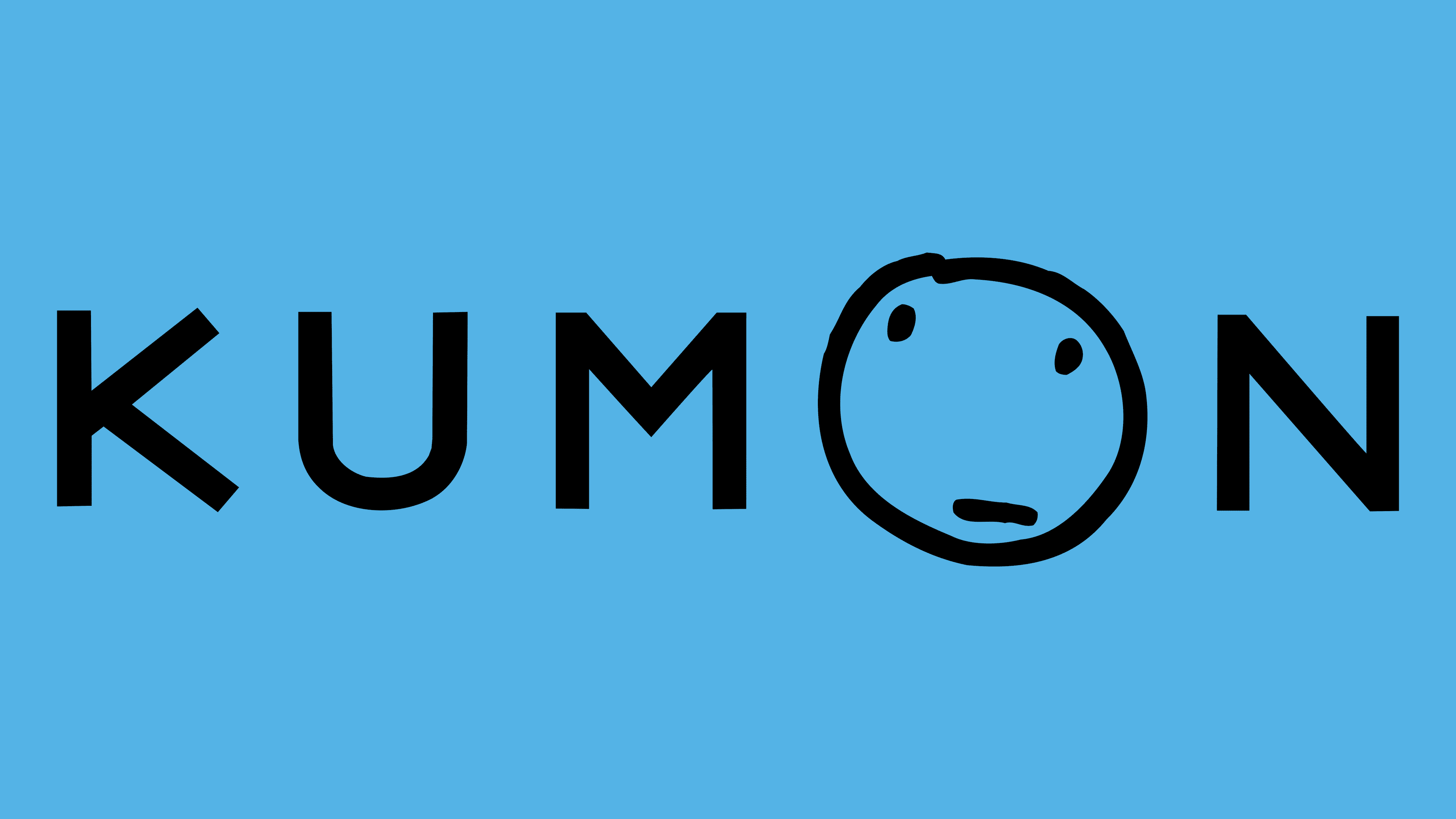
2002 – today
![]()
The latest logo is carefully thought out in terms of methodology, consideration, and essence. It appeared when the number of students worldwide exceeded 3 million.
The emblem consists of the inscription “Kumon” in capital letters, with the letter “O” replaced by a child’s drawing of a face. The emoji looks thoughtful, symbolizing a pondering child. The image reflects the main goal of the developmental workbooks to stimulate thought processes. The tasks develop logic and unleash children’s creative potential.
The second meaning of the image is the motivation for educators to continually grow and improve. Each teacher is reflecting on how to help their students develop and how to conduct lessons more effectively.
Font and Colors

The main colors of the emblem are blue and black.
- Blue. The organization’s leaders indicate that this shade represents the sky, covering all participants in the educational process worldwide. Another meaning is knowledge, learning, and intellect, emphasizing the importance and uniqueness of programs that contribute to the intellectual development of the younger generation.
- Black. This color symbolizes the pencil lead and writing in the workbooks. It demonstrates the program’s goal of developing independence and self-reliance in children.
The font is reminiscent of Namoogothic Extra Bold 210.