The Kuwait Airways logo conveys the company’s determination to become a leader among international carriers in the Asian region. It symbolizes smooth takeoffs and landings, comfort, and convenience. The emblem reflects the airline’s ambition to dominate the skies while providing its passengers unparalleled service.
Kuwait Airways: Brand overview
Kuwait Airways’ history starts with establishing Kuwait National Airways, a small private company founded by Kuwaiti businessmen who saw the potential for air transport development in the Persian Gulf region. Kuwait was under British protection then, and having a national airline was a big step for the country.
1954, the airline began operating with a Douglas DC-3 aircraft, flying to nearby countries like Iraq, Syria, and Lebanon. These initial flights were important for connecting Kuwait with other Arab states.
1955, the Kuwaiti government acquired 50% of the company, signaling a shift towards state ownership.
By 1956, it became the official national carrier, with the government purchasing the remaining 50% stake. This change allowed the airline to access more resources for expansion. During the 1960s, the company grew rapidly, adding new routes in Europe and Asia.
In 1962, it received its first jet aircraft, the de Havilland Comet 4C, which enabled it to compete on long-haul flights. By 1968, it had introduced its first Boeing 707, which became a key part of its fleet for the next decade.
In the 1970s, the airline continued modernizing, acquiring its first wide-body aircraft, the Boeing 747-200, in 1976. This addition increased passenger and cargo capacity on important European and Southeast Asian routes.
In the 1980s, the company expanded its network, adding routes to North America, including flights to New York. The airline focused on improving passenger services to stay competitive with other Gulf carriers. However, in 1990, the invasion of Kuwait by Iraq caused a major crisis. The airline had to stop all operations, and many of its aircraft were seized by Iraqi forces. After Kuwait was liberated in 1991, it resumed operations, gradually recovering its fleet and restarting flights on key routes. This period involved significant efforts to rebuild the airline’s infrastructure and reputation.
In the 1990s, the company made significant progress in its recovery and modernization efforts. The airline upgraded its fleet by introducing new Airbus A300 and A310 aircraft, which improved its efficiency on medium- and long-haul routes. However, in the 2000s, the company faced increased competition from emerging carriers in the Gulf region. To stay competitive, the airline initiated a restructuring process to enhance its efficiency and overall competitiveness. During this time, it expanded its route network by adding new destinations in Asia and Europe.
Between 2010 and 2015, the airline continued its fleet modernization by placing orders for new Airbus aircraft, such as the A330 and A350. These acquisitions aimed to refresh the fleet and boost operational efficiency.
In 2016, the Kuwaiti government approved a plan to privatize the company, selling up to 35% of the company’s shares to private investors and employees. However, the privatization process encountered delays and obstacles.
From 2017 to 2019, the airline continued its renewal strategy by receiving new aircraft, including the Boeing 777-300ER and Airbus A320neo. These state-of-the-art planes allowed the company to enhance passenger service quality and improve fuel efficiency.
Meaning and History
What is Kuwait Airways?
Kuwait Airlines is Kuwait’s national carrier, based at Kuwait International Airport. It offers regular passenger and cargo services across an extensive network of destinations in the Middle East, Europe, Asia, and Africa. The company operates a modern fleet of narrow-body and wide-body aircraft, including the Airbus A320, Boeing 777, and Boeing 787 Dreamliner, providing high comfort and convenience for its passengers.
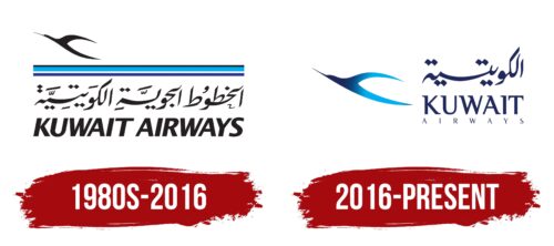
1980s – 2016
The brand adopted a logo in its signature style to become recognizable, maintain prestige, and show readiness to soar to heights. It conveys its professional nature and the absence of obstacles in achieving its ultimate goal. To express this concept, the carrier chose a well-recognized image that associates it with flights and the sky: an upward-flying bird.
Despite its black color, the bird does not appear negative or heavy. On the contrary, this palette makes it weightless and light and draws attention, shifting the clients’ gaze from the center to the upper left corner. This idea aligns harmoniously with the concept of an aviation representative ready for takeoff and confident progress.
This is not a specific bird but an abstract one. It is not associated with national symbols or endemic animals. The thin silhouette with an upward-pointing narrow beak appeared accidentally, inspired by a bird preparing to take off from a tree. Thus, a quick sketch turned into a well-recognized emblem. The bird is considered an allegory of flight safety and a guarantee of the absence of unforeseen situations.
The upper part is separated from the lower by three horizontal stripes of different widths:
- Black (indicating stability, practicality, reliability)
- Azure (embodying calmness, confidence, spirituality)
- Blue (symbolizing the vast expanses of the sky)
These precisely match the aviation carrier’s field, moving forward confidently. The fact that the bird flies from right to left is a distinctly Eastern characteristic, as Arabs write texts this way. Consequently, the Arabic version of the name is also read from right to left, not vice versa. Hence, the “strange” direction of the bird in flight makes it seem like it is moving backward.
2016 – today
The Kuwait Airways logo signifies that any height can be conquered with the right identity, a goal the airline has initially pursued. The introduction of the new emblem is linked to the updated aircraft livery. The brand has revamped almost all visual elements, modernizing them. The stylized bird has been enlarged and is now honored before the name.
The silhouette features a blue gradient: the color darkens closer to the head and lightens toward the wingtips and tail as if sun-bleached. This demonstrates the high utilization of the airline’s fleet, indicating that they are in demand and constantly flying routes. The shortened neck makes the bird closely resemble an airplane’s elongated fuselage.
The company’s uniqueness and authenticity are conveyed in Arabic, written from right to left. However, the shortened form “Kuwait” is used in English and Arabic versions instead of the full name. The country of origin reflects the brand’s commitment to originality, infusing the logo with national spirit.
The word “Airways” is in small font with the same serifs as the middle line. These serifs are straight, even, and neat, indicating the company’s high responsibility towards passengers and commitment to maintaining high service standards. Essentially, it demonstrates an active stance on improving operations, meticulousness, and a focus on consistent positivity.


