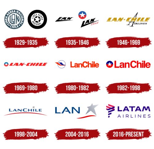
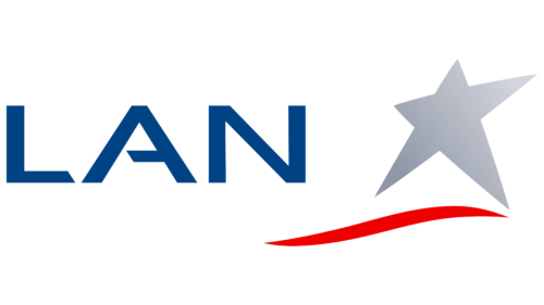
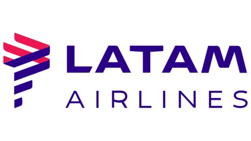
The LAN Airlines logo inspires travel. It conveys the essence of a company dedicated to providing comfortable passenger air transportation, reflecting the sky, speed, freedom, and a thirst for adventure. At the same time, the emblem demonstrates the brand’s growth, development, and aspiration to reach new heights.
LAN Airlines: Brand overview
The history of LAN Airlines began with the establishment of Línea Aérea Nacional de Chile (LAN Chile) by the President of Chile, Carlos Ibáñez del Campo. The company’s founder was Arturo Merino Benítez, a Chilean military aviator.
Initially, the airline was a state-owned entity created to improve air connectivity in a country with challenging geography. The company’s first operations involved delivering mail between Santiago and Arica.
Throughout the 1930s, the airline expanded its services to include passenger transportation using small piston-engine aircraft like the de Havilland Moth and Fairchild FC-2 along the Chilean coast. This was crucial in developing Chile’s aviation infrastructure at the time.
In the 1940s, during World War II, the airline continued its operations, providing essential transport within the country. After the war, the company upgraded its fleet by acquiring more modern aircraft, such as the Douglas DC-3.
In 1956, it completed its first trans-Andean flight to Buenos Aires, Argentina, beginning its international expansion. The company then expanded its presence in South America by adding flights to Lima, Peru, in 1958 and starting flights to Panama in 1961, its first international route outside South America.
In the 1970s, the airline continued to grow its international network by introducing flights to Miami in 1970 and opening flights to Europe with a route to Madrid via Rio de Janeiro in 1971. Despite the economic challenges Chile faced in the 1980s, it modernized its fleet by introducing the Boeing 767 to serve long-haul routes efficiently. The privatization process began in 1989 when the Chilean government sold 51% of the company’s shares to local investors and employees to enhance its efficiency and competitiveness internationally.
In 1994, it became a public company by listing its shares on the New York Stock Exchange to raise additional capital for expansion and modernization.
In the 1990s, the airline expanded into other South American countries by establishing subsidiaries in Peru (1999), Ecuador (2003), and Argentina (2005), strengthening its position as a leading carrier in the region. The company changed its name from LAN Chile to LAN Airlines in 2000 to reflect its growth beyond Chile and its ambition to become a pan-Latin American carrier. It joined Oneworld’s global aviation alliance in 2004, expanding its cooperation opportunities with major airlines and enhancing its global network.
In 2005, the company continued its expansion by launching LAN Argentina, entering the large Argentine domestic market. In 2010, it announced a merger with Brazilian airline TAM Airlines to form the largest aviation group in Latin America. The merger was completed on June 22, 2012, forming LATAM Airlines Group, the largest airline in Latin America and one of the largest globally by market capitalization.
From 2015 to 2016, all operations gradually rebranded to unify under the LATAM brand. This transformation marked the airline’s evolution from a Chilean national airline to a vital part of the largest aviation group in Latin America.
In 2017, LATAM, incorporating former LAN operations, focused on integrating and optimizing its network. Introducing a new fare model for domestic flights in various South American countries provided passengers with more flexible options, enhancing competitiveness in response to the rise of low-cost carriers in the region. Expanding its route network in 2018, the company added new destinations with a particular emphasis on improving connections between South America and Europe. Flights from São Paulo to Lisbon and Santiago to Tel Aviv were initiated using Boeing 787 aircraft previously operated by LAN.
In 2019, the company shifted its strategy significantly by exiting the Oneworld alliance, which LAN had been a member of since 2000. Instead, the company formed a partnership with Delta Air Lines, resulting in Delta acquiring a 20% stake in the brand. This move aimed to bolster the company’s position in the North American market and optimize its international network. Continuing its restructuring efforts in 2020, the company announced the closure of its subsidiary in Argentina, formerly LAN Argentina, due to economic challenges. This decision reflected the group’s commitment to optimizing its network and focusing on profitable routes.
In 2021, the company expanded its presence in the cargo market by converting up to eight passenger Boeing 767 aircraft into freighter versions to meet the increasing demand for air cargo transport in the region. In 2022, the company continued its fleet modernization by planning to acquire 28 new Airbus A320neo aircraft to replace older models on regional routes formerly operated by LAN. This move aimed to enhance operational efficiency and reduce environmental impact. By 2023, the company completed the restructuring process initiated in 2020 by emerging from Chapter 11 bankruptcy in the United States. This milestone allowed the company to embark on a new phase of development with an improved financial structure, paving the way for expanding its route network and introducing new destinations in North America and Europe.
Meaning and History
What is LAN Airlines?
It is a leading Chilean airline based in Santiago. It offers an extensive network of regular passenger and cargo services covering many destinations in South America and worldwide. The company operates a modern and diverse fleet of narrow-body and wide-body aircraft, such as the Airbus A320, Boeing 787, and Boeing 767, providing high comfort, efficiency, and reliability.
1929 – 1935
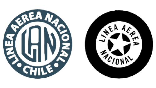
The early LAN Airlines logo is filled with motion, conveyed through the emblem’s circular shape, reminiscent of a wheel. This design captures the desire to break free from the ordinary plane, to lift off the ground, and soar forward rapidly. The emblem exudes determination and practicality, resembling a rare ancient coin, symbolizing the brand’s high value.
- One version of the logo is done in silvery-white tones. It has the shape of a classic roundel, with the brand’s essence centered. On a white background, the abbreviated company name is presented in gray letters, which will become the basis for all future versions – LAN. The inscription is made with jagged lines. The rest of the space is occupied by the circular phrase “Linea Aerea Nacional” with the country indicated – CHILE.
- Another emblem version also consists of a circle with a highlighted center, but it has a monochromatic color scheme and different content. The key element is a white five-pointed star that stands out against a black background. It symbolizes the airline’s stellar moment—or at least its aspiration for it. Next, the brand name is indicated on a thick light strip. The border is a wide black band, giving the emblem the look of a vintage vinyl record.
Each version reflects the airline’s high value, conquering heights and the hearts of travelers. The logo hints at comfortable conditions, affordable prices, increased attention, professionalism, and reliability.
1935 – 1946
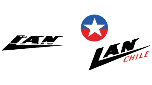
A Latin American airline underwent a redesign to optimize its visual identity and make it modern and progressive. This redesign affected all elements. As a result, the airplane livery now features a unique logo—swift, dynamic, and highly authentic. It expresses the core values of decisiveness, energy, passion, and enjoyment, which align with the brand’s concept of providing quality services.
Classic roundels were replaced with monolithic inscriptions with patriotic characters. This is conveyed through several elements:
- The profile of an eagle (the national symbol of Americans) replaces the capital “L.”
- A single five-pointed white star (part of the Chilean national flag).
- A blue-red circle reflecting the colors of Chile’s national coat of arms (these colors are featured on the heraldic shield).
This interpretation of the identity evokes a sense of pride in the country the airline represents. It shows that the brand aims to take a leading position in the industry, to represent Chile honorably on all popular routes, and to instill confidence in its clients about the high quality of services.
Although the form of the LAN Airlines emblem has become simpler, it is filled with profound meaning. The inscription is swift, flying, and purposeful. Each letter eloquently demonstrates this, complemented by a sharp angle on the right side. For the “L,” this angle turns into a long underlining stripe that stretches along the entire abbreviation.
The “A” and “N” are adorned with large spikes at the top, reminiscent of an eagle’s beak. These add movement and liveliness to the text. In one version of the logo, the glyphs are solid; in another, they are perforated with small dashed lines. There is also an indication of the country where the airline is based, enhancing the emblem’s authenticity.
1946 – 1969
The chaotic lower strokes of the letters transformed into systematic lines running along the entire name of the airline. These lines effectively organize the space, demonstrating the carrier’s high energy, businesslike approach, and decisiveness. The white stripes resemble the marks on pilot chevrons, making the logo recognizable on all routes, including international ones.
The update to the visual identity coincided with an increase in international flights. The emblem’s form changed significantly:
- The main inscription became linear.
- The primary elements were colored in gold.
- The letters have a rightward slant.
- A text background is present.
The monolithic glyphs are very wide. To maintain optimal readability, designers separated the word “LAN” from “CHILE” with a small hyphen. This prevents the two parts of the name from merging, highlighting the brand’s place of origin. Authenticity is enhanced by the background inscription “Airlines,” which is markedly different from the rest of the text. This background text has a wavy outline reminiscent of a cloud mist and is black, adding clarity to the letters.
1969 – 1980
The airline decided to focus on authenticity and connection to its territory, so it brought back a logo with national colors. It chose a minimalistic approach to keep the visual design simple, emphasizing the country it operates in. This strategy helps the company expand to new routes, using a central point from where planes depart to various attractive tourist areas.
The simplicity of the identity helps reveal the cultural context better, highlighted by several components:
- A white star from Chile’s coat of arms.
- Blue and red colors from the country’s flag.
- A bright inscription filled with passion.
- An italic font with a dynamic slant.
Together, these elements create a positive brand image, showcasing its expressive nature, dedication to maximum comfort, and protection of travelers from any issues during the flight. The company positions itself as a star – a leader in its region, with a widely recognized emblem featuring the star. Therefore, it opted not to use the full name in the logo and chose an abbreviation well-known to the local population.
Red symbolizes brightness, enjoyment, peak emotions, dynamism, high energy, unstoppable speed, and decisiveness. Combined with monolithic capital letters, they form a memorable image, perfectly fitting a brand from a hot country with expressive views of the world.
1980 – 1982
The Chilean airline chose a different color palette to show its connection to a hot region and demonstrate its readiness for decisive actions to ensure passenger comfort. The LAN Airlines logo has now become extremely vibrant, expressive, and bright with an updated concept:
- The red color symbolizes the southern sun, enjoyment of vacation, and a positive attitude towards passengers.
- The blue color represents coolness on board, the vast sky above, and the oceanic expanses below.
Together, they infuse the emblem with confidence, safety, and a trustworthy atmosphere, inviting customers to use this airline’s services. At the same time, the emblem conveys a drive for leadership – the brand’s desire to be first and unmatched in its field. This has proven true, as the company has become a key representative on Latin American and international routes.
During this period, the airplane livery featured a special mark—a circle with a thin border and two airplane tails inside, shaped like refined feathers. This graphic element aims to showcase the airline’s professionalism, expertise, ease of flights, and accessibility for tourists.
The updated typography brings calm and tranquility to the LAN Airlines emblem: the word “LanChile” is written with rounded glyphs. The smooth lines symbolize a serene takeoff and a gentle landing. Despite the incredibly bright red color, they provide an anti-stress effect on customers. The font is a combination of uppercase and lowercase letters, adding balance through the fusion of two elements:
- Lan (an abbreviation of Linea Aerea Nacional)
- Chile (the country where the airline originated)
Thus, the updated logo is significant for the brand, as it conveys its business stance, work ethic, service region, high responsibility, and readiness to transport passengers to a paradisiacal sunny destination.
1982 – 1998
The LAN Airlines emblem has gained more authenticity. In addition to the red and blue palette taken from Chile’s official flag, it includes another national symbol—a white five-pointed star from the country’s coat of arms.
- The circle symbolizes the safe zone that the airline provides for passenger travel within the Latin American region.
- The color palette signifies the company’s roots and primary area of operation.
- The star represents leadership and the ambition to become the best airline on the continent.
Another significant change is the text: it now features a geometric font with sharply defined angles and soft rounded edges. This balance creates a sense of well-protected comfort, conveying a guarantee of safety and various services offered.
The colors convey dynamism and energy. They are vivid, bright, and expressive, indicating the maximum speed of flight and the transition to ultra-fast travel in the sky.
1998 – 2004
The LAN Airlines logo from this period symbolizes the vast reach of the regions where the Chilean company’s planes fly. This concept is conveyed by a simple, concise line – a smoothly bent arc that occupies the entire emblem. It hints at the airline’s dawn, resembling the thin edge of the horizon at sunrise. The middle of the stripe is wide, while the edges are narrow, adding a sense of curvature.
However, the key element remains the name. It has been completely rewritten, recolored, and regrouped.
- The font has become modernist.
- The text is now blue.
- The inscription is centered.
The squat and wide glyphs accurately match the aviation brand: they look like comfortable seats in an airplane cabin. This is evidenced by the varying thickness of lines in different parts of the letters and the ample space between them. This typographic technique brings the logo to life, fills it with air, and evokes confidence and calm.
The star replacing the dot above the lowercase “i” hints at the airline’s high professionalism. By the way, the star has changed from white to silver, enhancing the company’s aesthetic and cultural value in customers’ eyes by suggesting the brand’s exclusivity.
2004 – 2016
A new LAN Airlines logo was adopted after a series of structural changes related to expanding the aviation sector in the South American region. It is much simpler and less cluttered than before. This simplicity is due to the airline’s wide recognition and the planned merger with another carrier, TAM. The name needed to be shortened to facilitate this combination.
The word “LAN” was brought to the forefront. The font style remained the same – uppercase, wide, with medium-thickness strokes. The only addition was enhanced dynamism, achieved by cutting the lower end of the “L.” This now harmonizes the letter with the “A,” which had a similar cut introduced earlier.
The star was also made a key element of visual identity. It is the main symbol of the airline’s unrivaled significance, a mark of high professionalism, and a sign of impeccable service. The silver star signifies the comfort and safety of flights, while its slanted shape indicates the airline’s readiness to meet customer desires.
A red wavy ribbon conveys movement, energy, and dynamism. Its pointed ends can easily cut through the air layers and swiftly cover hundreds of kilometers to the final destination. The emblem accurately represents the brand, reflecting it with a simple, bright element that makes it easily recognizable.
2016 – today
This version of the logo emerged from the merger of LAN Airlines and TAM Airlines, which formed a new entity in the Latin American aviation services market. The group was named LATAM, and its logo was introduced. Its shape and appearance differ significantly from previous versions to emphasize its distinctiveness. It is not a continuation of the founding companies’ identities but rather the beginning of a new era in South American aviation services. Specifically, it features:
- Clean, straight lines
- Open intra-letter spaces
- Soft features
- The balance between graphics and text
Together, these elements ensure the inscription is easily readable, and the emblem can be conveniently placed on any medium. The company also adopted a modern visual identity format, choosing trendy colors of the time: blue with a purple tint and dark red from the crimson spectrum.
The star and ribbon were replaced by a complex structure of numerous strokes – small alternating rectangles. Their varying lengths create an abstract geometric figure. This element resembles a vertical platform, symbolizing a launch pad for the new brand. The smooth, grotesque font indicates convenience and openness to travelers.
All glyphs are bold, monolithic, and uppercase, ensuring a positive image of a confident company.
