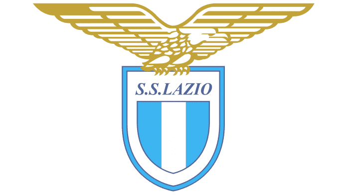
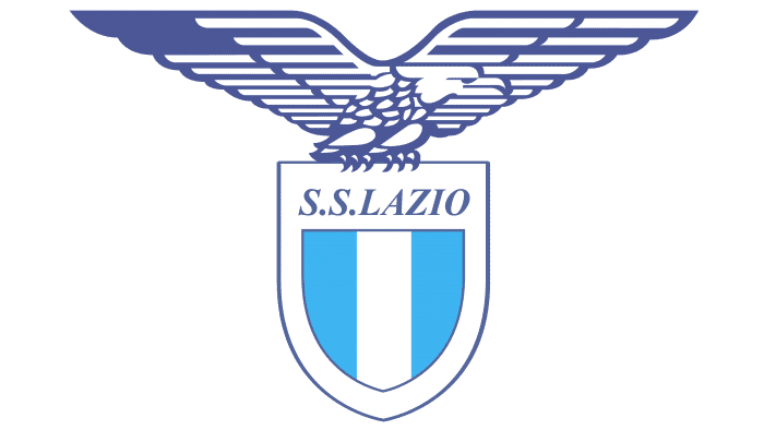
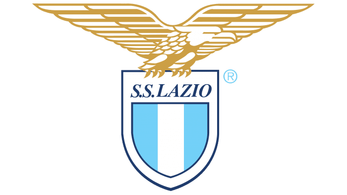
The modern logo of the Roman sports community “Lazio” includes an image of an eagle as a heritage of Roman heraldry. It symbolizes fearlessness and a fighting spirit. The graphics reflect the brand’s commitment to its past and affiliation with the administrative region.
Lazio: Brand overview
| Founded: | 9 January 1900 |
| Founder: | Claudio Lotito |
| Headquarters: | Rome, Italy |
| Website: | sslazio.it |
S.S. Lazio was formed after the revival of the Olympics in 1900. From the beginning, the athletes’ uniforms were white and sky blue, like the national flag of the Greeks, the founders of the Olympic movement.
When choosing a name for the sports community, its founders decided to denote affiliation to the capital without mentioning it (at that time, there was already a sports community called Gimnastica Roma). Ultimately, they used the name of the administrative region Lazio, which includes Rome. Consequently, now more fans of the “eagles” support the team in their surroundings than in the Eternal City.
Meaning and History
“Lazio” was created as a multi-sport athletic society (Societa Podistica Lazio), with running, swimming, and gymnastics as its priority sports. Since 1927, the organization has been called Societa Sportiva Lazio S.p.A., reflected in the Lazio logo in the form of the abbreviation S.S.
The eagle on the Lazio logo is a legacy of Roman symbolism. In the times of the Roman Empire, the most fearless legions adopted the image of a golden eagle as their symbol. This bird was depicted on the first versions of the football team’s emblem, then it was removed and added several times. In 1958, the eagle finally became established in the “Lazio” emblem. The eagle (more precisely, the female eagle) is named Olympia, corresponding to the club’s roots.
What is Lazio?
“Lazio,” short for Società Sportiva Lazio, is an Italian football club founded in 1900. It has won the national championship twice (in 1974 and 2000) and has been the holder of Coppa Italia seven times. At the professional level, the team competes in Serie A, the country’s top league. The team’s first significant success came in 1958 when it won the national cup. The club plays its home matches at the capital stadium “Foro Italico,” which it shares with its main rival – “Roma.”
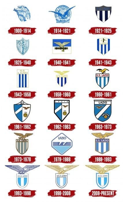
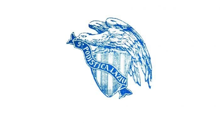
1900 – 1914
One of the first logos of “Lazio” depicted an eagle – a classic symbol of the Roman Empire. The proud bird is also associated with Zeus, allowing the club’s owners to pay tribute to the cultural-historical heritage of Ancient Greece. This explains the choice of color – a combination of blue and white. The eagle sits on a triangular shield, folding its wings, and clutches a ribbon with the inscription “S. PODISTICA LAZIO,” where “S.” stands for “Società.”
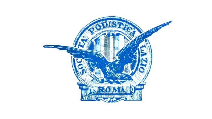
1914 – 1921
To dispel any doubts about the eagle’s origin, “Lazio” adopted an emblem in the form of a round bas-relief on a pedestal with the inscription “ROMA.” The text “SOCIETÀ PODISTICA LAZIO” was arranged around the circle’s outer edge. The bird’s wing covers the letters “I” and “E” in the first word.
1921 – 1925
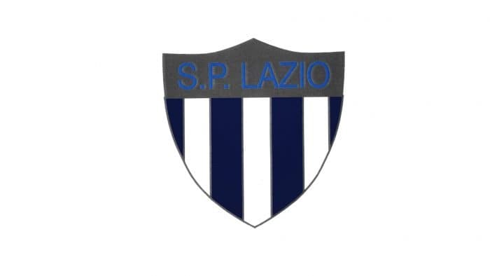
Until 1925, the club used a graphic symbol in the form of a triangular shield. The heraldic element was divided into two parts. Above was a gray polygon with the inscription “S.P. LAZIO.” Below was a simple pattern consisting of vertical stripes in blue and white.
1925 – 1940
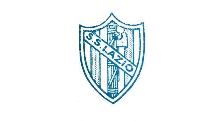
In 1925, the team was renamed Società Sportiva Lazio, which was reflected in the following emblem. A new graphic symbol appeared in 1927 when “Lazio” refused to merge with other sports organizations to create the fascist club AS Roma. Despite this, it was forced to change its emblem, adding wooden sticks with an ax, one of the main symbols of fascism.
1940 – 1941
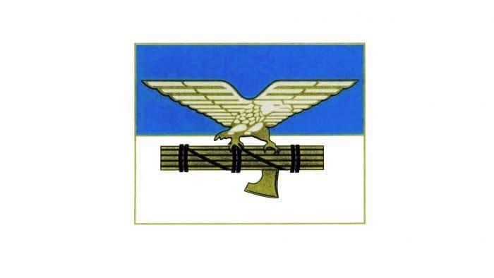
At the beginning of the 1940s, the triangular shield was replaced by a horizontal rectangle. The lower (white) part contained fasces and an ax, while the upper (blue) part featured a spread-winged eagle.
1941 – 1943
After a redesign, the emblem took the form of a shield with a triangular top and a sharp base. The club retained the traditional blue and white stripes reminiscent of Ancient Greece and complemented the fascist symbolism with the inscription “S.S. LAZIO.”
1943 – 1958
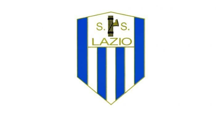
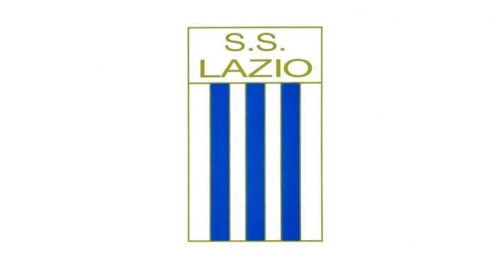
The team’s new logo is a vertical shield with three blue and two white lines. The wooden sticks with an ax disappeared, leaving only the abbreviation “S.S. LAZIO.”
1958 – 1960
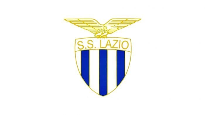
In 1958, the team returned to its classic: a triangular heraldic shield with an eagle in the upper part. The inscription and stripes remained in place.
1960 – 1961
From a compositional point of view, nothing changed – only the drawing style was updated. It became very simple and blurry.
1961 – 1962
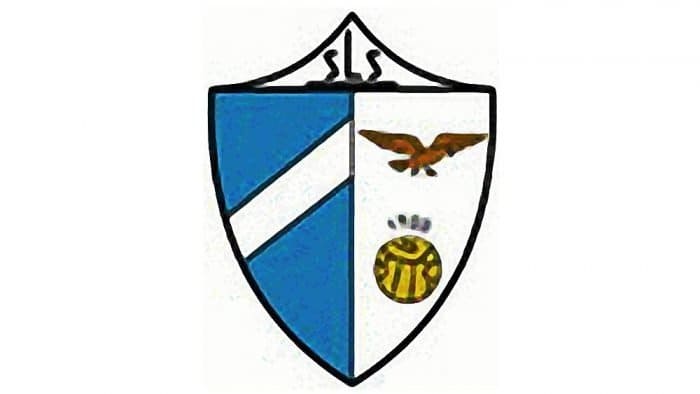
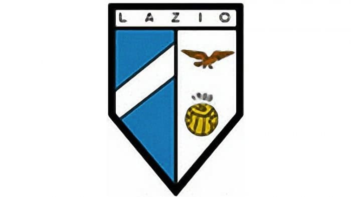
The artist depicted a triangular shield divided into three parts. In the upper part was the inscription “sLs,” to the left was a white diagonal line on a blue background, and to the right was an eagle flying over a yellow football.
1962 – 1963
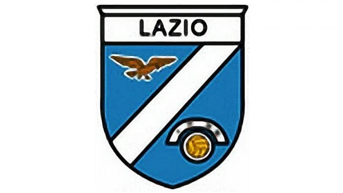
The elements remained the same, but the shape of the emblem changed. Now, it’s a quadrangular shield with a sharp base. Instead of the letters “sLs” in the upper part, the word “LAZIO” was written.
1963 – 1973
The designers made the lower part of the shield round and combined all the elements. In this version, the eagle and the ball are separated by a white diagonal line on a blue background.
1973 – 1978
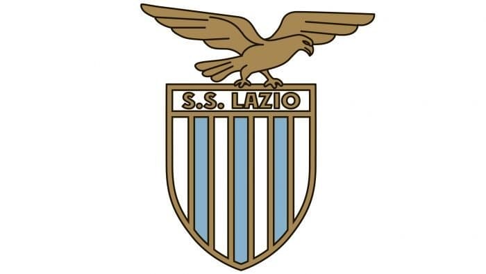
In the 1970s, another version of the logo with an eagle appeared. The bird sits on a shield, in the upper part of which the inscription “S.S. LAZIO” is placed. The traditional pattern of blue and white stripes was preserved, but thanks to the brown contours, it looks new.
1978 – 1988
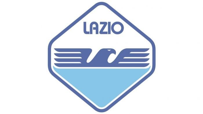
In the 1980s, the club used a logo in the form of a hexagon with rounded sides. Inside was the word “LAZIO,” an abstract image of an eagle (head and wings) and a blue geometric figure resembling an inverted triangle.
1988 – 1993
The bird returned, sitting on a rectangular shield with a sharp base. In this version, it hardly resembles an eagle, as the artists drew it schematically, without strict adherence to proportions.
1993 – 1998
In 1993, the logo took on a modern look. The eagle looks imposing, with its predatory profile, sharp claws, and abundance of details. The shield is broadly framed by the inscription “S.S. LAZIO.” Only three of the five vertical stripes remained: two blue and one white.
1998 – 2008
The designers made the eagle yellow-gold and changed the proportions of some elements.
2008 – today
After the redesign, the bird looked the same as in 1993 but remained golden. The frame around the shield acquired a wide blue outline.
Lazio: Interesting Facts
Società Sportiva Lazio, or just Lazio, is a famous soccer team from Rome, Italy, with a long history and many fans who love their team.
- Starting Up: Lazio began on January 9, 1900, making it one of the oldest soccer teams in Italy. It started as a club for many sports, not just soccer.
- Special in Rome: Lazio is the only big team in Rome still part of its original sports club. While other sports teams in Rome became their own thing, Lazio’s soccer team stayed with the original group.
- Big Rivalry: Games against their Rome neighbors, AS Roma, are super intense and known as the Derby della Capitale. These games are a big deal because of the strong feelings and history between the two teams.
- First Big Win: They won their first big league, Serie A, in 1973-1974. This showed everyone they were one of the top teams.
- A Memorable Season: The 1999-2000 season was unforgettable because Lazio won Serie A right at the end, just ahead of Juventus. It was an exciting time for fans.
- Winning in Europe: Lazio also excelled in European tournaments, winning the UEFA Cup Winners’ Cup in 1999 by beating Mallorca and then the UEFA Super Cup by beating Manchester United the same year.
- Eagle Mascot: Lazio’s mascot is an Olimpia bald eagle who flies around the stadium before games. This has become a special tradition for Lazio fans.
- Stadio Olimpico: They share this famous stadium with AS Roma. It’s hosted many big games, including the 1990 FIFA World Cup final.
- Famous Players: Some amazing players like Giuseppe Signori, Alessandro Nesta, and Paolo Di Canio have played for Lazio, making a big mark on the team’s history.
- Dedicated Fans: Lazio is known for its passionate fans, including the Ultras group. They create an amazing atmosphere at games, especially in the Curva Nord section of their stadium.
Lazio’s story is full of big wins and deep passion, showing why they’re an important part of soccer in Italy and beloved by fans worldwide.
Font and Colors
The modern emblem is a modernized version of the original logo. “Lazio” has often been criticized for the eagle, which was associated with fascism. In reality, this sign has nothing to do with fascist symbolism, as the team appeared in 1900 – 21 years before the founding of the National Fascist Party. The bird is associated with the Roman Empire, where it denoted success and power.
The club’s name is written in bold italic with serifs. The blue inscription is on the shield, which combines two colors from the ancient Greek cultural heritage: blue and white. The eagle is golden, so it stands out against the general background.
Lazio color codes
| Sky Blue | Hex color: | #87d8f7 |
|---|---|---|
| RGB: | 135 216 247 | |
| CMYK: | 45 13 0 3 | |
| Pantone: | PMS 305 C |
| Dark Midnight Blue | Hex color: | #15366f |
|---|---|---|
| RGB: | 21 54 111 | |
| CMYK: | 8 51 0 56 | |
| Pantone: | PMS 294 C |
| Goldenrodl | Hex color: | #d7a819 |
|---|---|---|
| RGB: | 215 168 25 | |
| CMYK: | 0 22 88 16 | |
| Pantone: | PMS 124 C |
