


![]() League of Legends Logo PNG
League of Legends Logo PNG
The League of Legends logo is cast in gold, signifying a premium game. The emblem hints at legendary missions, amazing characters, and the fight for a very important, expensive prize. The user will not regret participating in the tournament.
League of Legends grew out of the success of Defense of the Ancients, a mod for Blizzard Entertainment that lacked official support. In 2006, Brandon Beck and Marc Merrill founded Riot Games to build a standalone MOBA with regular updates and a managed community.
The game was announced in October 2008. Closed beta began in April 2009, open beta in October, and full release followed on October 27, 2009. The free-to-play model relied on cosmetic purchases rather than gameplay advantages, which was unusual at the time.
Early growth was moderate, with hundreds of thousands of players by late 2009. In 2010, Riot secured funding and faced competition from Heroes of Newerth by S2 Games. Riot expanded the roster and adjusted the balance, strengthening retention.
In 2011, the audience surged to 11.5 million daily and 32 million monthly users. The first World Championship at DreamHack featured a $50,000 prize pool. That year, Tencent acquired a minority stake, completing full ownership in 2015.
The 2012 and 2013 championships drew millions of viewers, with finals held at Staples Center. In 2013, Riot launched the LCS, introducing structured seasons and player salaries.
By 2017, the World Championship final reached 60 million viewers, but in 2019, it faced competition from Fortnite and Dota 2. Riot expanded with titles like Valorant and Legends of Runeterra.
In 2021, the series Arcane was released on Netflix, topping charts in multiple countries and winning Emmy awards, extending the franchise beyond gaming.
Meaning and History
![]()
The logo of a computer game changed only once, and that was ten years after its launch. It was part of the large-scale anniversary events scheduled for October 15. Both the old and new versions included the written name “League of Legends”. The designers emphasized the connection between the two by making the second badge gold as well.
Despite the two emblems’ obvious similarity, many have criticized the latter for its simplicity and minimalism. But the developers do not even consider returning to the previous state: they will carry out the next redesign only for the 20th anniversary. They are sure that by that time, gamers will get used to the existing logo.
What is League of Legends?
League of Legends, or abbreviated as LoL, is a multiplayer video game with combat elements. It was launched in 2009. The game was developed and published by Riot Games. Access to the game is free; monetization occurs only through character customization. Compatible platforms are Windows and macOS.
2009 – 2019
![]()
The first LoL sign appeared at the same time as the video game’s release. Its appearance clarifies why the fans liked it so much: in this version, the inscription “LEAGUE OF LEGENDS” looks like a gateway to the gaming universe. It takes you to the world of eerie landscapes, heroic battles, untold treasures, and brave warriors.
The designers used a stylized serif typeface with curved endings, similar to the Friz Quadrata typeface designed by Victor Caruso and Ernst Friz for the International Typeface Corporation foundry in 1965. Old-style letters appear three-dimensional due to black shadows. The antiquity effect is accentuated by the dark gradient, giving the impression that the lettering is made of shiny metal that has faded around the edges.
The game’s name is split into two lines: the top is “LEAGUE OF,” and the bottom is “LEGENDS.” Moreover, the preposition “OF” is so small that it is practically invisible. The words are set against an elongated polygon with a marble pattern and gold edging. The geometric figure is shaped like a coat of arms.
2019 – today
![]()
In 2019, the development team decided to celebrate the game’s anniversary by updating the logo. So the fantasy logo was replaced by a minimalistic version without the aging effect. Millions of gamers who have grown accustomed to classic visual identity have greeted the redesign with disappointment for over a decade. They called him non-conceptual and soulless. And all because they did not like the vintage atmosphere and the overly simple lettering.
Despite the negative feedback, Riot Games representatives decided not to change anything and wait for users to get used to the modern graphic sign. It is not much different from the previous version except in the font and the absence of a heraldic shield in the background. To decorate the letters, as before, color effects are used: shading, shine, and gradient.
Font and Colors
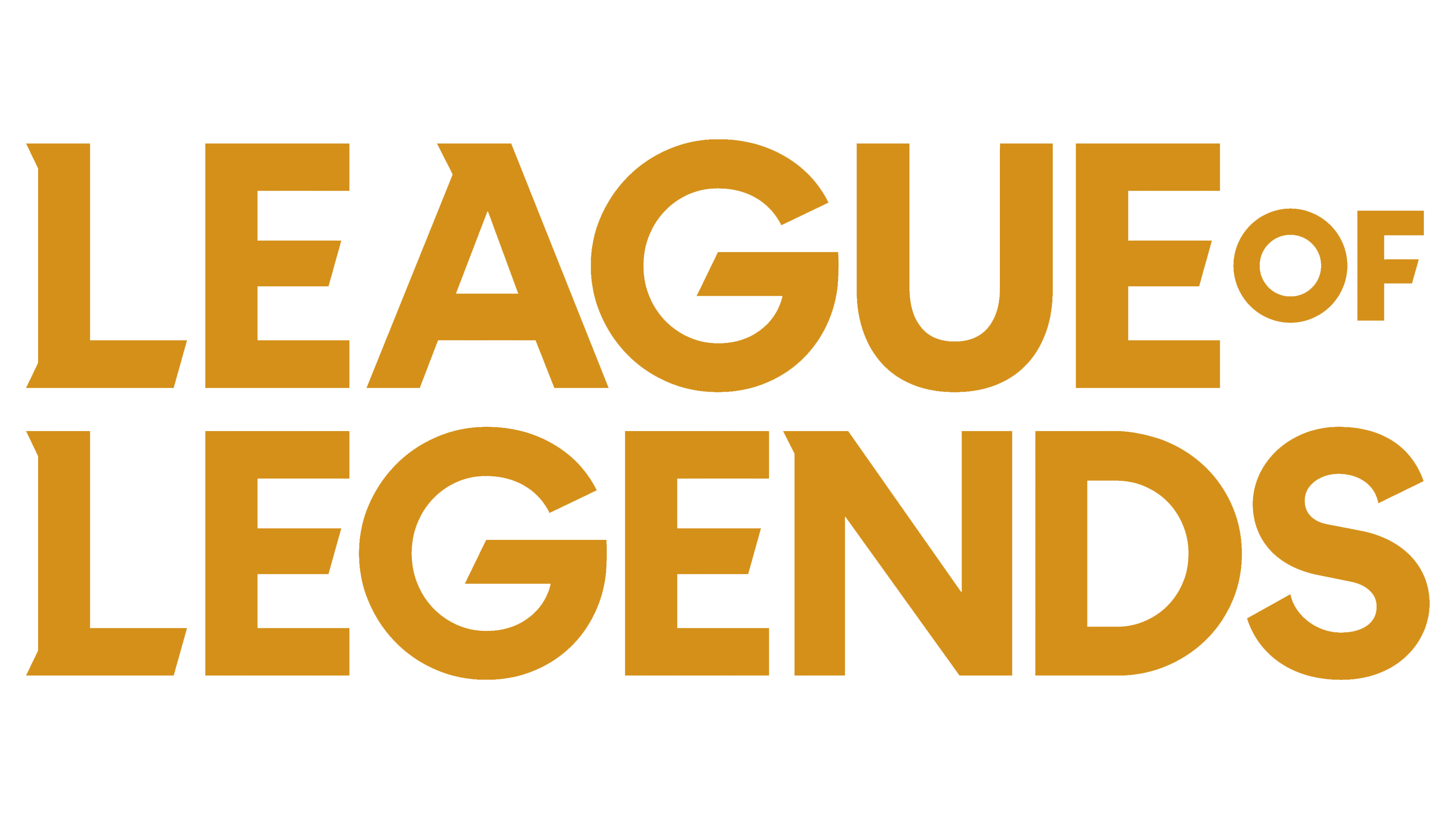
Both versions of the logo feature gold lettering denoting the name of the RPG video game. Despite their similarity, they differ in shape: earlier, the top line was shorter than the bottom one, but now they are aligned in length and form a perfect rectangle. Some gamers speculate that the Riot Games development team has simplified the logo to scale well on all screen sizes. In this regard, they hope that the company will release a mobile version of League of Legends.
With the logo’s modernization, the Friz Quadrata-like font is a thing of the past. As a result, “E,” “G,” “U,” “D,” and “S” have their serifs disappear, while “L,” “A,” and “N” have them much shorter. But the inscription still does not look minimalistic – the designers made it gold, outlined each letter with a dark outline, and added volume with a gradient and a metallic sheen.