


 Lebron James Logo PNG
The LeBron James logo is royal because he is a legendary figure, the king of the sports fields, and a star player. The emblem’s central element is a three-pointed crown. It sits at the junction of mirrored, identical “L” and “J” letters. The massive letters emphasize an athlete’s importance in basketball.
LeBron James became a brand before his first NBA game. In 2003, Reebok, Adidas, and Nike pursued the 18-year-old from Akron. pursued the 18-year-old from Akron. Reebok offered more than $100 million and put a $10 million check on the table if he skipped other meetings. Adidas hosted talks in Malibu but lowered its offer. Nike had already built a prototype shoe in his exact size, and on May 22, 2003, James signed a seven-year, $87 million deal.
In 2004, he created the LeBron James Family Foundation to support children and families in Akron. In 2006, he and longtime friend Maverick Carter formed LRMR Ventures to manage marketing, branding, and investments. A year later, they launched SpringHill Entertainment, named after the Akron housing complex where James lived as a child.
The brand expanded beyond basketball through media and equity deals. More Than a Game arrived in 2008, the same year James invested in Beats Electronics, which Apple later acquired for $3 billion in 2014. In 2015, Nike gave him a lifetime deal estimated at $1 billion, and James and Carter launched Uninterrupted, a platform that lets athletes speak directly to audiences.
The Shop grew from Uninterrupted in 2017, while James invested in Blaze Pizza and co-founded Ladder with Arnold Schwarzenegger. In 2018, his foundation opened the I PROMISE School in Akron. In 2020, SpringHill Entertainment, Uninterrupted, and Robot Company merged into SpringHill Company, backed by $100 million and deals with Disney, Universal Pictures, Netflix, and Amazon. In 2021, James and Carter joined Fenway Sports Group.
Meaning and History
As early as age 20, James was being called the exception to all the rules and was a great player. That’s what Denver Nuggets coach George Karl said about him. But until that time, the young man had a difficult path because he had no father (he had many convictions and disappeared after the birth of his son), and his mother was a 16-year-old girl. She was rushing with her son from one shabby apartment to another, as she had neither a place of her own nor a permanent job. In the end, Gloria Marie James was forced to agree to leave LeBron James in the care of Frank Walker, the youth team’s coach. He was nine years old then.
The boy became interested in sports, made friends, showed interest in basketball, and had his first wins. In high school, those around him were already surprised by his talent. Gradually, he earned a place on top teams, rising to the status of basketball king. And he became not just a superstar but an icon and a brand. James debuted his logo in 2003 after signing a contract with Nike to produce a line of shoes and apparel bearing his name.
The first personalized mark appeared on the Air Zoom Generation sneakers. It had a multi-component structure, consisting of the basketball player’s initials, a miniature icon, and his jersey number from his time with the Cleveland Cavaliers. Even though the shoes were bought, the logo was not perceived – the symbol was incredibly complicated and not entirely clear. This prompted a review of the identity, and Nike decided to make the logo timeless to ensure it would remain relevant. Especially since the athlete switched groups and started playing for the Miami Heat, it was necessary to start over.
As a result, in 2010, LeBron James applied to Darrin Crescenzi of Nike Brand Design, an advertising studio. Together with other agency specialists, he designed a new logo for the basketball player. He uses it to this day because it reflects his personality, not the team he plays for.
What is LeBron James?
This is the story of an outstanding basketball player who became a true sports legend and a successful entrepreneur. Known for his NBA career, he reached incredible heights, turning his on-court achievements into the foundation for large-scale projects. These include his athletic footwear line, work with a major media company, and involvement in educational initiatives, such as a school for children from underprivileged backgrounds. He actively engages in philanthropy and even holds a stake in a well-known soccer club. This individual exemplifies how sports, business, and a commitment to helping others can create a lasting legacy.
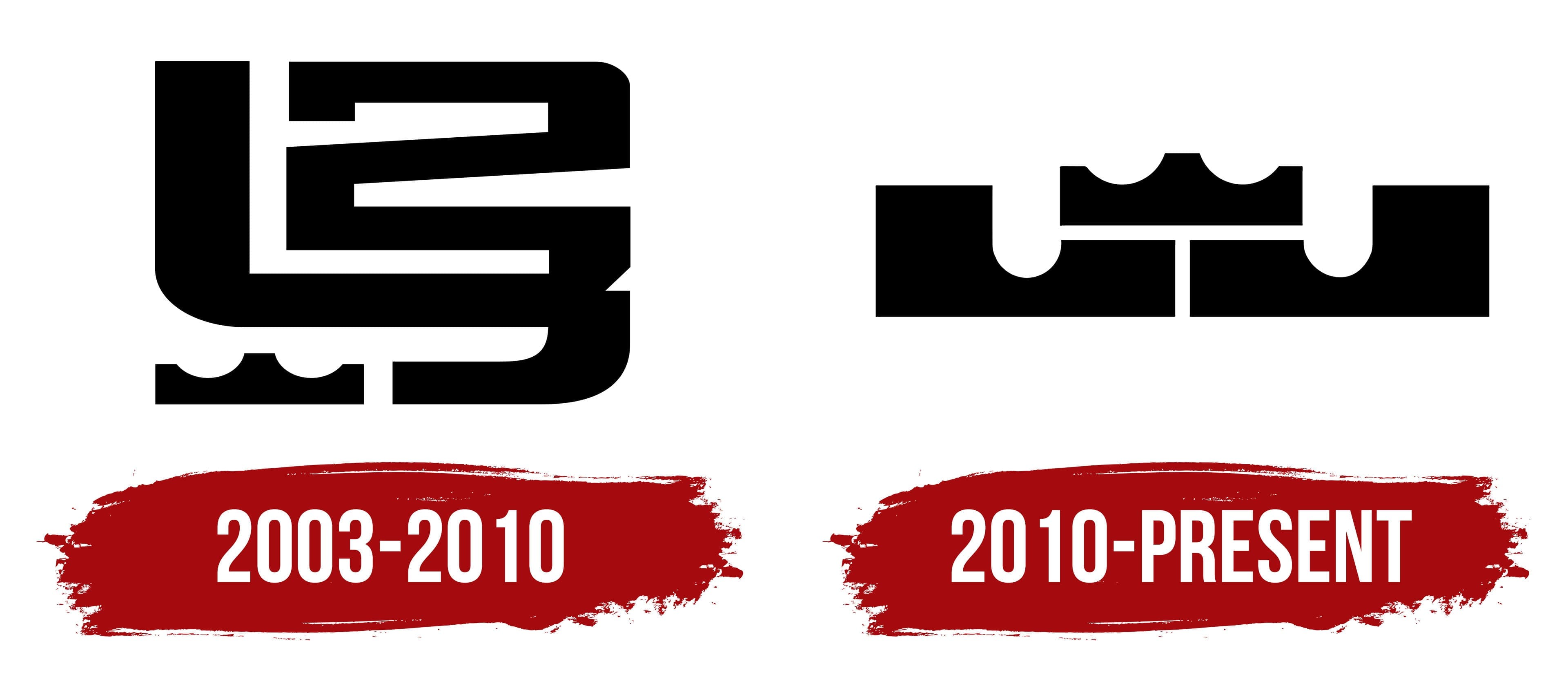
2003 – 2010

This is not an emblem; it’s a cipher. The “puzzle” contains almost all the iconic elements associated with the basketball player, but you have to figure them out. For example, the two moves smoothly into the three, whose middle suddenly becomes the first letter of LeBron James’ name: “L.” And in a complex monogram, where the lines seem free and harmonious, nothing reads as a whole. Separately, yes, each piece is visible, but they don’t work in the design because they overlap and don’t highlight the center link. And the center should be one. When there are many, the logo becomes nonsense. And only a small crown lurks in the lower-left corner.
2010 – today

The current emblem is much simpler than the previous one because it is based on a simpler design. The main detail is the tiny crown, which was previously relegated to a distant and inconspicuous corner. Now the designers have placed it in the most honorable spot: the foreground. Despite its simplicity, the logo contains all the elements needed to represent a megastar. The crown remains because it signals the athlete’s high status and unmatched game: LeBron James is the acknowledged king of basketball.
The absolute mark of power and recognition is a “stand” consisting of two rectangles, one of which is cut off. These are not geometric shapes. They relate more to the alphabet than to the exact sciences. The point is that this is how the designers depicted the letters in the athlete’s first and last names: the “L” on the left and the “J” on the right. They noticed their similarity and placed them mirror-like, actually decorating the logo with ornaments.
Font and Colors

The debut version was a complex configuration with many details, but it lacked a central element. After the redesign, the picture changed the composition drastically, while fully preserving the style. The depressions of the letters and the crown are identical, which adds to the logo’s harmony. In the negative space, lines form a structure that evokes a ruled basketball court. The logo’s popularity grew with LeBron James’ career and became an integral part of his visual identity.
The logo contains no text. Only single letters are made according to geometric rather than typographical requirements. They are proportional, large, strict, and figure-like.

According to Nike’s concept, the logo has no specific color scheme. It depends on the background on which the personal mark is set and how it looks on that background. But in the classic layout, black and white dominate.