The LensCrafters logo speaks of love for customers and their eyes. The stores will pick up the necessary accessories to restore vision. The emblem conveys the return of clarity and bright colors of the surrounding world, which is possible thanks to optics.
LensCrafters: Brand overview
| Founded: | March 1983 |
| Founder: | E. Dean Butler |
| Headquarters: | Mason, Ohio, U.S. |
| Website: | lenscrafters.com |
Meaning and History
The idea of retailing medical glasses came to Dean Butler in 1983 and brought millions in profits in just a year. But the businessman, seeing even greater prospects, a year later sold his offspring to US Shoe, which helped Butler, who remained at the head for another four years, expand the business, raising its profitability from 2 to 305 million dollars and increasing the number of stores from 3 to x to 350. In 1992, the company became the leader in sales in the United States, which attracted the attention of the global giant Luxottica, which absorbed US Shoe for the sake of the optics division in 1995. In 2018, Luxottica merged with the French firm Essilor to form the EssilorLuxottica Corporation, and in 2021 it completely absorbed Essilor.
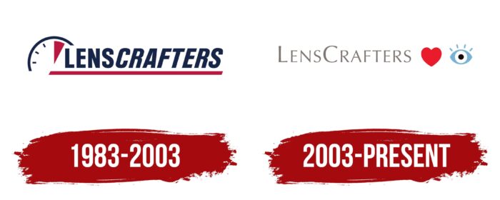
The company logo changed only once, but dramatically. The update reflected a change in ownership, who came to the company with a different marketing approach and already established values.
What is LensCrafters?
The American division of the Italian eyewear corporation Luxottica is headquartered in Ohio. It has 1266 stores, most of which are located in the US.
1983 – 2003
The LensCrafters logo consists of the brand name and an image. The name translates as “lens makers.” The two parts of the word “lenses” and “artisans” can be seen through different spellings. The first part has straight strict capital letters. The second is made in the same font but italics. The slope of the word Crafters to the right shows the constant growth of the skills and knowledge of artisans, their movement in step with the times, and the development of all new products and technologies. This allows them to create reliable and high-quality glasses, as evidenced by the reference position of the word Lens. It also symbolizes the idea of a consistently high level of quality. As proof of its competence, the brand returned the money to customers within 30 days of production if they were unsatisfied.
Before the name, there is a schematic representation of the dial, partially covered by the letter L. The division equal to the hour is marked in red on the dial. One of Butler’s marketing gimmicks was a promise to provide the consumer with glasses within an hour. That’s what the watch says. All the necessary operations, from eye examinations to fitting lenses and placing them in frames, were carried out on-site while customers were shopping at that time since the outlets were located in shopping centers.
The watch also hinted at rapid growth: in 1986, 2 outlets appeared every week!
The title’s red underline enhanced the sense of movement and speed, supporting the “points per hour” idea.
2003 – today
In 1995 the company changed hands. And after a while, the visual sign was also revised. The presence of high competition in the retail niche required a change in approach. It was important to remove the conveyor feeling and focus on professionalism and emotional closeness to customers.
Therefore, the new visual sign has become friendlier and has lost the sense of speed and reference to time. Now he carries a positive and is an encrypted message in the form of a rebus. The image of the eye and heart after the brand name reads: “love to see.” Using glasses from the company, you can see the world in all colors and enjoy life. Another reading of the encrypted message: “LensCrafters loves eyes.” Cares for eyesight and helps clients see well.
Sometimes a different style is used, with the eye, heart, and letters LC above the name, which expands the reading: “love to see with LensCrafters” or “Eyes love LensCrafters.”
All associations of the logo carry the idea of love, the company’s concern for customers’ vision, and the information that the brand’s products are perfect for the eyes.
Font and Colors
Primary colors:
- Saturated dark blue and red in the first logo reflected the idea of dynamics, rapid development, and providing a professionally made product in a short time.
- Blue – the color of clarity and transparency, which is the epitome of good vision.
- Red – the energy of love and care.
- Hemp is a gray color with very little red undertones. Gray is obtained by mixing red, green, and blue: passion, life, and dreams. It means fundamental values, stability, and constancy. Vision with glasses of the company is invariably 100%. A slight excess of red shows loves, energy, and care as the predominant values of the company. In addition, hemp is a very popular plant for producing environmentally friendly fabrics. They are durable, hypoallergenic, and pleasant to the body, just like the brand’s glasses are safe, do not cause discomfort, and wear well.
The font of the second edition of the logo was chosen from the Optima Nova Light family.
LensCrafters color codes
| Spanish Red | Hex color: | #e91b2a |
|---|---|---|
| RGB: | 233 27 42 | |
| CMYK: | 0 88 82 9 | |
| Pantone: | PMS Bright Red C |
| Moonstone Blue | Hex color: | #76b4d5 |
|---|---|---|
| RGB: | 118 180 213 | |
| CMYK: | 45 15 0 16 | |
| Pantone: | PMS 637 C |
| Smoky Black | Hex color: | #140c08 |
|---|---|---|
| RGB: | 20 12 8 | |
| CMYK: | 0 40 60 92 | |
| Pantone: | PMS Black 6 C |
| Gray | Hex color: | #7f7573 |
|---|---|---|
| RGB: | 127 117 115 | |
| CMYK: | 0 8 9 50 | |
| Pantone: | PMS 409 C |


